Introduction
Seaborn is one of the most widely used data visualization libraries in Python, as an extension to Matplotlib. It offers a simple, intuitive, yet highly customizable API for data visualization.
In this tutorial, we’ll take a look at how to plot a scatter plot in Seaborn. We’ll cover simple scatter plots, multiple scatter plots with FacetGrid as well as 3D scatter plots.
Import Data
We’ll use the World Happiness dataset, and compare the Happiness Score against varying features to see what influences perceived happiness in the world:
import pandas as pd

df = pd.read_csv('worldHappiness2016.csv')
Plot a Scatter Plot in Seaborn
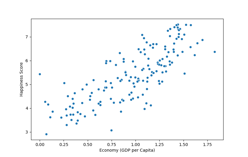
Now, with the dataset loaded, let’s import PyPlot, which we’ll use to show the graph, as well as Seaborn. We’ll plot the Happiness Score against the country’s Economy (GDP per Capita):
import matplotlib.pyplot as plt
import seaborn as sns
import pandas as pd

df = pd.read_csv('worldHappiness2016.csv')

sns.scatterplot(data = df, x = "Economy (GDP per Capita)", y = "Happiness Score")

plt.show()
Seaborn makes it really easy to plot basic graphs like scatter plots. We don’t need to fiddle with the Figure object, Axes instances or set anything up, although, we can if we want to. Here, we’ve supplied the df as the data argument, and provided the features we want to visualize as the x and y arguments.
These have to match the data present in the dataset and the default labels will be their names. We’ll customize this in a later section.
Now, if we run this code, we’re greeted with:
#python #seaborn #matplotlib #data visualization #data science