I used this bar chart for one of my projects where I had to create a chart preview on the main page. This tutorial is more about what you can do with styled-components rather than math calculations and algorithms.
Let’s have a look at what we are about to create and then move to the coding part. For this project I am going to use React.js and styled-components.
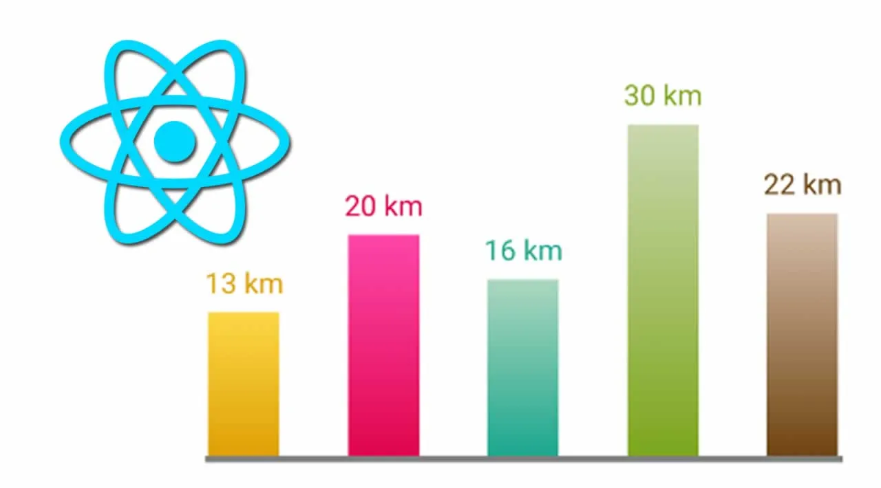
What our bar chart is about
The Chart consists of columns of a different height and different gradient colors.
_Similarities:_The width of columns is the same and spacing is made of the distance left between them.
It’s easy to achieve dynamic spacing using a css property “flexbox” and the same width using a constant value.
Differences:
Each column has a different height and the number representing the distance.
Each number should correspond to the height of the column and its color to the gradient.
1. Creating Chart Data
Let’s create an array of data with sample values we are going to display in a chart. Normally, you would load this data from elsewhere. For the sake of our example, static data will suffice.
const __DATA__ = [
  { distance: 13, colors: ["#ffd847", "#e0a106"] },
  { distance: 20, colors: ["#ff47ab", "#e0064e"] },
  { distance: 16, colors: ["#add9c0", "#1da890"] },
  { distance: 30, colors: ["#cbd9ad", "#7ca81d"] },
  { distance: 22, colors: ["#d9c1ad", "#714511"] },
];
The data array contains objects with key-value pairs of distance and colors.
Because we’re using a gradient to make the chart look nicer, we have two colors in the colors array, where the first color is lighter and the second one is darker.
#web-development #react #css-in-js