This article is the second half of my two-part series for beginners on how to analyze data. The main goal of this guide is to teach and use some basic, but useful techniques in Matplotlib that will allow you to visualize your datasets. Before we start, I strongly suggest you make sure to read the first part of my series or you might not have some of the correct tools to complete the tasks in this article.
Objectives
- A brief introduction to Matplotlib
- Learn some basic plotting techniques
- Visualize our dataset
- Review of what we accomplished and learned
- Helpful resources for the future
A Brief Introduction to Matplotlib
Matplotlib is a Python software library, and it’s primarily used for data visualization. Because of Matplotlib, we can effortlessly sketch detailed plots of our datasets (such as histograms, scatterplots, 3-D plots, and much more). Let’s start exploring!

To begin, we have to first install Matplotlib. I will be using the terminal and pip, but this isn’t the only way to install it. If you are having trouble with this, this article should help you.
The line below will begin the installation of Matplotlib when executed in the terminal:
python -m pip install -U matplotlib
Now that we have Matplotlib installed, we can jump back over to JupyterLab and start visualizing our SAT score dataset. I plan to use Python 2 in this article, so if you are using Python 3, be aware of the errors that may arise from Python 2 vs. Python 3 syntax.
We should also import the Matplotlib library in order to use its helpful methods and functions.
import matplotlib.pyplot as plt
Learning Some Basic Plotting Techniques
Before we start experimenting with our SAT score dataset, we should go over some of the basic plotting techniques available to us in Matplotlib. Most of the information is very basic and won’t be hard to grasp. However, these are some of the fundamental techniques you must be familiar with when you want to visualize datasets. Keep in mind, the labels and use I use in this section are totally made up off the top of my head.
Line Plot
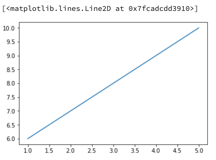
The first basic plotting technique you should know is the plot() function. This function essentially creates a line plot using the points you put into it. For instance, try writing the code below:
plt.plot([1, 2, 3, 4, 5], [6, 7, 8, 9, 10])
Your output should look exactly like this:
#data #matplotlib #data-science #big-data #programming #data analysis