Elegant_Notification | A New Flutter Package to Display Notifications
Elegant Notification
In this tutorial we will learn about elegant_notification - A new flutter package to display notifications on top of the screen, full customizable with built-in themes
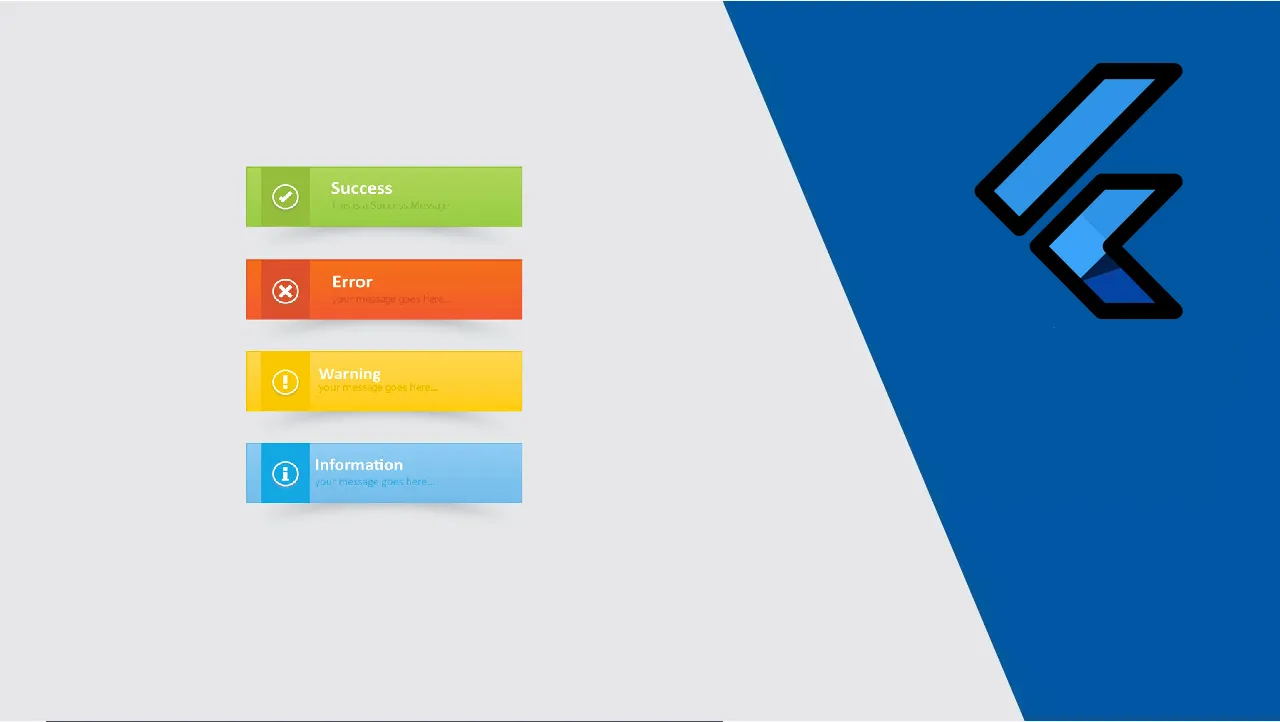
An elegant notification to display important messages to users
|  |
|  | |--|--| |
  |
|  |
|
Features
- Display a top notification with animation
- Built-in themes (Success, Error, Info)
- Different display animations
- Support custom theme implementation
- onClose and onProgressFinished callback handlers
Getting Started
To use this elegant notification package you need to add the dependency in pubspec.yaml file.
dependencies:
	elegant_notification: ^1.0.0
Parameters
///The toast title String (required)
final  String title;


///The title text style
///by default it's `TextStyle(fontWeight: FontWeight.bold, fontSize: 14)`
final  TextStyle titleStyle;


///The toast description text (required)
final  String description;


///The description text style
///by default it's `TextStyle(fontSize: 12)`
final  TextStyle descriptionStyle;


///The toast icon, required only if using the default constructor
///for other toast types (Success, Info, error) the icon is not changeable
late  Widget? icon;


///The size of the icon, by default it's 40px
late  double iconSize;


///The type of the animation set on the notification
///possible values
///{
///FROM_LEFT,
///FROM_RIGHT,
///FROM_TOP
///}
///default value `FROM_LEFT`
final  ANIMATION animation;


///The duration of the animation
///Default value `Duration(milliseconds: 100)`
final  Duration animationDuration;


///The shadow color applied on the notification widget
/// by defualt it's `Colors.grey`
/// for types constructors (Success, Info, Delete) this parameter is unchangeable
late  Color shadowColor;


/// the background color of the notification
/// by default it's set to white
/// for types constructors (Success, Info, Delete) this parameter is unchangeable
late  Color background;


///The color of the progress
///by default it's blue
/// for types constructors (Success, Info, Delete) this parameter is unchangeable
late  Color progressIndicatorColor;


///the border radius of the notification widget
///this parameter it's only set if you are using the default constructor
/// for types constructors (Success, Info, Delete) this parameter is unchangeable
late  double radius;


///The duration how much the notification will take time, duration in milliseconds
///by default the duration is `2500 milliseconds`
final  int toastDuration;


///enable or disable the shadow rendering
///by default it's true
/// for types constructors (Success, Info, Delete) this parameter is unchangeable
late  bool enableShadow;


///enable or disable the progress indicator rendering
///by default the indicator is displayed
/// for types constructors (Success, Info, Delete) this parameter is unchangeable
late  bool showProgressIndicator;


///Display or hide the close button
///by default the close button is displayed
/// for types constructors (Success, Info, Delete) this parameter is unchangeable
final  bool displayCloseButton;


///Function invoked when user press on the close button
final  Function? onCloseButtonPressed;


///Function invoked when the notification is closed after the finish of the progress indicator
final  Function? onProgressFinished;
Examples
- Success theme animation example
ElegantNotification.success(
	title:  "Update",
	description:  "Your data has been updated")
.show(context);
- Info theme animation example
ElegantNotification.info(
	title:  "Info",
	description:  "This account will be updated once you exit")
.show(context);
- Error theme animation example
ElegantNotification.error(
	title:  "Error",
	description:  "Please verifiy your data")
.show(context);
- Custom theme animation example
ElegantNotification(
	title:  "New version",
	description:  "A new version is available to you please update.",
	icon:  Icon(Icons.access_alarm,color:  Colors.orange,),
	progressIndicatorColor:  Colors.orange,)
.show(context);
Contribution
Of course the project is open source, and you can contribute to it repository link
- If you found a bug, open an issue.
- If you have a feature request, open an issue.
- If you want to contribute, submit a pull request.
Use this package as a library
Depend on it
Run this command:
With Flutter:
$ flutter pub add elegant_notificationThis will add a line like this to your package's pubspec.yaml (and run an implicit dart pub get):
dependencies:
  elegant_notification: ^1.0.0
Alternatively, your editor might support flutter pub get. Check the docs for your editor to learn more.
Import it
Now in your Dart code, you can use:
import 'package:elegant_notification/elegant_notification.dart';example/lib/main.dart
import 'package:elegant_notification/elegant_notification.dart';
import 'package:flutter/material.dart';

void main() {
  runApp(MyApp());
}

class MyApp extends StatelessWidget {
  // This widget is the root of your application.
  @override
  Widget build(BuildContext context) {
    return MaterialApp(
      title: 'Flutter Demo',
      theme: ThemeData(
        primarySwatch: Colors.blue,
      ),
      home: Scaffold(
        body: ExampleApp(),
      ),
    );
  }
}

class ExampleApp extends StatelessWidget {
  @override
  Widget build(BuildContext context) {
    return Container(
      child: Column(
        mainAxisAlignment: MainAxisAlignment.center,
        children: [
          Row(
            mainAxisAlignment: MainAxisAlignment.center,
            children: [
              InkWell(
                onTap: () {
                  ElegantNotification.success(
                          title: "Update",
                          description: "Your data has been updated")
                      .show(context);
                },
                child: Container(
                  width: 150,
                  height: 150,
                  color: Colors.blue,
                  child: Center(
                    child: Padding(
                      padding: const EdgeInsets.all(8.0),
                      child: Text(
                        "Success theme notification",
                        style: TextStyle(color: Colors.white),
                        textAlign: TextAlign.center,
                      ),
                    ),
                  ),
                ),
              ),
              SizedBox(
                width: 20,
              ),
              InkWell(
                onTap: () {
                  ElegantNotification.error(
                          title: "Error",
                          description: "Please verifiy your data")
                      .show(context);
                },
                child: Container(
                  width: 150,
                  height: 150,
                  color: Colors.blue,
                  child: Center(
                    child: Padding(
                      padding: const EdgeInsets.all(8.0),
                      child: Text(
                        "Error theme notification",
                        style: TextStyle(color: Colors.white),
                        textAlign: TextAlign.center,
                      ),
                    ),
                  ),
                ),
              ),
            ],
          ),
          SizedBox(
            height: 20,
          ),
          Row(
            mainAxisAlignment: MainAxisAlignment.center,
            children: [
              InkWell(
                onTap: () {
                  ElegantNotification.info(
                          title: "Info",
                          description: "This account will be updated once you exit")
                      .show(context);
                },
                child: Container(
                  width: 150,
                  height: 150,
                  color: Colors.blue,
                  child: Center(
                    child: Padding(
                      padding: const EdgeInsets.all(8.0),
                      child: Text(
                        "Info theme notification",
                        style: TextStyle(color: Colors.white),
                        textAlign: TextAlign.center,
                      ),
                    ),
                  ),
                ),
              ),
              SizedBox(
                width: 20,
              ),
              InkWell(
                onTap: () {
                  ElegantNotification(
                          title: "New version",
                          description: "A new version is available to you please update.",
                          icon: Icon(Icons.access_alarm,color: Colors.orange,),
                          progressIndicatorColor: Colors.orange,)
                      .show(context);
                },
                child: Container(
                  width: 150,
                  height: 150,
                  color: Colors.blue,
                  child: Center(
                    child: Text(
                      "Custom notification",
                      style: TextStyle(color: Colors.white),
                    ),
                  ),
                ),
              ),
            ],
          ),
        ],
      ),
    );
  }
}
Download Details:
Author: koukibadr
Source Code: https://github.com/koukibadr/Elegant-Notification