In an earlier post, I described how to explain a fine-grained sentiment classifier’s results using LIME ( Local Interpretable Model-agnostic Explanations). To recap, the following six models were used to make fine-grained sentiment class predictions on the Stanford Sentiment Treebank (SST-5) dataset.
- Rule-based models: TextBlob and VADER
- Feature-based models: Logistic regression and Support Vector Machine
- Embedding-based models: FastText and Flair
A linear workflow was used to analyze and explain the sentiment classification results using each method. Each model was trained on 5 classes of sentiment (1 through 5), with 1 being “strongly negative”, 3 being “neutral” and 5 being “strongly positive”.
The goal of this post is to show how to build an explainer dashboard (using any one of three frameworks) that takes in a trained model, and outputs LIME explanations for the prediction made by the model.
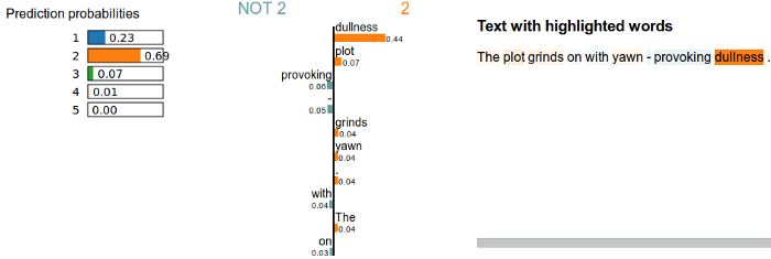
Example LIME explanation
Put simply, LIME generates an explanation object containing visualizations (as embedded JavaScript) that can be output to an HTML file, which can then be opened in any browser. A typical output from LIME is shown below.
Why build an interactive dashboard app?
To explain a classifier’s results using LIME, it can be cumbersome to have to write out individual HTML files each time an explanation needs to be made. An interactive dashboard that takes in user input is a very effective means to rapidly iterate through multiple test samples in real time, providing the user with immediate feedback. In addition, having a dashboard allows non-technical users (who may or may not know how to execute Python scripts) to be able to make their own LIME explanations on demand.
The following sections show how we can build LIME explainer dashboards using three different frameworks: Flask, Dash and Streamlit.
#python #visualization #data-science #web-development #machine-learning