Even though your website works perfectly on a desktop, doesn’t mean it’ll render perfectly on mobile or tablets as well. With the plethora of devices available, you’re bound to miss out a few crucial ones, and hurt your users’ experience. Optimising your website for every single device seems like a daunting task, but what if i told you that you don’t have to do it!
All you need to do is make sure that your website has responsive web design, i.e your content adjusts to different devices automatically, and you’re good to go. But, it is easier said than done, even while making your website responsive, you’re bound to face certain challenges on the way.
In this article on responsive web design, I’ll explore the challenges faced with responsive web design to ease out the process for you. Also, I’ll also explain how to transition to responsive web design and why you should go for it? So, hold on to your seats, coz you’re in for a ride!
What Is Responsive Web Design?
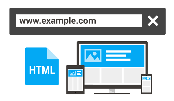
responsive design-google
Responsive Web Design is the design approach where you make sure that the web pages automatically adjust to the different view ports they are being accessed on. In simpler terms, it means making web pages that look great on all devices.
While making your website responsive, you have to ensure that all the elements automatically scale in accordance with the screen size and resolution. This makes sure that all the different users accessing your website using different devices gets a seamless user experience.
Why Should You Go for Responsive Web Design?
#responsiveness #responsive-web-design #web-development #responsive-design #web-design