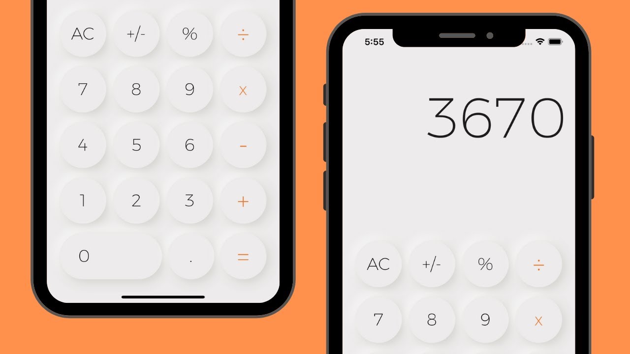
A simple neumorphic calculator app created using Flutter.
🎨 Design:
https://dribbble.com/shots/9157457--Nuemorphism-Calculator-UI
🔥 Learn Flutter & Dart to Build iOS & Android Apps 2020
☞ http://learnstartup.net/p/fr40LuDAo
🔥 The Complete 2020 Flutter Development Bootcamp with Dart
☞ http://learnstartup.net/p/jl9iy4vPh
🗂 Source Code:
https://github.com/happyharis/neumorphic/tree/master/lib/calculator
Neumorphic designs with Flutter
This is a small tutorial on creating Neumorphic interface elements using Flutter. Here’s the end result.
Also in this tutorial:
- CSS code from 2013
Containeris a cake- Metal processing tools
- Unnecessary use of Dart 2.7 extensions
- Quite a few ugly screenshots
- A lot of Space!
Neu… What?
Neumorphic design is one of the trends which started getting traction in late 2019.
This visual style itself is not completely new, as you can find samples of interfaces utilising it dating much earlier.
You could google such terms as “soft embossing” or “bevel and emboss” to find them. One of the earliest samples I have located dates back to 2013.
However, I am sure that it wasn’t the first one, as the effect was known in the Flash era, as well as used in graphical designs before capabilities to draw soft shadows in realtime emerged.
Despite being known for a while, the term itself was coined relatively recently. It was done by Michal Malewicz, who’s exploring different UI trends and implications of using them.
Typical Neumorphic interface looks like this:
This beautiful shot was created by Chandra Mudha Mahendra
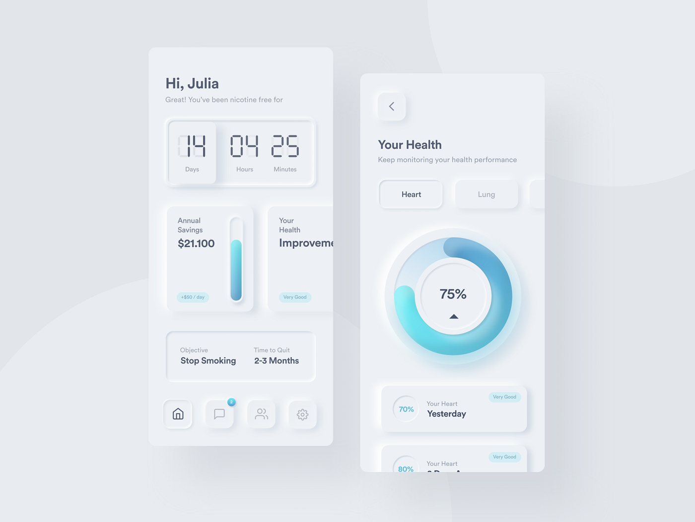
You can also find a lot of experimentation with neuomorphic interfaces on Dribbble. You can safely expect to see this visual style everywhere very soon, just like it was with previous design trends.
The central point of Neumorphism are shadows, which are giving the interface this feel of a surface carefully carved with a spherical drill.

A rare picture of a full toolset of a Neumorphic interface designer.
The recipe itself is very simple, just take your drill bit and work on all those corners in your interface.

Please, note the slight curve of the top of the “neumorphized” piece. That’s what gives it that smooth gradient on top.
You can play with the visual effect a bit more right in your browser, just visit the https://neumorphism.io.
Neu… Why?
There’re a few articles that state that Neumorphism won’t be a huge trend in the upcoming year and that it’s not a replacement for a current generation of interfaces. A couple of good reasons are:
- Performance, shadows are expensive. Especially for animation.
- Function over Form, there are no pragmatic reasons to employ this design style, except visual appearance.
However, it won’t hurt to add another expressive instrument to your visual toolset!
Neu… How?
Flutter has great support for all the integral parts of Neumorphic UI: Shadows and Gradients.
Let’s start with scaffolding a new Flutter project:

Then, open this new project in your IDE of choice (I mean VS code, of course). Let’s get rid of everything in main.dart and replace it with the following.
import 'package:flutter/material.dart';

void main() => runApp(NeumorphicApp());

class NeumorphicApp extends StatelessWidget {
  @override
  Widget build(BuildContext context) {
    return MaterialApp(
      title: 'Neumorphic App',
      theme: ThemeData(
        primarySwatch: Colors.blue,
      ),
      home: Scaffold(
        body: Center(
          child: Text('Neumorphic'),
        ),
      ),
    );
  }
}
Many good things (and bad ones too) in Flutter starts with a Container. Let’s add one here too, we’ll figure out if that’s for good or bad a bit later.
class NeumorphicContainer extends StatelessWidget {
  final Widget child;

  NeumorphicContainer({Key key, this.child}) : super(key: key);

  @override
  Widget build(BuildContext context) {
    return Container(
      child: child,
    );
  }
}
Container in reality is just an orchestrator for many other useful widgets to work together to create a convenient way to draw 2D panels. That is, if you’ll visit Container.build implementation, you’ll see that Container without any properties renders just… its child! Here’s an approximation of how it looks:
// flutter:widgets/container.dart
// in Container
// ...

@override
Widget build(BuildContext context) {
  Widget current = child;

  if (decoration != null) {
    current = DecoratedBox(...);
  }

  if (constraints != null) {
    current = ConstrainedBox(...);
  }

  // ...
  // More code
  // ...

  return current;
}

// ...
So, in future, as a matter of optimization, you may look at using some of those Box implementations directly.
We’re not that concerned with this now, so let’s render something fancy. Let’s render a bevel.
// In NeumorphicContainer
// ...

// New property
final double bevel;

// Also adding initializer to a constructor
const NeumorphicContainer({
  Key key,
  this.child,
  this.bevel = 2.0,
}) : super(key: key);

// ...
After it’s possible to define bevel size, let’s add a border to our Container.
// In NeumorphicContainer.build
// ...
return Container(
  decoration: BoxDecoration(
    border: Border(
      top: BorderSide(width: bevel, color: Color(0xFFFFFFFFFF)),
      left: BorderSide(width: bevel, color: Color(0xFFFFFFFFFF)),
      right: BorderSide(width: bevel, color: Color(0xFFFF000000)),
      bottom: BorderSide(width: bevel, color: Color(0xFFFF000000)),
    ),
  ),
  child: Container(
    padding: const EdgeInsets.symmetric(horizontal: 20.0, vertical: 2.0),
    decoration: BoxDecoration(
      border: Border(
        top: BorderSide(width: bevel, color: Color(0xFFFFDFDFDF)),
        left: BorderSide(width: bevel, color: Color(0xFFFFDFDFDF)),
        right: BorderSide(width: bevel, color: Color(0xFFFF7F7F7F)),
        bottom: BorderSide(width: bevel, color: Color(0xFFFF7F7F7F)),
      ),
      color: Color(0xFFBFBFBF),
    ),
    child: child,
  ),
);
// ...
And… It renders as…
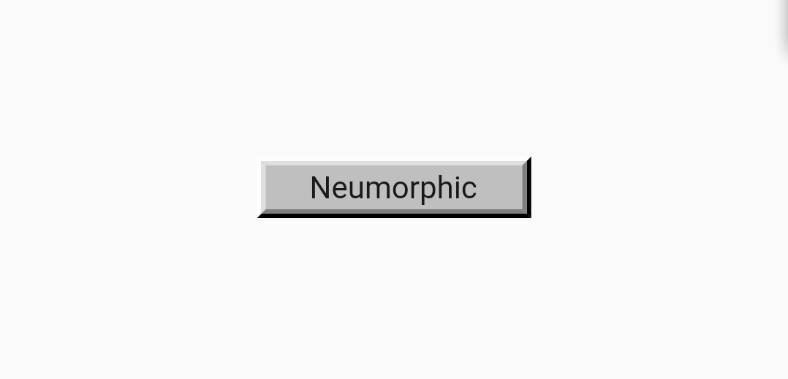
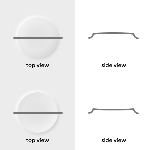
We’ll get there, I promise. This iconic look is described with the following simple shape.

So let’s take our spherical drill and remove some material from it!
return Container(
  decoration: BoxDecoration(
      borderRadius: BorderRadius.circular(bevel),
      color: Colors.grey.shade200,
      boxShadow: [
        BoxShadow(
          blurRadius: bevel,
          offset: -blurOffset,
          color: Colors.white,
        ),
        BoxShadow(
          blurRadius: bevel,
          offset: blurOffset,
          color: Colors.grey.shade400
        )
      ]),
  child: child,
);
Which will look as following, when code is added to the app.

And here we can see one very prominent limitations of Neumorphic design. You can only use it in low-contrast environments. That is, you can’t imitate physically correct soft emboss on an absolutely white or absolutely black surface. So you will always have to choose something in between. It also has some limitations on the accessibility of your visual language. As you can’t have all these barely noticeable touches being an integral part of the design. It simply won’t work for everyone.
To avoid this issue, let’s add some background to our NeumorphicApp.
// In NeumorphicApp
// ...
home: Scaffold(
  // Adding some background
  backgroundColor: Colors.blueGrey.shade200,
  body: Center(
    child: NeumorphicContainer(child: Text('Neumorphic')),
  ),
)
// ...
I’m choosing blueGrey here, but please feel free to choose anything you’re up to. Pastel palette would probably work the best, but not choose anything too bright or too dark.

Well, at least we can see our counter shadow (light) now. The reason why it looks so ugly now is simply because your 🧠 knows how shadows supposed to look on real objects and it doesn’t look like one.
The first thing to fix is color. Shadows are not black. And the lights are not white. That’s probably one of the widest known secrets in design. They are instead relative to the surrounding surface color.
Two simple rules are:
- Shadows a tone darker than background
- Lights are a tone lighter than the background
The gotcha here is that nowBoxShadows needs to be aware of the colour they have been drawn on top of.
Or does it?

On the left is a tonal shadow, on the right is monochrome. I’m going to stick to the first one.
To implement one, we need a couple of small additions.
Addition #1: Color mixer.
I do prefer excessive use of extensions for adding new functionality to existing entities when using Dart. Even for the simplest tasks which already covered by the framework. So here you have it.
extension ColorUtils on Color {
  Color mix(Color another, double amount) {
    return Color.lerp(this, another, amount);
  }
}
It could be used as Colors.blue.mix(Colors.red, .5). If you don’t like how it looks, you could stick to using Color.lerp directly.
Addition #2: Theme awareness
Let’s make use of awesome Theme support in Flutter and make our NeumorphicContainer support to be drawn on a standard backgrounds.
For that, let’s define the background color behavior, in NeumorphicApps ThemeData.
// In NeumorphicApp.build > MaterialApp > ThemeData
// ...
backgroundColor: Colors.blueGrey.shade200,
scaffoldBackgroundColor: Colors.blueGrey.shade200,
dialogBackgroundColor: Colors.blueGrey.shade200,
// ...
And let’s add color property to NeumorphicContainer. Which would fetch its value from ThemeData but support overrides where needed. Always leave your users a way to override defaults. Especially if you’re the future user of the code you’re writing.
class NeumorphicContainer extends StatelessWidget {
  // ...

  // New property, will store overridden color
  // if passed from outside
  final Color color;

  NeumorphicContainer({
    Key key,
    this.child,
    this.bevel = 10.0,
    // We can't initiailize it with default background here, unless we
    // know it aforehead and don't bother with dynamic themes.
    this.color,
  })  : this.blurOffset = Offset(bevel / 2, bevel / 2),
        super(key: key);

  @override
  Widget build(BuildContext context) {
    // We'll use either provided color, or color from theme.
    final color = this.color ?? Theme.of(context).backgroundColor;

    return Container(...);
  }
}
The only thing left is to mix this Colors.white and Colors.black to this color and enjoy tonal shadows.
// In NeumorphicContainer.build > Container > BoxShadow
// Mixing with white
color: color.mix(Colors.white, .6),
// ...
// Mixing with black
color: color.mix(Colors.black, .3),
// ...
You may see that I’ve used different values for white and black here. This disproportion would shift depending on luminosity of the color. dart:ui have a handy computeLuminance which returns a unit luminosity (value between 0 and 1) for a given color and could be used to programmatically adjust the dominant shadow.

Let’s move on. Next step is to apply our Spherical drill bit to the top of this surface.
Neumorphic design allows a couple of options here: convex and concave. That difference determines how lighting will be applied to our surface.
Let’s start with a latter one and a grain of salt. Flutter doesn’t support inset shadows. At least for now. So we’ll have to go with Gradients, for now.
// In NeumorphicContainer.build > Container > BoxDecoration
// ...
gradient: LinearGradient(
  begin: Alignment.topLeft,
  end: Alignment.bottomRight,
  colors: [
    color.mix(Colors.white, .2),
    color.mix(Colors.black, .1),
  ]
),
// ...
Which looks as following.

Alright. Let’s check what we got.
- Direct light shadow. Present.
- Counter light reflection. Present.
- Concave surface shape. Present.
But it still looks ugly!
Widely known design secret #2. When something looks ugly but should look nice, just add space.
Space could fix a bad design and turn good design to be a great one. Also, space is what most of the universe consists of, taking into account that the radius of an atom is more than 10,000 times more than the radius of its nucleus. That’s right, only 0.0001% of the universe’s matter is actually something solid. So don’t try to go against that universal law of nature. Just add some space.
// ...
padding: const EdgeInsets.all(24.0),
// ...
With that and some text color tweaks, our surface looks light years better immediately.

We can now also make gradient a little bit more complex, to adapt for this pill shape.
gradient: LinearGradient(
  begin: Alignment.topLeft,
  end: Alignment.bottomRight,
  colors: [
    color.mix(Colors.black, .1),
    color,
    color,
    color.mix(Colors.white, .5),
  ],
  stops: [
    0.0,
    .3,
    .6,
    1.0,
  ]
),

The final push would be to make our container respond to touch gestures. To do so, let’s sprinkle some Listener on top of the Container. And convert NeumorphicContainer to be a StatefulWidget, as it’ll now have isPressed state.
To the users of VS Code, there’s a very convenient helper. Just place text caret into the widget class name and hit Cmd/Ctrl + . , or `Cmd/Ctrl + Shift + R`` or right click the class name and choose “Refactors”. That’ll call a context menu with “Convert to StatefulWidget” option. Very convenient!

After that, we can wrap Container in NeumorphicContainer with Listener , using another automatic refactor, wrap with widget.
A productive developer is a happy developer. So know your tools to be happy!
// Converting NeumorphicContainer to a StatefulWidget
class NeumorphicContainer extends StatefulWidget {
  final Widget child;
  final double bevel;
  final Offset blurOffset;
  final Color color;

  NeumorphicContainer({
    Key key,
    this.child,
    this.bevel = 10.0,
    this.color,
  })  : this.blurOffset = Offset(bevel / 2, bevel / 2),
        super(key: key);

  @override
  _NeumorphicContainerState createState() => _NeumorphicContainerState();
}

class _NeumorphicContainerState extends State<NeumorphicContainer> {
  // New state, representing if surface is being pressed
  bool _isPressed = false;

  // We're only really interested in down and up events,
  // for now.
  void _onPointerDown(PointerDownEvent event) {
    setState(() {
      _isPressed = true;
    });
  }

  void _onPointerUp(PointerUpEvent event) {
    setState(() {
      _isPressed = false;
    });
  }

  @override
  Widget build(BuildContext context) {
    final color = this.widget.color ?? Theme.of(context).backgroundColor;

    // Listener is almost like GestureDetector,
    // just a bit simpler
    return Listener(
      onPointerDown: _onPointerDown,
      onPointerUp: _onPointerUp,
      child: Container(...),
    );
  }
}
And pressing our container now… Does nothing! We need to use this _isPressed first.
We could do that by conditionally adding or removing boxShadow depending on if _isPresset is set.
// In _NeumorphicContainerState.build > Listener > Container > BoxDecoration
boxShadow: _isPressed ? null : [...]
// ...
And voila!
I mean, “Voila, our ugly interaction is ready”. Let’s make it nicer.
Making things nicer #1.
After button is pressed, it’s surface is squished, so some interactivity is expected. Let’s change our gradient look depending on _isPressed
// In _NeumorphicContainerState.build > Listener > Container > BoxDecoration
// ...
colors: [
  _isPressed ? color : color.mix(Colors.black, .1),
  _isPressed ? color.mix(Colors.black, .05) : color,
  _isPressed ? color.mix(Colors.black, .05) : color,
  color.mix(Colors.white, _isPressed ? .2 : .5),
],
// ...
You can tweak these color variation to your liking as per effect you’re trying to achieve.
Making things nicer #2.
It’s way too snappy. Not that users don’t love snappy interfaces, but this one might be too much. With Flutter, it’s **extremely**easy to fix this. We literally need just one new line of code. Just swap Container with AnimatedContainer and add a required duration param. 150ms would feel pretty snappy still, but you can tweak that as per your preference. Just don’t make it less than 0, otherwise, your Dart VM instance will explode.
// Before
child: Container(
//...

// After
// ...
child: AnimatedContainer(
  duration: const Duration(milliseconds: 150),
// ...
And we’re done, a simple, yet quite alive sample of Neumorphic UI is ready!
A complete code example is available in this gist.
#flutter #mobile-apps