Navigation Bar with Equal Width Navigation Links using HTML and CSS
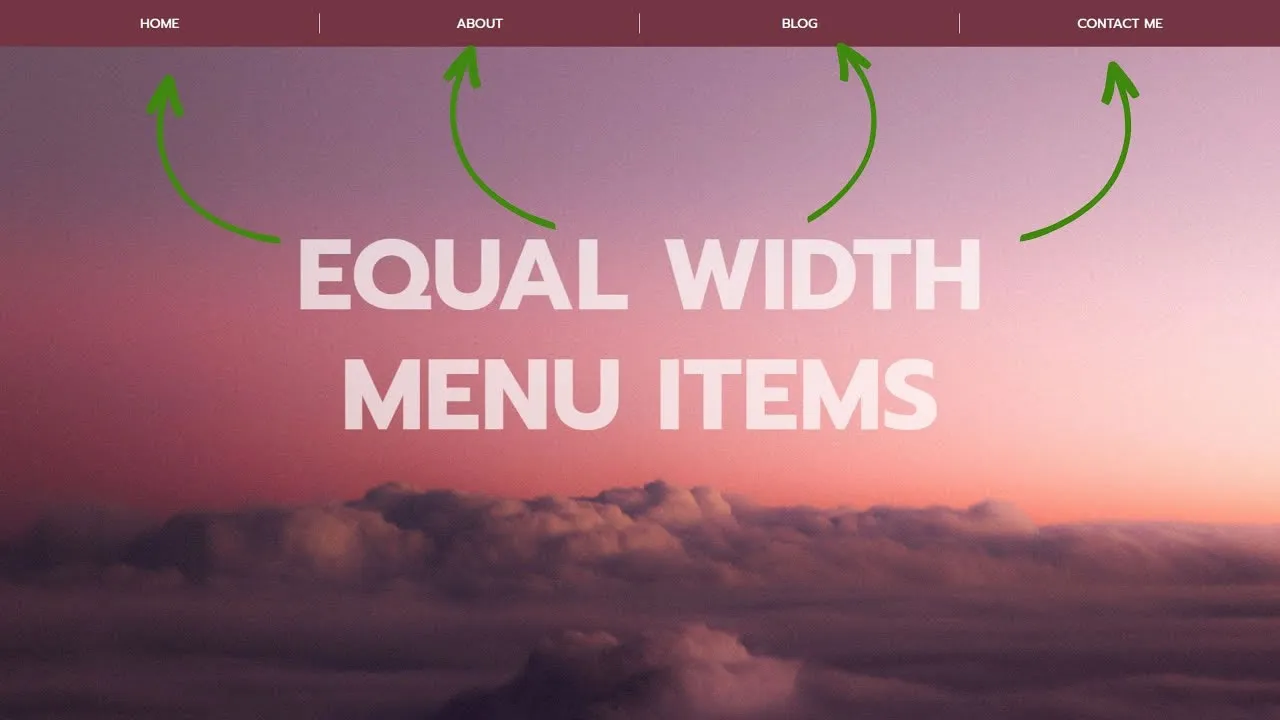
Learn how to create a navigation bar with equal-width navigation links using HTML and CSS. Build a stylish navigation bar with equal-width links using HTML and CSS. Learn step-by-step to create an aesthetically pleasing and responsive design.

Create a Responsive Navigation Bar
Step 1) Add HTML:
Example
<!-- The navigation menu -->
<div class="navbar">
  <a class="active" href="#">Home</a>
  <a href="#">Search</a>
  <a href="#">Contact</a>
  <a href="#">Login</a>
</div>
Step 2) Add CSS:
Example
/* Style the navigation menu */
.navbar {
  width: 100%;
  background-color: #555;
  overflow: auto;
}

/* Navigation links */
.navbar a {
  float: left;
  padding: 12px;
  color: white;
  text-decoration: none;
  font-size: 17px;
  width: 25%; /* Four equal-width links. If you have two links, use 50%, and 33.33% for three links, etc.. */
  text-align: center; /* If you want the text to be centered */
}

/* Add a background color on mouse-over */
.navbar a:hover {
  background-color: #000;
}

/* Style the current/active link */
.navbar a.active {
  background-color: #04AA6D;
}

/* Add responsiveness - on screens less than 500px, make the navigation links appear on top of each other, instead of next to each other */
@media screen and (max-width: 500px) {
  .navbar a {
    float: none;
    display: block;
    width: 100%;
    text-align: left; /* If you want the text to be left-aligned on small screens */
  }
}
Equal Width Navigation Links with Icons
Example

#html #css
4.35 GEEK