A Custom Carousel With Vuejs
vue2-custom-carousel
The simplest and most lightweight carousel ever, made with flexbox and CSS “scroll-snap-type” and “scroll-behavior” for smooth scrolling.
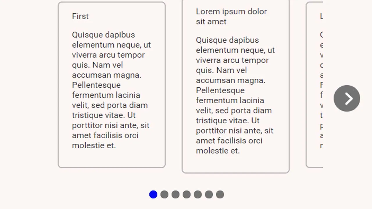
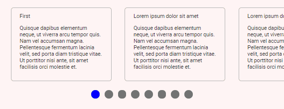
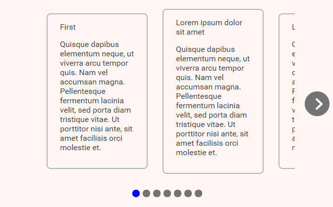
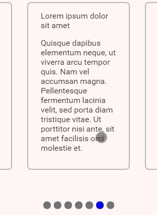
Example
Vue2-custom-carousel does not provide default CSS/template themes, you must build them yourself and wrap them up in another component using your own styles.
  <Carousel class="carousel" >
    <template>
      <Item v-for="(item, index) in items"
        :key="index"
        v-bind="item"
      />
    </template>
    <template v-slot:pagination='{active, number, scroll}'>
      <div class="dot" :class="{active}"
        @click="scroll"
      ></div>
    </template>
  </Carousel>
In this example, we use the functional component to display the items and the pagination template slot to display the dots, the template provides the active boolean which we use to differentiate the active element. The carousel uses scroll-behavior: smooth; for smooth scrolling.
We can easily add button navigators using this code and doing the proper positioning.
<template v-slot:left='{scroll, show}'>
  <Button v-if="show"
    @click.native="scroll"
  />
</template>
<template v-slot:right='{scroll, show}'>
  <Button v-if="show" class="right"
    @click.native="scroll"
  />
</template>
.Button {
  position: absolute;
  top: 50%;
  transform: translateY(-50%) rotate(-180deg);
  right: unset;
  left: -20px;
}

.right {
  transform: unset;
  left: unset;
  right: -20px;
}
Pagination Template Slot Props
| Property | Description |
|---|---|
| number | The current index. |
| scroll | Scroll trigger function, you should use it on the @click.native=‘scroll’ event. |
| active | Will be true at the active navigation. |
Navigation Template Slot Props
| Property | Description |
|---|---|
| show | Will be false on the corners of the carousel. |
| scroll | Scroll trigger function, you should use it on the @click.native=‘scroll’ event. |
Component Props
| Property | Description |
|---|---|
| value/v-model | Sets and updates the current page. The current page will never be bigger than the number of pages or less than 0, that is, if set to a value greater than the number of carousel pages, values settles itself to the maximum value, value doesn’t respond to negative values, instead, it sets itself back to 0. |
Component Methods
| Method | Parameters | Return Value | Description |
|---|---|---|---|
| scroll | (paginationIndex: number) | finalPageIndex: number | Goes to the given page index. The return value will never be bigger than the number of pages or less than 0, that is, if set to a value greater than the number of carousel pages, it settles itself to the maximum value, scroll doesn’t respond to negative values, instead, it sets itself back to 0. |
| next | nothing | nothing | Goes to the next page. |
| previous | nothing | nothing | Goes to the previous page. |
| focus | (elm: HTMLElement) | nothing | Focuses on the element. |
Component Events
calculated event
Runs every time the component calculates the data, runs on mounted, updated, on window resize, and on container scroll event.
Data
{
  numberOfPages: number;
  activePage: number;
  showRightNavigation: boolean;
  showLeftNavigation: boolean;
}
trigger event
Runs every time the scroll changes manually, this can happen when clicking in one of the pagination options, when clicking on the navigation buttons or whenever the component methods are used.
Data
newScroll: number;
Flexbox Usage
The items are by default centralized using flexbox, this means width and display won’t work as expected and you might want to use flex-shrink: 0;, you can overwrite the flexbox styles this way:
<template>
  <Carousel>
  ...
  </Carousel>
</template>

<style>

._CustomCarousel .scroll-wrapper {
  justify-content: flex-start;
}

<style>
The same applies to the pagination wrapper:
<template>
  <Carousel>
  ...
  </Carousel>
</template>

<style>

._CustomCarousel .pagination {
  align-items: flex-start;
  padding: 40px;
}

<style>
Carousel Snap
The carousel .wrapper container uses scroll-snap-type: x mandatory;, this means you can easily snap your items by adding scroll-snap-align: center;:
You can find more information here.
.Item {
  scroll-snap-align: start;
}
Download Details:
Author: Gustavodacrvi
Source Code: https://github.com/Gustavodacrvi/vue2-custom-carousel
#vuejs #vue #javascript