Table of content.
- Introduction
- Data Description
- Exploratory data analysis using plotly express
- Conclusion
1. Introduction
We often keep hearing about so many people committing suicide and the number of such cases keep rising every passing day. Also I read somewhere that “ Suicide or depression doesn’t end the pain. It passes on to someone else”. This is exactly what triggered me to look out for data related to suicide because I wanted to understand the trend and gain some insights about such mournful events.
Also, if you are a part of any public health organization, you may get the opportunity to work with with such projects to perform analysis and come up with various trends leading to suicides which could in turn give us some hope of helping the ones with suicidal thoughts.
2. Data Description
I have used a dataset from Kaggle which is also available in my github repository.
The dataset contains information about suicides in India that occurred between 2001–2012 and consists of below seven features:
- **State : **Details of suicide data for each state.
- **Year: **Details of suicide data for each year.
- **Type_code: **Type code of suicide data which is subdivided into three categories — causes, means adopted and professional background of a person committing suicide.
- **Type: **Type is a subset of type code which gives details about cause of suicide, means adopted for suicide and professional background at an individual level.
- Gender : Gender of the person committing suicide(Male/Female).
- **Age_group: **Age range of people committing suicide which is divided into five categories.
- **Total : **Number of suicides.
3. Exploratory data analysis using plotly express
Finally we will dig into the main agenda of exploring our data using one of python’s best interactive visualization libraries known as Plotly Express which is a wrapper for Plotly.py.
_Since the idea of this article is to visualize the data and understand the trends, I will not embed any code here but it is available in _github_ which can be accessed without any hassle._
- Let us see the suicide trend over the years from 2001 to 2012.
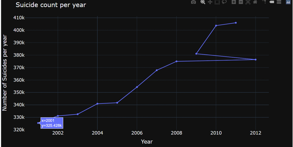
In the above plot, we can see the details of each year and the respective count of suicides which have grown exponentially over the years and isn’t a good sign and the count has a steep rise from the year 2009 to 2010.
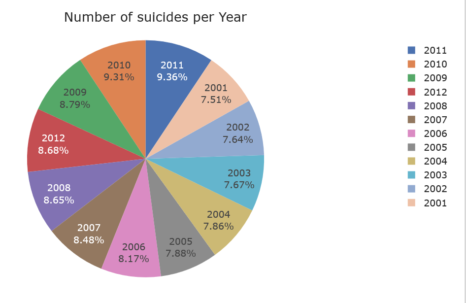
The above pie chart shows us an increased suicide rate from 7.51% in 2001 to 9.36% in 2011.
#data-visualization #data-analysis #plotly #visual studio code #visual studio