In the late 90s, it was an easy life for the developers. The internet was fairly new and only two browsers ruled the world wide web. The screens were fixed and small desktops were all that anybody could purchase. There was no choice after all. You either buy this or nothing at all. Today, it looks like a faded world making it hard to imagine how those people functioned. But if I see it from a web developer’s point of view, everything is a mess now.
When Jack Ma started building websites, he didn’t worry about how it would look on a mobile or tablet because they didn’t exist. There were fewer elements; developers would just put a few hyperlinks, a lot of content, and maybe one poor quality image. Nobody cared about the bandwidth because everyone was working on poor internet network connections. I remember watching an interview when Jack Ma was asked, _“How did you convince your team to work on something called the Internet which was fairly new in those days?”_and he said, “It was very hard to do. I called my team members into my apartment to show them how the Internet works and a single web page took 20 minutes to load. They were not convinced, not even one.”
Jack Ma’s teammates might have been wary of the internet but that is definitely not the case anymore. As the Internet started to grow wider and wider, building websites became interesting and complicated at the same time. From a basic website to a responsive website, we have come a long long way. The magnitude of the internet and devices accessing it is definitely a little scary. But this responsive web design tutorial will guide you all the way through in creating an impressive mobile view of a website.
What Is A Responsive Website?
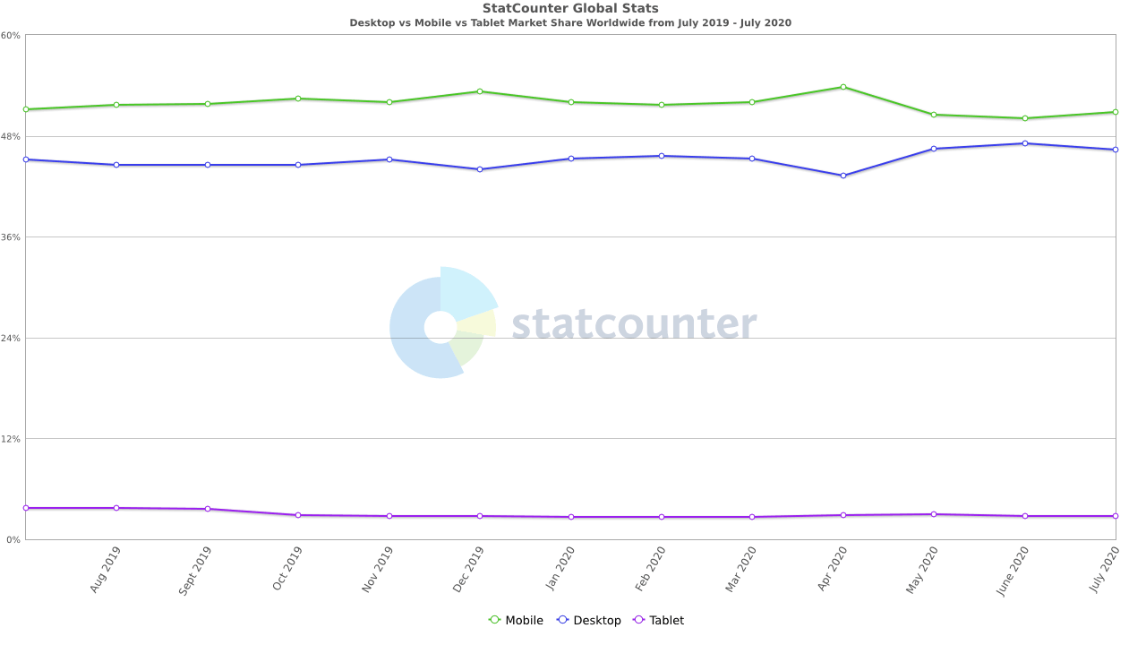
If you go to a store to purchase a mobile phone, the salesman floods you with so many devices and all of them differ from tip to toe physically. The “number of inches” has become a common parameter for a person to judge his phone. Devices are available in any size you want with any specification loaded onto them. Desktops are no different. The following example will show you how diverse these products have become. In my own house, I can open a website on my mobile (6.1 inches), on my father’s mobile (5.5 inches), my laptop (15.6 inches), my tablet (13 inches) and my TV (42 inches). Obviously this is just a small portion of the devices available in the market today. Take a look at the global stats (from July 2019- July 2020) according to GS StatCounter–
#web development #web #web dev