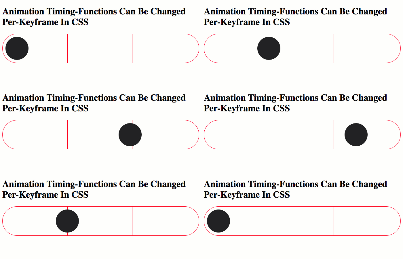
A couple of weeks ago, I looked at creating a simple slide-show using dynamic keyframe animations in Angular 10.0.9. In the video for that demo, I mentioned that my approach was somewhat limited because the timing-function wasn’t granular enough. As it turns out, my assumption of granularity was completely wrong. In fact, as I just learned from Una Kravets on the Animations episode of the CSS Podcast, the animation-timing-function property is applied on a per-keyframe basis. To help correct my poor mental model, I put together a small demo showcasing this per-keyframe granularity.
Run this demo in my JavaScript Demos project on GitHub.
View this code in my JavaScript Demos project on GitHub.
To demonstrate that the animation-timing-function within a CSS animation is applied on a per-keyframe basis, I am going to use cubic-bezier() function that moves a dot across the screen with a sort-of “bouncing” effect. This way, we can see that the dot “bounces” beyond the bounds of each keyframe configuration - not just beyonds the bounds the overall animation.
In the following CSS animation, the dot will rest at about 1/3 the horizontal distance; then again at about 2/3 the horizontal distance. At each resting point, we should see the cubic-bezier() animation-timing-function “bounce” the dot beyond the target left setting.
#html / css #css
