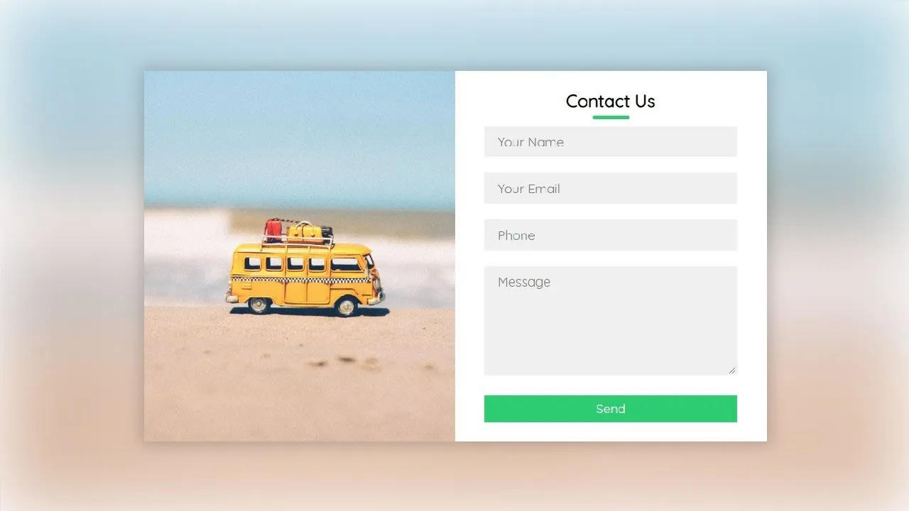
CSS Forms - Explained with Examples
Demystify CSS Forms with our insightful guide and practical examples. Elevate your web design skills to create stylish and user-friendly forms effortlessly.
The look of an HTML form can be greatly improved with CSS:
Styling Input Fields
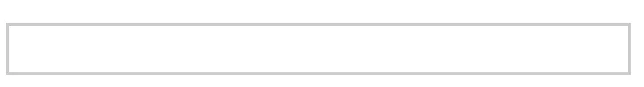
Use the width property to determine the width of the input field:

Example
input {
  width: 100%;
}
The example above applies to all <input> elements. If you only want to style a specific input type, you can use attribute selectors:
input[type=text]- will only select text fieldsinput[type=password]- will only select password fieldsinput[type=number]- will only select number fields- etc..
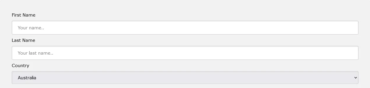
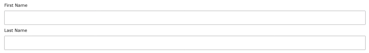
Padded Inputs
Use the padding property to add space inside the text field.
Tip: When you have many inputs after each other, you might also want to add some margin, to add more space outside of them:
Example
input[type=text] {
  width: 100%;
  padding: 12px 20px;
  margin: 8px 0;
  box-sizing: border-box;
}
Note that we have set the box-sizing property to border-box. This makes sure that the padding and eventually borders are included in the total width and height of the elements.
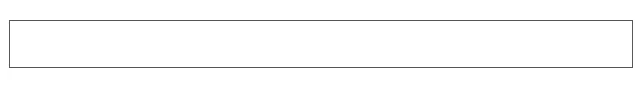
Bordered Inputs
Use the border property to change the border size and color, and use the border-radius property to add rounded corners:

Example
input[type=text] {
  border: 2px solid red;
  border-radius: 4px;
}
If you only want a bottom border, use the border-bottom property:

Example
input[type=text] {
  border: none;
  border-bottom: 2px solid red;
}
Colored Inputs
Use the background-color property to add a background color to the input, and the color property to change the text color:

Example
input[type=text] {
  background-color: #3CBC8D;
  color: white;
}
Focused Inputs
By default, some browsers will add a blue outline around the input when it gets focus (clicked on). You can remove this behavior by adding outline: none; to the input.
Use the :focus selector to do something with the input field when it gets focus:
Example
input[type=text]:focus {
  background-color: lightblue;
}
Example
input[type=text]:focus {
  border: 3px solid #555;
}
Input with icon/image
If you want an icon inside the input, use the background-image property and position it with the background-position property. Also notice that we add a large left padding to reserve the space of the icon:

Example
input[type=text] {
  background-color: white;
  background-image: url('searchicon.png');
  background-position: 10px 10px;
  background-repeat: no-repeat;
  padding-left: 40px;
}
Animated Search Input
In this example we use the CSS transition property to animate the width of the search input when it gets focus.

Example
input[type=text] {
  transition: width 0.4s ease-in-out;
}

input[type=text]:focus {
  width: 100%;
}
Styling Textareas
Tip: Use the resize property to prevent textareas from being resized (disable the "grabber" in the bottom right corner):
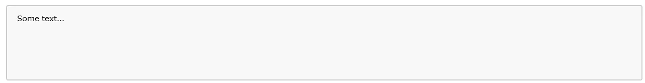
Example
textarea {
  width: 100%;
  height: 150px;
  padding: 12px 20px;
  box-sizing: border-box;
  border: 2px solid #ccc;
  border-radius: 4px;
  background-color: #f8f8f8;
  resize: none;
}
Styling Select Menus

Example
select {
  width: 100%;
  padding: 16px 20px;
  border: none;
  border-radius: 4px;
  background-color: #f1f1f1;
}
Styling Input Buttons
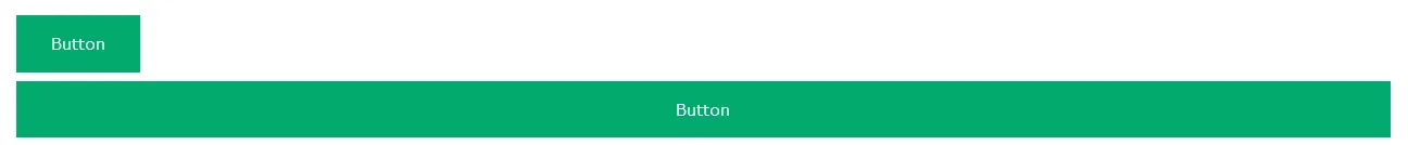
Example
input[type=button], input[type=submit], input[type=reset] {
  background-color: #04AA6D;
  border: none;
  color: white;
  padding: 16px 32px;
  text-decoration: none;
  margin: 4px 2px;
  cursor: pointer;
}

/* Tip: use width: 100% for full-width buttons */
#css