We at School Of AI Hyderabad, built the Racing Bar Chart in collaboration with Co-learning Lounge (CLL) its an fastest-growing tech community in a mission to open-source education hence making it affordable. All the community members will get the free access to this article through friendly link. Check out our work in the video below.
Let’s start building the Racing Bar Chart
First, if you don’t know the basics of D3js I would highly recommend you to go through my D3js article otherwise it will be very difficult as I won’t be explaining any technical stuff here.
D3.js Basic to Mastery Part 1 Fundamentals
D3js Basic to Mastery Part 2 Mastery
Data Source
The data source I am going to use is from https://api.covid19india.org which is “A volunteer-driven, crowd-sourced database for COVID-19 stats & patient tracing in India.”. I took the states daily json data from
https://api.covid19india.org/states_daily.json.
Let’s check the data format.
{"states_daily": [
{"an": "0"
"ap": "1",
"ar": "0",
"as": "0",
"date": "14-Mar-20",
"dd": "0",
"dl": "7",
...
"status": "Confirmed",
"tg": "1",
"tn": "1",
...}]}
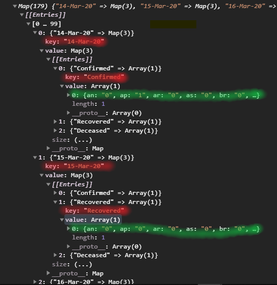
You can see under the states_daily Object, there is an array object with all state codes and the date and status. We can group the items with data and status and then use it to build the chart.
Setup your project add D3js then come back.
Processing Data
Use fetch to get the data from the API.
fetch('https://api.covid19india.org/states_daily.json')
     .then(res => res.json())
     .then((data: any) => {
       const processedData = processData(data);
       plotChart(processedData)
})
We process the data into desired format in processData function and pass it to plotChart funtion to plot the chart.
function processData(data) {
   return d3.group(data.states_daily, d => d.date, e => e.status);
}
This is doing a two stage nesting of the data. We took date for the first stage nest because we need to iterate through the dates. As you know we need to animate through each date to make it look like a racing chart. Second stage nesting we took the status as we only need to compare one type of status at any given date.
The output is the Map key pair values with date as key and another Map with status as key. If you don’t know about Map in Javascript Learn about it by clicking here. It also improves performance over Object for large datasets.
Okay, now we got the data processed, to plot the chart, first we need make the scales. To make the scales we need the size of our SVG, and also the extant (min, max) of the data. When not animating, we only plot chart for a single date at a time. So lets build for a single date.
#data-visualization #javascript #d3js #front-end-development #bar-chart-race
