Data visualization is the graphical representation of data in a graph, chart or other visual formats. It shows relationships of the data with images.
Python offers multiple graphics libraries, with which you can create interactive, live or highly customizable plots with the given data.
To get a little overview here are a few popular plotting libraries:
In this article, we will learn about creating a different type of plots using the Matplotlib library.
Matplotlib is the most popular plotting library for python, which was designed to have a similar feel to MATLAB’s graphical plotting. It gives you control over every aspect of a plot.
Matplotlib allows you to create reproducible figures using a few lines of code. Let’s learn how to use it! I also encourage you to explore: http://matplotlib.org/.
Installing Matplotlib
Install it with pip or conda at your command line or the terminal with:-
pip install matplotlib
OR
conda install matplotlib
To quickly get started with Matplotlib without installing anything on your local machine, check out Google Colab. It provides Jupyter Notebooks hosted on the cloud for free which are associated with your Google Drive account and it comes with all the important packages pre-installed.
Necessary Imports
pyplot is a module of Matplotlib that makes this library work like MATLAB. Import the matplotlib.pyplot module under the name plt (the tidy way):
import matplotlib.pyplot as plt
import numpy as np # for working with arrays
Making a Simple Plot
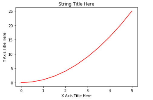
We pass two NumPy arrays(x and y) and ‘r’ as arguments to Pyplot’s plot() function. Here ‘r’ is for red colour, x elements will appear on x-axis and y elements will appear on the y-axis.
import matplotlib.pyplot as plt
import numpy as np

x = np.array([0, 0.5, 1, 1.5, 2, 2.5, 3, 3.5, 4, 4.5, 5])
y = x ** 2 # y is now a list with elements of x to the power 2

plt.plot(x, y, 'r')
plt.xlabel('X Axis Title Here')
plt.ylabel('Y Axis Title Here')
plt.title('String Title Here')
plt.show()
# The plot below is the output of this program.
Creating Multiple Plots on The Same Canvas
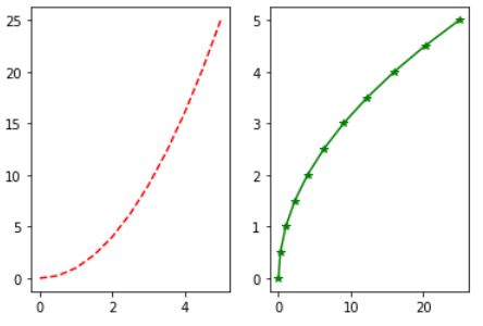
subplot(): a method of pyplot, divides the canvas into nrows x ncols parts and using plot_number argument you can choose the plot.
Syntax: subplot(nrows, ncols, plot_number)
In the below example, using plt.plot(x, y, 'r--’)we plot a red coloured graph with line style ‘- -’ between x and y at plot_number=1.
import matplotlib.pyplot as plt
import numpy as np

x = np.array([0, 0.5, 1, 1.5, 2, 2.5, 3, 3.5, 4, 4.5, 5])
y = x ** 2
plt.subplot(1,2,1) # subplot(nrows, ncols, plot_number)
plt.plot(x, y, 'r--') # r-- meaning colour red with -- pattern
plt.subplot(1,2,2)
plt.plot(y, x, 'g*-') # g*- meaning colour green with *- pattern
# The plot below is the output of this program.
For making it more simple subplots() method can be used instead of subplot(). You will see its example in “Creating Multiple plots on The Same Canvas” under “Matplotlib Object-Oriented Method”.
#data-science #matplotlib #data-visualization #python #plotting-data #data analysis