How to Build Customized Data Tables with PrimeReact
In this React.js tutorial, you will learn how to build beautiful, customized data tables with PrimeReact. Add custom components and features like sorting and pagination.
In the world of web development, data tables are essential for displaying and organizing large amounts of data clearly and concisely. Data tables are relevant for a wide variety of websites, such as finance, ecommerce, directories, analytics and reporting, CRM and sales management, project management, inventory management, human resources and employee management, and education and learning.
In this article, we’ll demonstrate how to build a beautiful, customized data table using PrimeReact, a popular library that provides a wide range of UI components for React. PrimeReact is a useful resource for easily creating professional-looking data tables that are customizable and responsive, making it an excellent choice for building data-driven React applications.
Contents:
- Setting up the project
- Creating a basic data table
- Customizing the data table layout
- Sizing the data table
- Adding gridlines
- Styling the rows
- Defining custom content with templating
- Adding a custom header and footer
- Customizing individual columns
- Adding sorting
- Adding pagination
- Adding radio or checkbox selection
- Displaying the data table as a modal popup
Setting up the project
The first step in building a data table with PrimeReact is to set up the project. If you already have a React project, you can skip this step. If not, you can create a new React project using the following command:
npx create-react-app my-appOnce your project is set up, you’ll need to import PrimeReact. You can do this by running the following command in your terminal:
npm install primereact primeiconsNext, import the PrimeReact styles into your app by copying and pasting the following code in your index.js file:
//theme
import "primereact/resources/themes/lara-light-indigo/theme.css";
//core
import "primereact/resources/primereact.min.css";
//icons
import "primeicons/primeicons.css";
Creating a basic data table
For our demo, we will consider an ecommerce website and will use an array of products available on the site as data for our table. The array contains objects representing products with properties such as id, name, price, category, quantity, and rating, which can be used to populate the data table.
const products = [
    {
      id: 1,
      name: "Apple Watch",
      price: "₦350,000",
      category: "Accessories",
      quantity: "7",
      rating: "5",
    },
    {
      id: 2,
      name: "Fitness watch",
      price: "₦10,000",
      category: "Fitness",
      quantity: "23",
      rating: "2",
    },
    {
      id: 3,
      name: "Beach dress",
      price: "₦25,000",
      category: "Clothing",
      quantity: "5",
      rating: "4",
    },
    {
      id: 4,
      name: "Washing machine",
      price: "₦260,000",
      category: "Electronics",
      quantity: "10",
      rating: "4",
    },
    {
      id: 5,
      name: "Blue Jeans",
      price: "₦10,000",
      category: "Clothing",
      quantity: "50",
      rating: "5",
    },
    {
      id: 6,
      name: "Samsung Watch",
      price: "₦270,000",
      category: "Accessories",
      quantity: "7",
      rating: "3",
    },
    {
      id: 7,
      name: "Yoga mat",
      price: "₦15,000",
      category: "Fitness",
      quantity: "15",
      rating: "4",
    },
    {
      id: 8,
      name: "Jumpsuit",
      price: "₦15,700",
      category: "Clothing",
      quantity: "30",
      rating: "5",
    },
    {
      id: 9,
      name: "Hand mixer",
      price: "₦50,000",
      category: "Electronics",
      quantity: "10",
      rating: "4",
    },
    {
      id: 10,
      name: "Pallazo",
      price: "₦12,000",
      category: "Clothing",
      quantity: "4",
      rating: "3",
    },
  ];
Next, we’ll create a component, called Table, that will be used to render the data table. Then, we’ll add the following code to our Table.js file:
import React from "react";
import { DataTable } from "primereact/datatable";
import { Column } from "primereact/column";

const Table = () => {
  const products = [
    // our products array
  ];

  return (
    <div className="table-wrapper">
      <h2 className="table-name">PrimeReact data table</h2>

      <DataTable value={products} responsiveLayout="scroll">
        <Column field="name" header="Name"></Column>
        <Column field="price" header="Price"></Column>
        <Column field="category" header="Category"></Column>
        <Column field="quantity" header="Quantity"></Column>
        <Column field="rating" header="Rating"></Column>
      </DataTable>
    </div>
  );
};

export default Table;
Here we are importing two components from PrimeReact, DataTable and Column. We have a <div> element that wraps around the DataTable component we imported. We also have five Column components within the DataTable component.
The DataTable has two props passed into it: products accepts an array of items to be displayed in the table and responsiveLayout determines the responsive layout of the table. It accepts two options: scroll and stack. The scroll option gives the table a horizontal scrollbar for smaller screens, while the stack option defines a breakpoint to display the row’s cells as a vertical stack.
The Column component also has two props passed into it: field and header. The header represents the header or title of a column, and field represents the values we want displayed in that column. We have only five Column components because the objects in our products array have five key-value pairs.
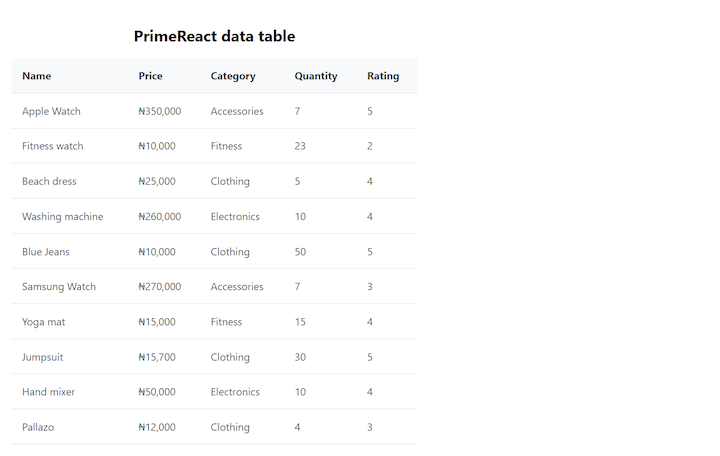
Each value is represented by and displayed in one Column component. For example, the five key-value pairs for the first item listed in the below table are: id–1, name–Apple Watch, price–₦350,000, category–Accessories, quantity–7, and rating–5.
Here’s an example of a basic data table built in PrimeReact:
Customizing the data table layout
PrimeReact offers a variety of options for customizing a data table. To start, we can further customize our table by passing more props with varying values to the DataTable or Column components.
Sizing the data table
We can easily change the size of our data table by setting the size property on the DataTable component. It accepts the following values as props: small, normal, and large:
   <DataTable
        value={products}
        responsiveLayout="scroll"
        size="small">
      …
   </DataTable>

The default size prop is normal. Here's a smaller version of our demo PrimeReact data table: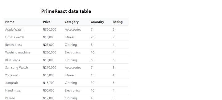
Adding gridlines
We can add gridlines to our table to help visually define each cell. To do this, we simply set the gridlines property to true:
   <DataTable
        value={products}
        responsiveLayout="scroll"
        size="small"
        showGridlines>
      …
   </DataTable>
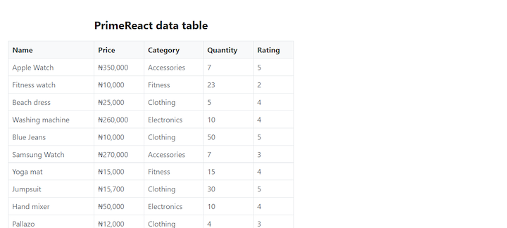
Here’s our PrimeReact table with gridlines:
Styling the rows
We can provide additional visual definition to our table by setting the table rows to display alternating colors. Setting the stripedRows property to true will add a light gray background to alternating rows within the table:
<DataTable
value={products}
responsiveLayout="scroll"
size="small"
showGridlines
stripedRows>
…
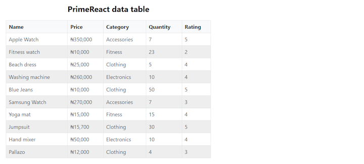
</DataTable>Here’s our PrimeReact table with striped rows:
Defining custom content with templating
Templating is a powerful feature of PrimeReact that allows us to define custom content for specific parts of our data table. For example, we can define a custom header or footer for our table or customize the appearance of individual columns.
Adding a custom header and footer
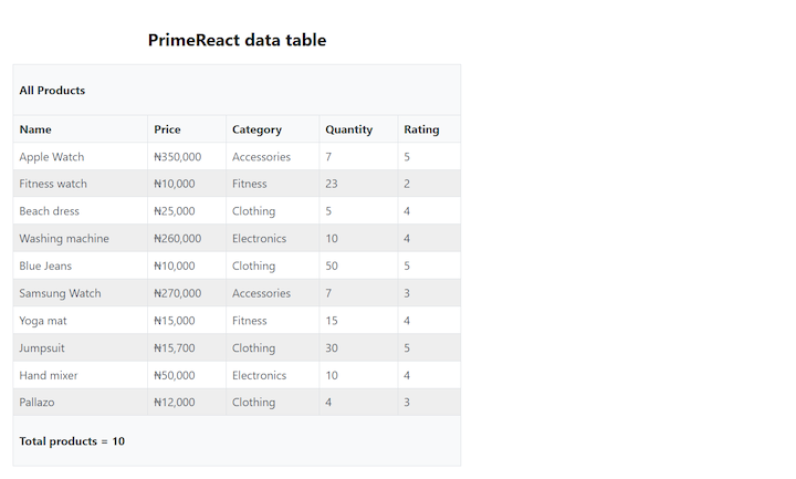
Let’s say we want to create a custom header with the text “All Products” and a custom footer that totals the number of products listed in the table. We can accomplish this by creating the header and footer and then passing them in as props into our DataTable component:
const header = <p>All Products</p>;
const footer = <p>Total products = ${products ? products.length : 0}</p>;
…

<div className="table-wrapper">
    <h2 className="table-name">PrimeReact data table</h2>

    <DataTable
        value={products}
        responsiveLayout="scroll"
        size="small"
        showGridlines
        stripedRows
        header={header}
        footer={footer}>
        <Column field="name" header="Name"></Column>
      …
    </DataTable>
Here’s our PrimeReact table with the custom header and footer:
Customizing individual columns
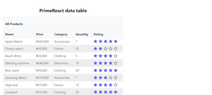
We can customize the appearance of individual columns within our data table by defining custom content for the body property of the Column component. For example, let’s say we want to display stars instead of numbers for the product ratings.
We import the Rating component from PrimeReact, create a rating body template called ratingBodyTemplate, and pass it into the body props of the Rating column:
const ratingBodyTemplate = (rowData) => {
    return <Rating value={rowData.rating} readOnly cancel={false} />;
  };
…

</DataTable>
…
    <Column
        field="rating"
        header="Rating"
        body={ratingBodyTemplate}></Column>
</DataTable>
Here’s our PrimeReact table with a custom column displaying a star rating:
Adding sorting
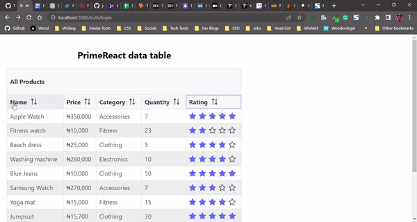
By adding the sortable property to a Column component, we can add functionality that enables that column to be sortable in both ascending and descending order. Adding the removableSort property to theColumn component allows you to revert to the column’s initial order:
<DataTable
      value={products}
      responsiveLayout="scroll"
      size="small"
      showGridlines
      stripedRows
      header={header}
      footer={footer}
      removableSort>
      <Column field="name" header="Name" sortable></Column>
      <Column field="price" header="Price" sortable></Column>
      <Column field="category" header="Category" sortable></Column>
      <Column field="quantity" header="Quantity" sortable></Column>
 </DataTable>
Here’s our PrimeReact data table with sorting functionality for each column:
Adding pagination
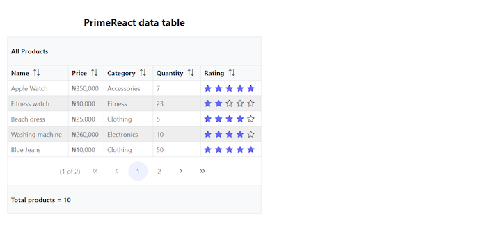
With a larger data table, it can be helpful to add pagination instead of trying to display all of the data on one page. We can get this functionality by adding the paginator property to the DataTable component and the paginatorTemplate prop. The paginatorTemplate prop allows us to define a template that indicates how we want the paginator to look and what properties or details we want it to display.
For example, we may want to only display the navigation buttons to the user and have the user select the number of rows to be displayed per page:
<DataTable
        …
        paginator
        paginatorTemplate="CurrentPageReport FirstPageLink PrevPageLink PageLinks
        NextPageLink LastPageLink"
        rows={5}>
…
</DataTable>
Here’s our PrimeReact table with pagination navigation:
Adding radio or checkbox selection
PrimeReact enables us to turn a row into a radio or checkbox input, thereby enabling the user to select one or multiple rows simultaneously.
To add row selection functionality to our data table, we’ll first import the useState Hook from React and create a state to store the selected product:
import React, { useState } from "react";
…
const [selectedProduct, setSelectedProduct] = useState(null);
Next, we’ll include the following to our DataTable component as props:
 <DataTable
        …
        selection={selectedProduct}
        onSelectionChange={(e) => setSelectedProduct(e.value)}
        dataKey="id">
 </DataTable>
Finally, we’ll add the selectionMode prop to the first Column component. We can pass in either single or multiple into this prop. For radio buttons, we would use single, indicating that only one column may be selected at a time. For checkboxes, we would use multiple, indicating that one or more columns can be selected simultaneously:
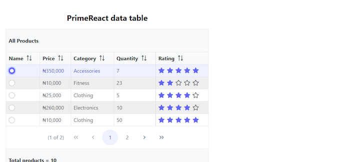
<Column selectionMode="single" field="name" header="Name"></Column>With radio buttons (single selection mode), when we select a column, the onSelectionChange function sets the selection value — in our case selectedProduct — to the object value of that selected column:
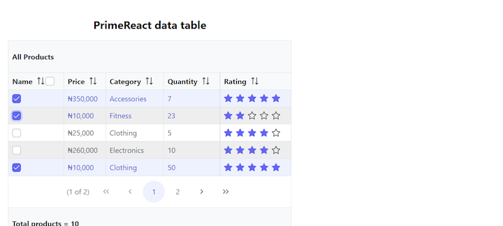
With checkboxes (multiple selection mode), when we select one or multiple columns, the onSelectionChange function sets the selection value to an array of objects (i.e., each column’s value):
Displaying the data table as a modal popup
Sometimes it’s useful to hide a data table and only display it when a user clicks on a button. We can accomplish this by displaying the data table as a dialog or modal popup.
First, we import the Button and Dialog components from PrimeReact:
import { Button } from "primereact/button";
import { Dialog } from "primereact/dialog";
Then we create a state called dialogVisible that will determine the visibility of the table:
const [dialogVisible, setDialogVisible] = useState(false);Next, we create three functions: openDialog, closeDialog, and dialogFooterTemplate. openDialog sets the visibility of our Dialog to true, while closeDialog sets the visibility of our Dialog to false. dialogFooterTemplate is the button that will be displayed in the footer of our Dialog; it also sets the visibility of our Dialog to false:
const openDialog = () => {
    setDialogVisible(true);
  };

  const closeDialog = () => {
    setDialogVisible(false);
  };

  const dialogFooterTemplate = (
    <Button label="Ok" icon="pi pi-check" onClick={closeDialog} />
  );
Now, we create a Button element that will render the Dialog visible on click. Lastly, we wrap the DataTable component with the Dialog component:
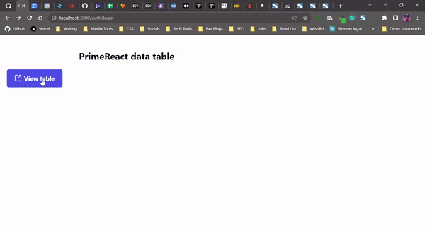
    <div className="table-wrapper">
      <h2 className="table-name">PrimeReact data table</h2>
      <Button
        label="View table"
        icon="pi pi-external-link"
        onClick={openDialog}
      />
      <Dialog
        header="Flex Scroll"
        visible={dialogVisible}
        style={{ width: "75vw" }}
        maximizable
        modal
        contentStyle={{ height: "300px" }}
        onHide={closeDialog}
        footer={dialogFooterTemplate}>
        <DataTable
          value={products}
          responsiveLayout="scroll"
          header={header}
          footer={footer}
          size="small"
          showGridlines
          stripedRows
          dataKey="id">
          <Column field="name" header="Name"></Column>
          <Column field="price" header="Price"></Column>
          <Column field="category" header="Category"></Column>
          <Column field="quantity" header="Quantity"></Column>
        </DataTable>
      </Dialog>
    </div>
Here’s our PrimeReact data table, displayed as a popup modal:
Conclusion
PrimeReact offers a variety of props and options for adjusting the appearance and functioanlity of data tables, enabling you to organize and display large amounts of data clearly and concisely. In this article, we explored how to build a beautiful, customized data table using PrimeReact.
We started by building a basic data table, then we demonstrated how to customize the layout, add a custom header and footer, and customize individual columns. We showed how to add sorting, pagination, and radio and checkbox selection. We also demonstrated how to display the data table as a popup modal. This tutorial illustrated how several PrimeReact components, such as the Button, Rating, and Dialog, work well together and improve the overall usability and design of a data table.
For other data table customization options, check out the PrimeReact documentation. You can find the code in this article in this GitHub repo.
Source: https://blog.logrocket.com
#react #reactjs