Build Bar and Column Charts in Power BI Desktop
This tutorial we will walk you through the step-by-step process of creating these charts, from importing your data to adding interactivity. You'll also learn how to choose the right chart type for your data and how to customize your charts to make them look their best. In this tutorial we will demonstrate how to build bar and column charts in Power BI Desktop.
Data
In this guide, you will work with a fictitious data set of bank loan disbursal across years. The data contains 3,000 observations and 17 variables. You can download the dataset here. The major variables are described below:
Date: Loan disbursal date.Loan_disbursed: Loan amount (in US dollars) disbursed by the bank.Gender: Whether the applicant is female (F) or male (M).Purpose: Purpose for which loan was taken.
Start by loading the data.
Loading Data
Once you open your Power BI Desktop, the following output is displayed.
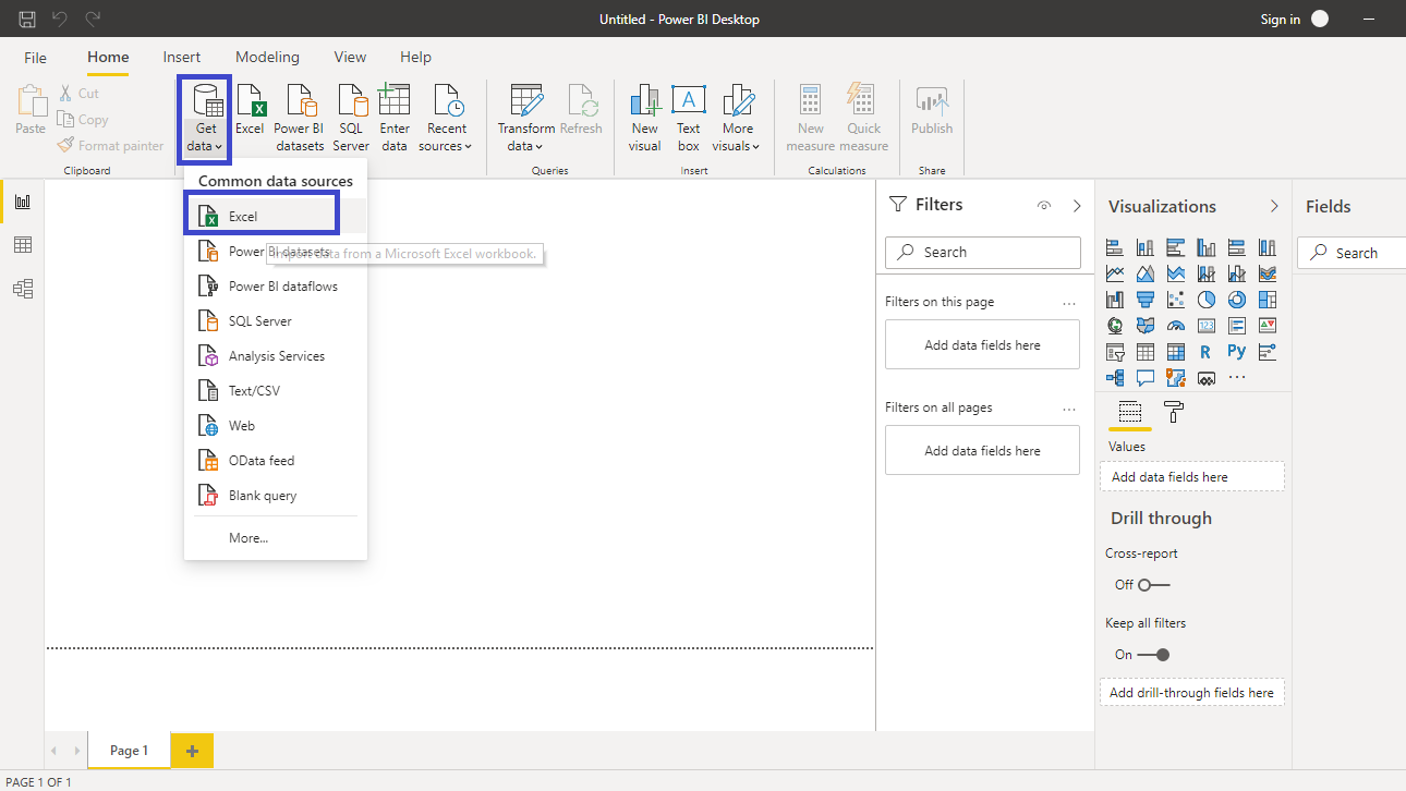
Click on Get data option and select Excel from the options.
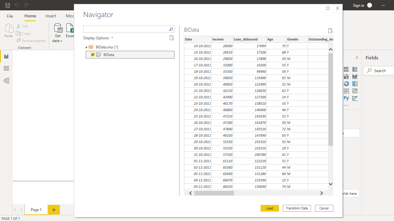
Browse to the location of the file and select it. The name of the file is BIdata.xlsx, and the sheet you will load is BIData sheet. The preview of the data is shown, and once you are satisfied that you are loading the right file, click Load.
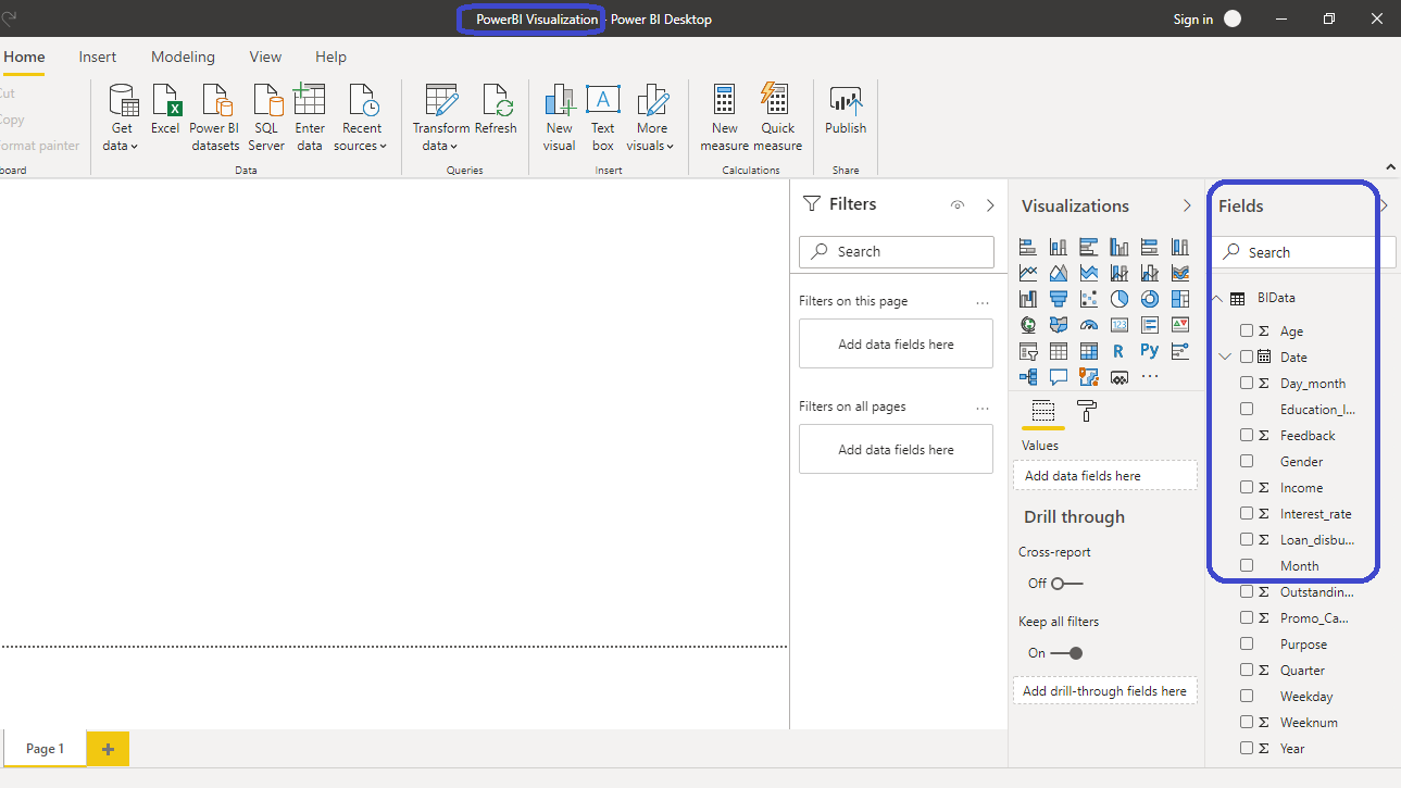
You have loaded the file, and you can save the dashboard. It is named PowerBI Visualization. The Fields pane contains the variables of the data.
Column Chart
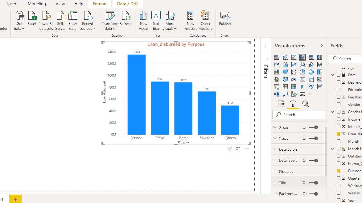
To begin, click on the Clustered column chart located in the Visualizations pane. This creates a chart box in the canvas. Nothing is displayed because haven't yet added the required visualization arguments.
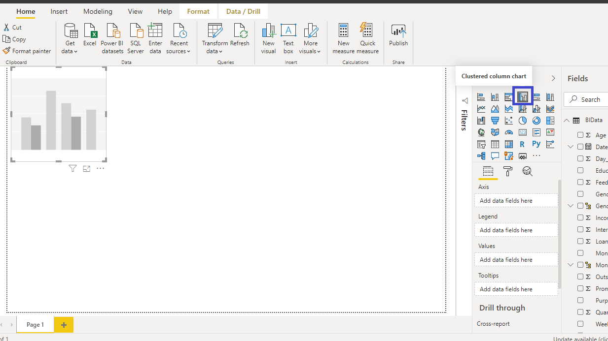
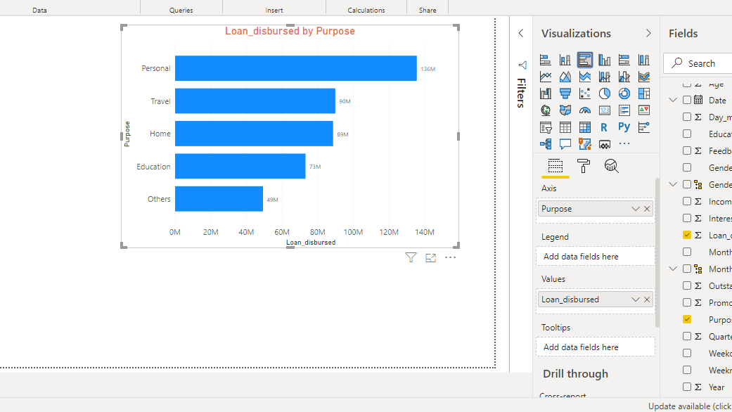
You can resize the chart on the canvas. The next step is to fill the visualization arguments under the Fields option as shown below. Drag the variable Purpose into the Axis field, and Loan_disbursed in the Values field.

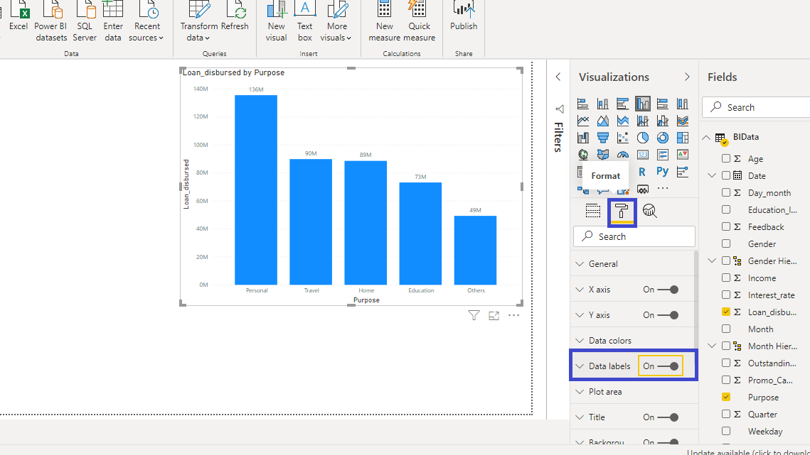
The output above shows the Loan_disbursed by Purpose chart. You can format the chart under the Format tab. For example, if you want to add values to the chart, turn on the Data labels.
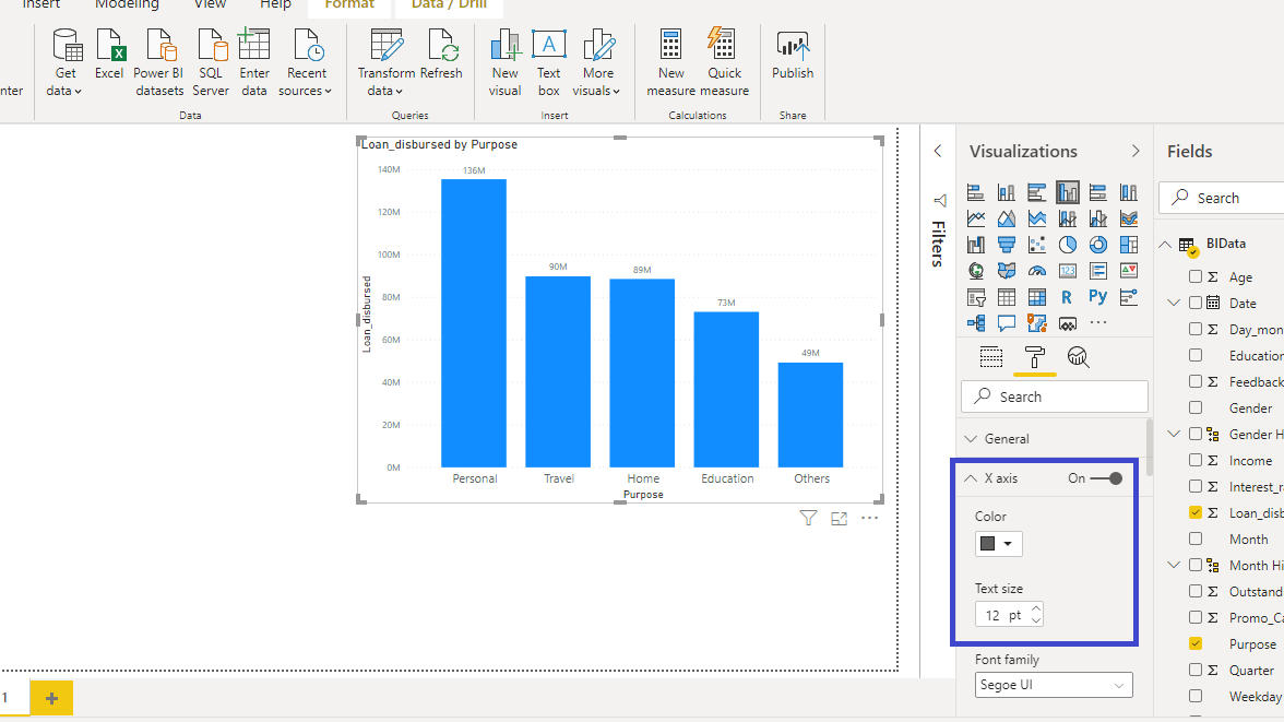
You can also increase the size of the X axis labels. Set the Text size to 12.
You can also adjust the title of the chart. Go to Title, and change the Font color, Alignment, and Text size arguments as shown below or as per your preference.
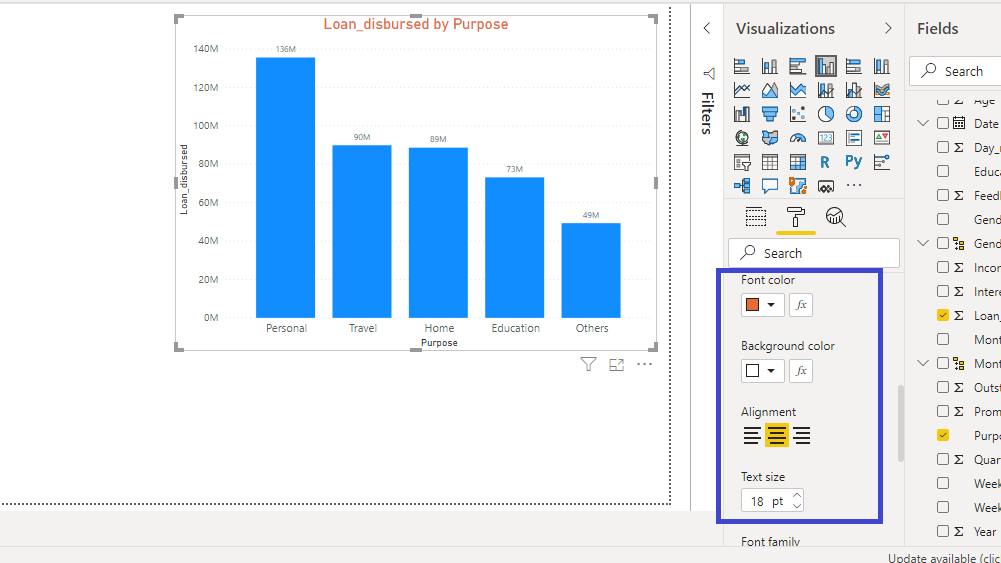
After making these changes, you will have the following column chart.
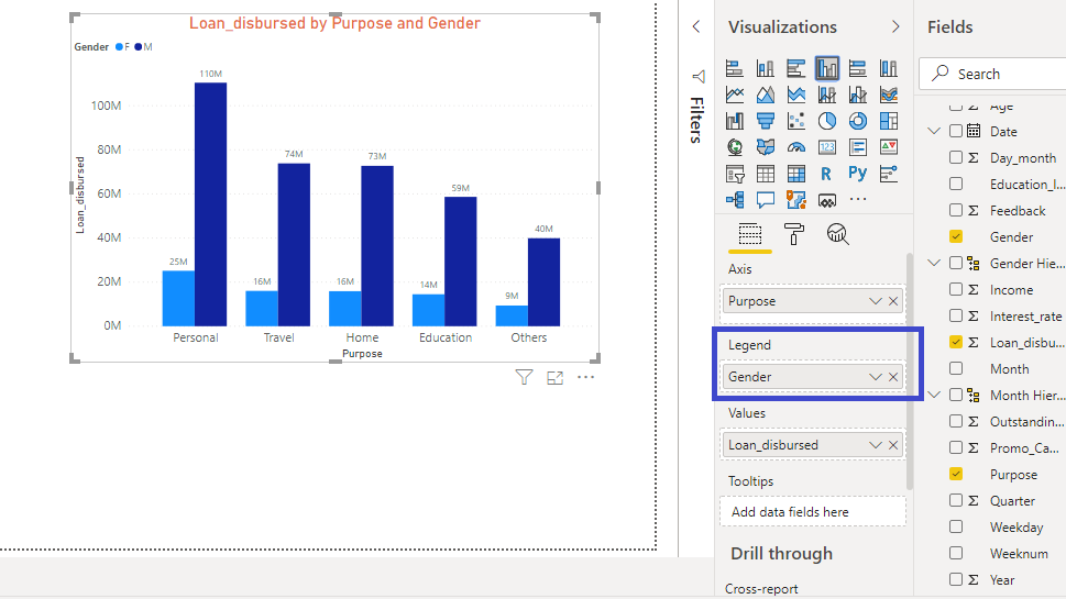
Clustered Column Chart
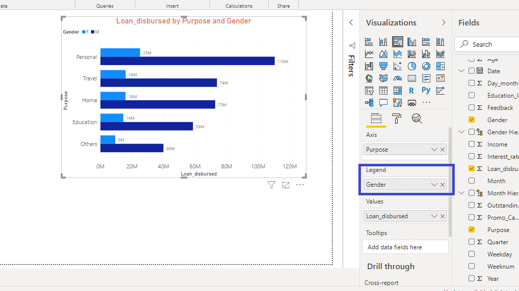
A clustered column charts is a type of column chart in which you compare two values side by side. In this case, you will compare the Loan_disbursed values against two categories, Purpose and Gender.
It is easy to make a clustered column chart by adding Gender in the Legend position of the previous column chart.
Bar Chart
If you have the column chart in the canvas, it is easy to convert it into a bar chart. Below is the Loan_disbursed by Purpose chart you created above.
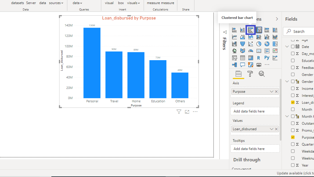
Locate the Clustered bar chart option in the Visualizations pane as shown above, and click on it. This will convert the column chart into a bar chart.
Clustered Bar Chart
To create a clustered bar chart, drag the Gender variable into the Legend option.
Bar and column charts are used regularly in visualization to compare two or more values. In business intelligence, you will be required to build these charts for a variety of areas, such as finance, sales, marketing, production planning, geographical coverage, time series analysis, and many more.
Originally published by Deepika Singh at Pluralsight