Learn CSS Animations In 20 Minutes
In this tutorial, we’re going to walk through the basics of CSS animation. We will also discuss how to create cool custom animations using CSS.
There are 2 ways of creating animations in CSS: Transitions.. And animations.
Transitions wait until a change in a property occurs and then allows those changes to take place over time. Without a transition, any changes in a property would take effect immediately. Transitions should be used when properties are changed interactively so for example, in CSS, a property can change when hovered on and when focused on.
Animations however, provide keyframes for more control over the animation and allows us to create complex animations on a frame by frame basis. Use animations when you want to create complex animations that just work without having to wait for properties that change interactively.
CSS Animation for Beginners
In this post we’re going to walk through the basics of CSS animation.
The Building Blocks of Animations
CSS animations are made up of two basic building blocks.
- Keyframes - define the stages and styles of the animation.
- Animation Properties - assign the @keyframes to a specific CSS element and define how it is animated.
Let’s look at each individually.
Building Block 1: Keyframes
Keyframes are the foundation of CSS animations. They define what the animation looks like at each stage of the animation timeline. Each @keyframes is composed of:
- Name of the animation: A name that describes the animation, for example,
bounceIn. - Stages of the animation: Each stage of the animation is represented as a percentage.
0%represents the beginning state of the animation.100%represents the ending state of the animation. Multiple intermediate states can be added in between. - CSS Properties: The CSS properties defined for each stage of the animation timeline.
Let’s take a look at a simple @keyframes I’ve named “bounceIn”. This @keyframes has three stages. At the first stage (0%), the element is at opacity 0 and scaled down to 10 percent of its default size, using CSS transform scale. At the second stage (60%) the element fades in to full opacity and grows to 120 percent of its default size. At the final stage (100%), it scales down slightly and returns to its default size.
The @keyframes are added to your main CSS file.
@keyframes bounceIn {
  0% {
    transform: scale(0.1);
    opacity: 0;
  }
  60% {
    transform: scale(1.2);
    opacity: 1;
  }
  100% {
    transform: scale(1);
  }
}
(If you’re unfamiliar with CSS Transforms, you’ll want to brush up on your knowledge. Combining CSS transforms in the animations is really where the magic happens.)
Building Block 2: Animation Properties
Once the @keyframes are defined, the animation properties must be added in order for your animation to function.
Animation properties do two things:
- They assign the
@keyframesto the elements that you want to animate. - They define how it is animated.
The animation properties are added to the CSS selectors (or elements) that you want to animate. You must add the following two animation properties for the animation to take effect:
animation-name: The name of the animation, defined in the@keyframes.animation-duration: The duration of the animation, in seconds (e.g., 5s) or milliseconds (e.g., 200ms).
Continuing with the above bounceIn example, we’ll add animation-name and animation-duration to the div that we want to animate.
div {
  animation-duration: 2s;
  animation-name: bounceIn;
}
Shorthand syntax:
div {
  animation: bounceIn 2s;
}
By adding both the @keyframes and the animation properties, we have a simple animation!

Animation Property Shorthand
Each animation property can be defined individually, but for cleaner and faster code, it’s recommended that you use the animation shorthand. All the animation properties are added to the same animation: property in the following order:
animation: [animation-name] [animation-duration] [animation-timing-function]
[animation-delay] [animation-iteration-count] [animation-direction]
[animation-fill-mode] [animation-play-state];
Just remember for the animation to function correctly, you need to follow the proper shorthand order AND specify at least the first two values.
Note About Prefixes
As of late 2014, many Webkit based browsers still use the -webkit-prefixed version of both animations, keyframes, and transitions. Until they adopt the standard version, you’ll want to include both unprefixed and Webkit versions in your code. (For simplicity, I’ll only be using the unprefixed versions in my examples.)
Keyframes and animations with WebKit prefixes:
div {
  -webkit-animation-duration: 2s;
  animation-duration: 2s;
  -webkit-animation-name: bounceIn;
  animation-name: bounceIn;
}
@-webkit-keyframes bounceIn { /* styles */ }
@keyframes bounceIn { /* styles */ }
To make your life easier, consider using Bourbon, a Sass mixin library which contains up-to-date vendor prefixes for all modern browsers. Here’s how simple it is to generate vendor-prefixed animations and keyframes using Bourbon:
div {
  @include animation(bounceIn 2s);
}
@include keyframes(bouncein) { /* styles */}
Additional Animation Properties
In addition to the required animation-name and animation-duration properties, you can further customize and create complex animations using the following properties:
animation-timing-functionanimation-delayanimation-iteration-countanimation-directionanimation-fill-modeanimation-play-state
Let’s look at each of them individually.
Animation-timing-function
The animation-timing-function: defines the speed curve or pace of the animation. You can specify the timing with the following predefined timing options: ease, linear, ease-in, ease-out, ease-in-out, initial, inherit. (Or for more advanced timing options, you can creating custom timing functions using cubic-bezier curve.)

The default value, if no other value is assigned, is ease, which starts out slow, speeds up, then slows down. You can read a description of each timing function here.
CSS syntax:
animation-timing-function: ease-in-out;
Animation shorthand syntax (recommended):
animation: [animation-name] [animation-duration] [animation-timing-function];
animation: bounceIn 2s ease-in-out;
Animation-Delay
The animation-delay: allows you to specify when the animation (or pieces of the animation) will start. A positive value (such as 2s) will start the animation 2 seconds after it is triggered. The element will remain unanimated until that time. A negative value (such as -2s) will start the animation at once, but starts 2 seconds into the animation.
The value is defined in seconds (s) or milliseconds (ms).

CSS syntax:
animation-delay: 5s;
Animation shorthand syntax (recommended):
animation: [animation-name] [animation-duration] [animation-timing-function]
[animation-delay];
animation:  bounceIn 2s ease-in-out 3s;
Animation-iteration-count
The animation-iteration-count: specifies the number of times that the animation will play. The possible values are:
#- a specific number of iterations (default is 1)
infinite - the animation repeats forever
initial - sets the iteration count to the default value
inherit - inherits the value from the parent

CSS syntax:
animation-iteration-count: 2;
Animation shorthand syntax (recommended):
animation: [animation-name] [animation-duration] [animation-timing-function]
[animation-delay] [animation-iteration-count];
animation:  bounceIn 2s ease-in-out 3s 2;
Animation-direction
The animation-direction: property specifies whether the animation should play forward, reverse, or in alternate cycles.
The possible values are:
normal (default) - The animation plays forward. On each cycle the animation resets to the beginning state (0%) and plays forward again (to 100%).
reverse - The animation plays backwards. On each cycle the animation resets to the end state (100%) and plays backwards (to 0%).
alternate - The animation reverses direction every cycle. On each odd cycle, the animation plays forward (0% to 100%). On each even cycle, the animation plays backwards (100% to 0%).
alternate-reverse - The animation reverses direction every cycle. On each odd cycle, the animation plays in reverse (100% to 0%). On each even cycle, the animation plays forward (0% or 100%).

CSS syntax:
animation-direction: alternate;
Animation shorthand syntax (recommended):
animation: [animation-name] [animation-duration] [animation-timing-function]
[animation-delay] [animation-iteration-count] [animation-direction];
animation:  bounceIn 2s ease-in-out 3s 3 alternate;
Animation-fill-mode
The animation-fill-mode: specifies if the animation styles are visible before or after the animation plays. This property is a little confusing, but once understood it is very useful.
By default, the animation will not effect the styles of the element before the animation begins (if there is an animation-delay) or after the animation is finished. The animation-fill-mode property can override this behavior with the following possible values:
backwards - Before the animation (during the animation delay), the styles of the initial keyframe (0%) are applied to the element.
forwards - After the animation is finished, the styles defined in the final keyframe (100%) are retained by the element.
both - The animation will follow the rules for both forwards and backwards, extending the animation properties before and after the animation.
normal (default) - The animation does not apply any styles to the element, before or after the animation.

CSS syntax:
animation-fill-mode: forwards;
Animation shorthand syntax (recommended):
animation: [animation-name] [animation-duration] [animation-timing-function]
[animation-delay] [animation-iteration-count] [animation-direction]
[animation-fill-mode];
animation:  bounceIn 2s ease-in-out 3s 3 forwards;
Animation-play-state
The animation-play-state: specifies whether the animation is playing or paused. Resuming a paused animation starts the animation where it was left off.
The possible values are:
playing - The animation is currently running
paused - The animation is currently paused

Example :
.div:hover {
  animation-play-state: paused;
}
Multiple Animations
To add multiple animations to a selector, you simply separate the values with a comma. Here’s an example:
.div {
  animation: slideIn 2s, rotate 1.75s;
}
How to Create Custom CSS Animations with Examples
Animations are a crucial component of modern web design. They enable you to create dynamic and engaging web elements that attract more customers and drive more sales.
In this article, we will discuss how to create cool custom animations using CSS.
How to Create Your First CSS Animation
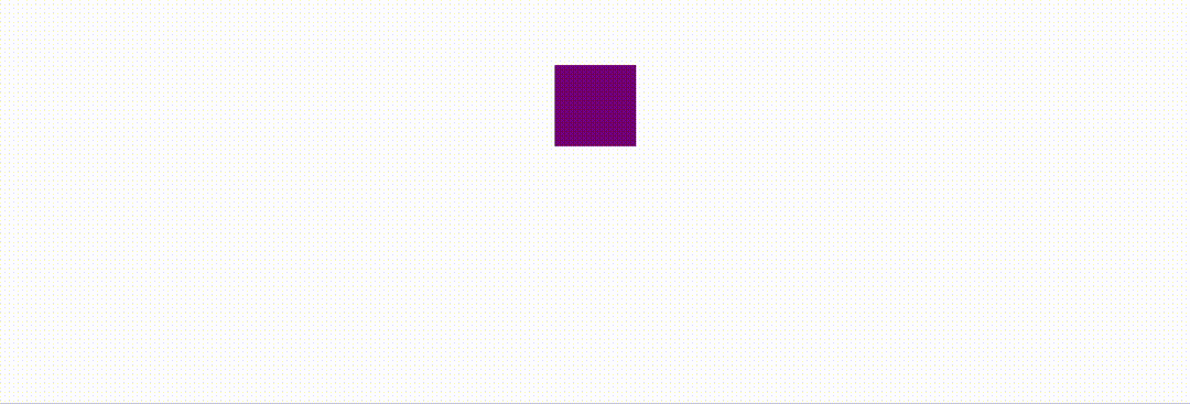
Let's start by preparing an HTML element.
<body>
  <div class="square"></div>
</body>
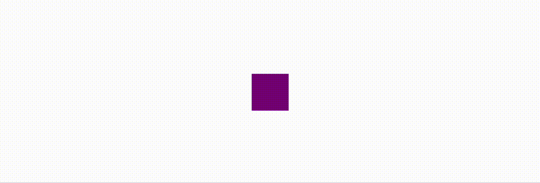
.square {
  width: 100px;
  height: 100px;
  background-color: purple;

  /* Center the element */
  position: absolute;
  top: 50%;
  left: 50%;
  transform: translate(-50%, -50%);
}
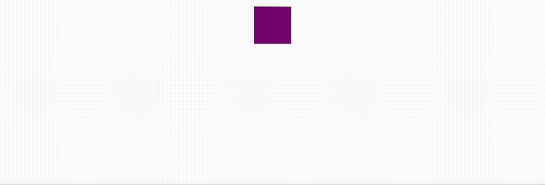
Lines 7 to 10 demonstrate a commonly used method to center an element using CSS. Here's the result of the above code:

Centered square
Before we start crafting the animation, you must first think about what kind of effect you wish to achieve.
For example, for this tutorial, I want to create a bouncing effect for the square. This means I need to create an animation based on the top property so that the square can move up and down.
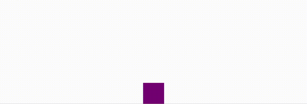
@keyframes bounce {
  0% {
    top: 90%;
  }
  100% {
    top: 10%;
  }
}
To define an animation, you need to use the @keyframes rule, which allows you to define keyframes in the animation process.
The keyframes are set with percentage values, starting from 0% and finishing with 100%. For instance, in our example, the animation will start from top: 90%;, and end with top: 10%;, and after that, it will reset back to 50%.
And, of course, you need to tie the bounce animation with the square (animation-name) and also tell the browser how long you want this animation to last (animation-duration). Here's how you do that:
.square {
  . . .
  animation-name: bounce;
  animation-duration: 2s;
}
A square moving up
How to Add Multiple Keyframes
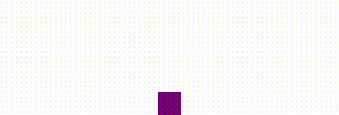
But as you can see, the square starts from the bottom, moves to the top, and then resets back to the center. That is not exactly a bouncing effect. So, how can we make the square move back down?
To do that, you can set up a third keyframe like this:
@keyframes bounce {
  0% {
    top: 90%;
  }
  50% {
    top: 10%;
  }
  100% {
    top: 90%;
  }
}
This way, the square will start from the bottom (top: 90%;), move to the top (top: 10%;), and then move back down (top: 90%;).
The square moving up and then back down
How to Create a Repeat Animation
There is one problem that still needs to be solved. The animation only plays once. In practice, you might want your animation to repeat several times to create the effect that the square is actually bouncing.
Instead of creating more keyframes, which is not easy, you can define an animation-iteration-count property and specify the number of times you want the animation to repeat.
.square {
  . . .
  animation-name: bounce;
  animation-duration: 2s;
  animation-iteration-count: 5;
}
The square moving up and down for five times
And if you want the animation to last indefinitely, simply specify infinite.
.square {
  . . .
  animation-name: bounce;
  animation-duration: 2s;
  animation-iteration-count: infinite;
}
How to Use a Timing Function for Smoother Animation
Finally, the bouncing effect started working, but there is still room for improvement. The movement of the square seems a bit unnatural. The bouncing effect would look better if you could smooth out the movement.
This can be achieved with a timing function. By default, the browser will assume a linear timing function, which means the animation will have constant speed from start to end. But you can change that using the animation-timing-function property, like this:
.square {
  . . .
  animation-name: bounce;
  animation-duration: 2s;
  animation-iteration-count: infinite;
  animation-timing-function: ease-in-out;
}
By specifying ease-in-out, you are telling the browser to start the animation slowly and also end it gradually. As a result, the entire animation will look a lot smoother.
ease-in-out making the square move smoothly
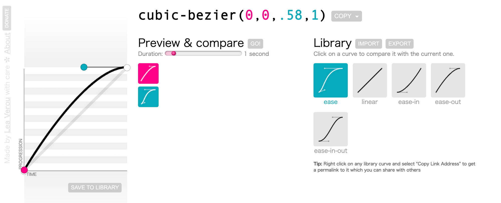
The Cubic Bezier curve
The value ease-in-out actually represents a mathematical equation called Cubic Bezier. I will spare you the complex mathematical definitions, and you only need to know that the function defines a curve with four control points.
cubic-bezier.com is an online tool that allows you to customize the curve by simply dragging the control points.
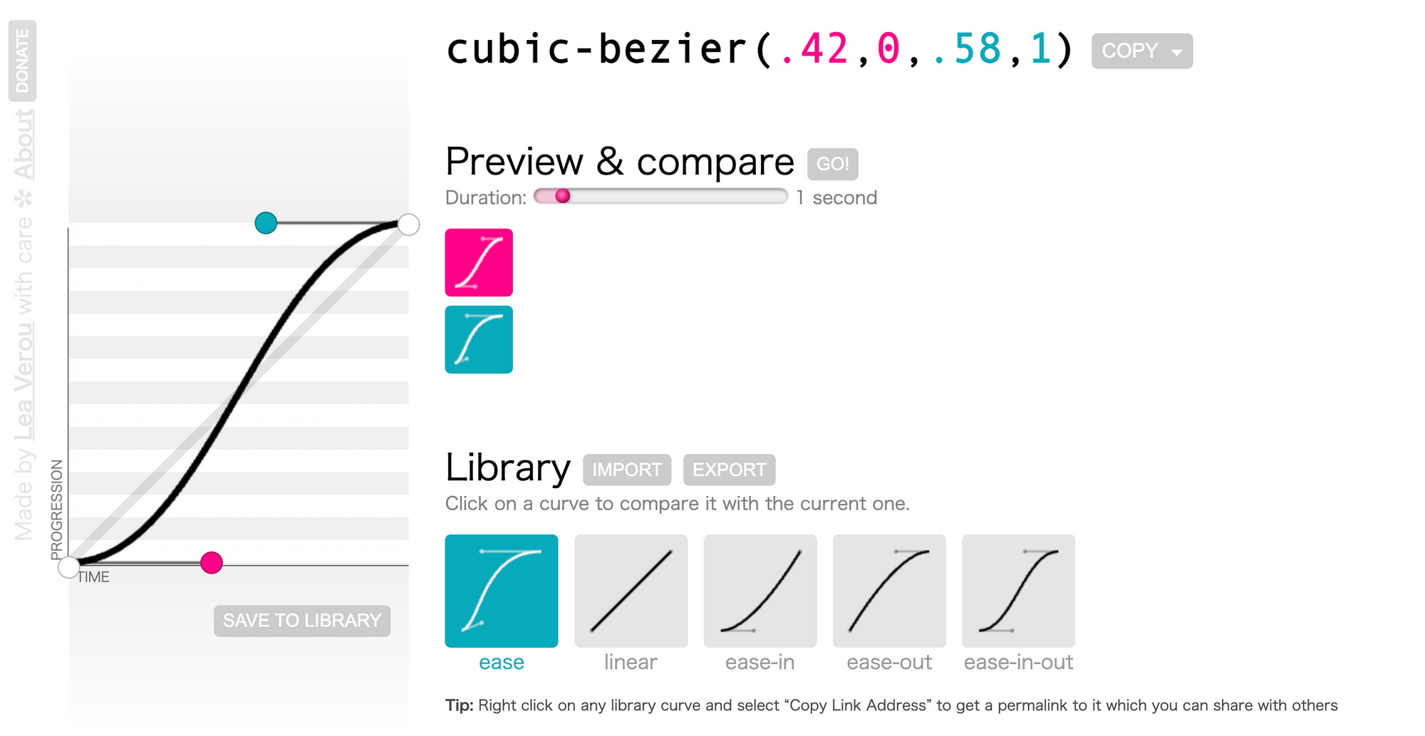
A Cubic Bezier curve
The points control the shape of the curve, and the slope of the curve then controls the speed of the animation. For example, the above graph indicates the animation will start slowly, accelerate, and then end smoothly.
.square {
  . . .
  animation-name: bounce;
  animation-duration: 2s;
  animation-iteration-count: infinite;
  animation-timing-function: cubic-bezier(0.17, 0.67, 0.8, 0.36);
}
In most cases, you don't have to define a customized Cubic Bezier curve. There are several predefined curves that should be enough for most use cases.
ease represents the curve cubic-bezier(0.25, 0.1, 0.25, 1). The animation will start by slowly accelerating and then decelerate to stop.
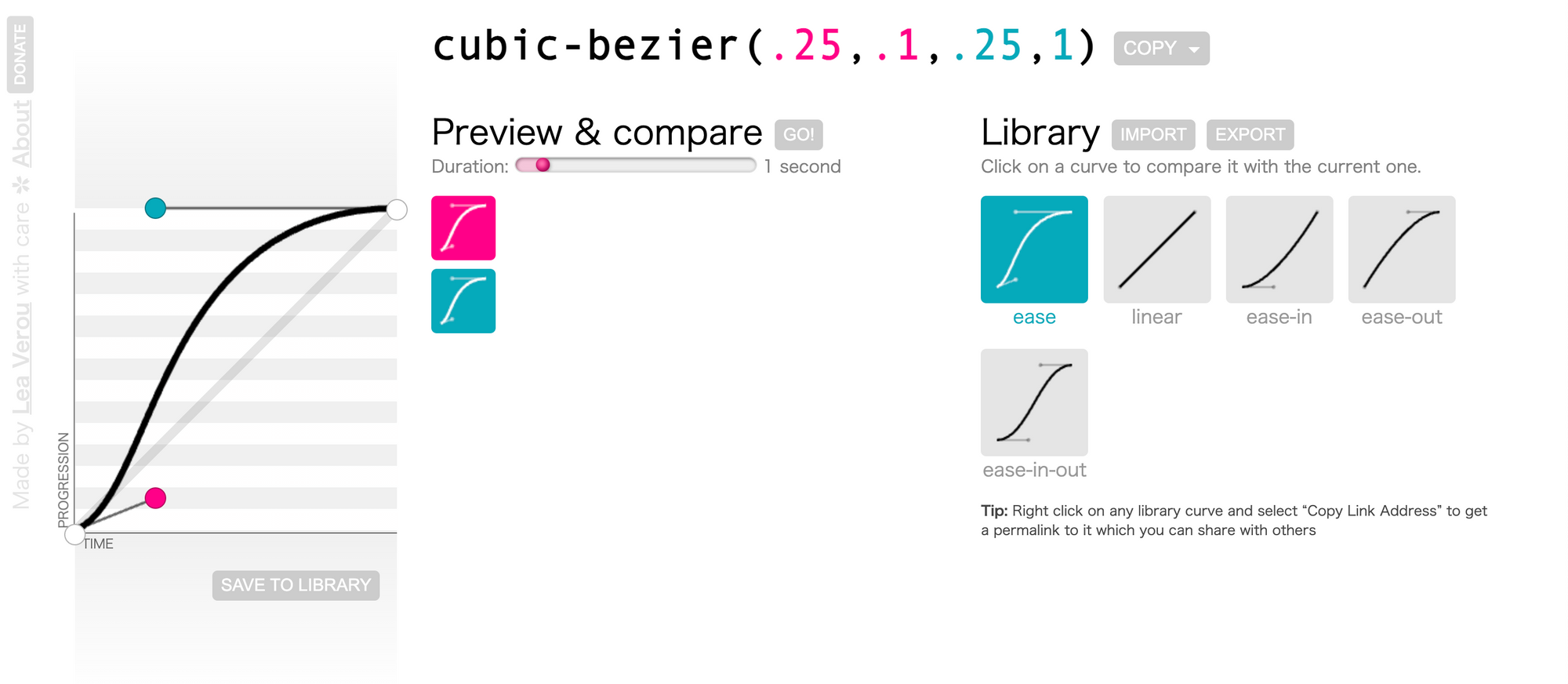
Cubic Bezier curve for ease
ease-in represents the curve cubic-bezier(0.42, 0, 1, 1). The animation will start smoothly and then stop rather abruptly.
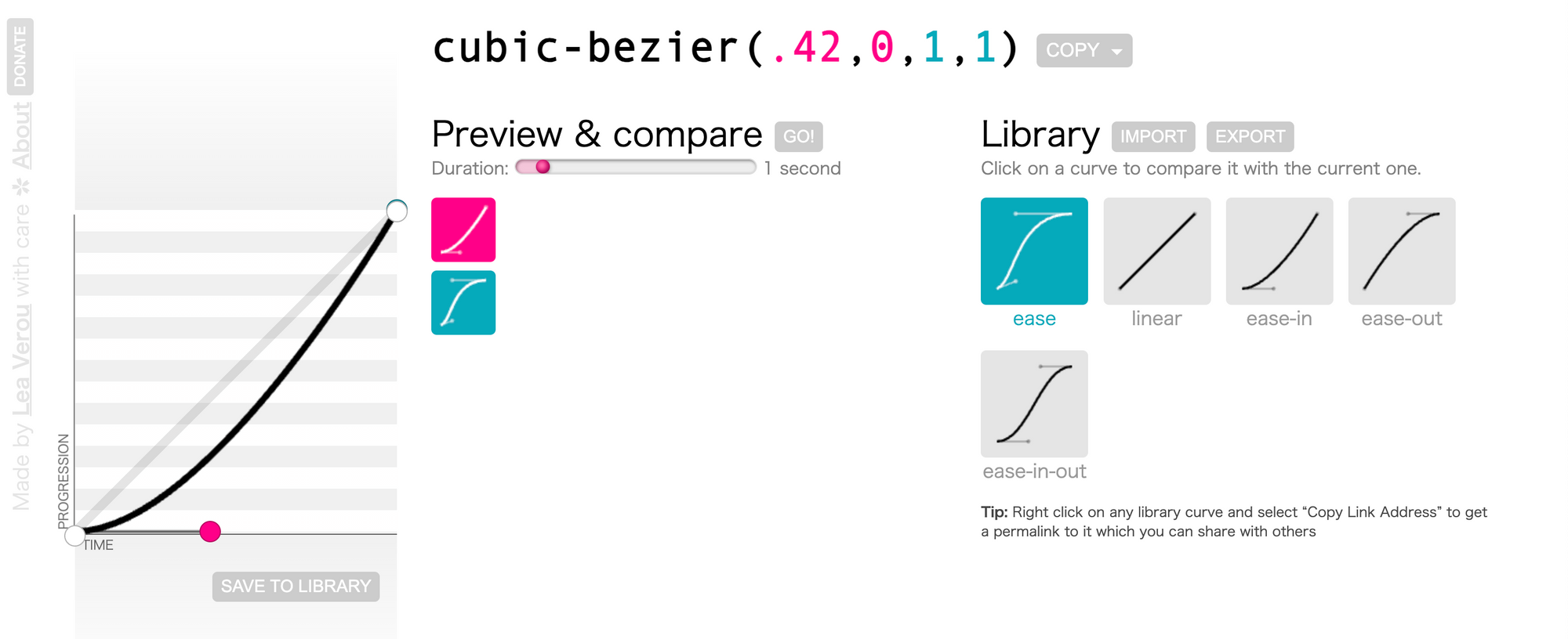
Cubic Bezier curve for ease-in
ease-out represents the curve cubic-bezier(0, 0, 0.58, 1). The animation will start abruptly and then slow down to stop smoothly.
Cubic Bezier curve for ease-out
ease-in-out represents the curve cubic-bezier(0.42, 0, 0.58, 1). The animation will be smooth on both ends.

Cubic Bezier curve for ease-in-out
The steps() function
Besides the smooth curve, you can also specify a stepping function. The function steps() takes two arguments. The first one specifies the number of steps, and the second one sets the point at which the change occurs within the step, either start or end.
.square {
  . . .
  animation-name: bounce;
  animation-duration: 2s;
  animation-iteration-count: infinite;
  animation-timing-function: steps(5, start);
}
In this case, the animation will be divided into five steps, and for each step, the change will happen at the beginning of the step.
A demo for the steps function
There are also two shortcuts available for the steps() function. step-start corresponds to steps(1, start), and step-end corresponds to steps(1, end).
How to Combine Multiple Animations
So far, we've covered all the fundamentals you should understand to create CSS animations. And now, it is time to get more creative.
Our previous examples all focused on changing the top property in order to create the bounce effect. You can, in fact, combine multiple properties in one animation. For example, you can create a pulse effect by changing the element's shape and opacity together.
@keyframes pulse {
  0% {
    transform: translate(-50%, -50%) scale(1);
    opacity: 1;
  }
  50% {
    transform: translate(-50%, -50%) scale(1.2);
    opacity: 0.7;
  }
  100% {
    transform: translate(-50%, -50%) scale(1);
    opacity: 1;
  }
}
.ball {
  width: 100px;
  height: 100px;
  background-color: purple;
  border-radius: 50%;

  position: absolute;
  top: 50%;
  left: 50%;
  transform: translate(-50%, -50%);

  animation: pulse 2s ease-in-out infinite;
}
Also note that the animation properties can be combined into a shortcut, animation.
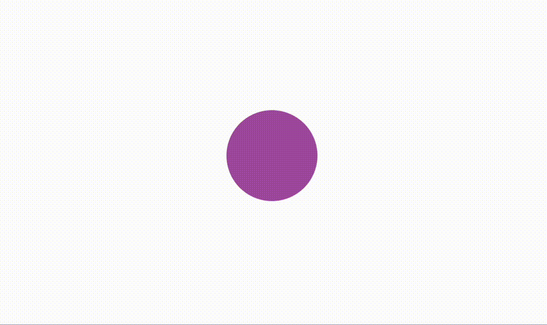
The pulse effect animation
Other Animation-Related Properties
Besides the animation properties we have discussed so far, there are some miscellaneous properties we should talk about. They can also be useful sometimes.
First of all, there is the animation-direction property, which defines how the animation will be played. The property accepts four different values:
normal: The animation is played forward.reverse: The animation is played backward.alternate: The animation is played forward first, then backward. It only works whenanimation-iteration-countis more than 1.alternate-reverse: The animation is played backward first, then forward.
By default, the animation will start playing immediately after the page is loaded. But you can change that with the animation-delay property, which specifies how long you wish to wait before the animation starts.
Lastly, the animation-fill-mode property determines how the element will be displayed before and after the animation is played. By default, the element will not retain any styles from the animation. After the animation stops, the element will reset to normal.
When animation-fill-mode is set to forwards, the element will retain the styles from the last keyframe of the animation after the animation is played.
When set to backwards, the element will take on the styles from the first keyframe of the animation as soon as the animation is played.
When set to both, the element will retain the styles from the first keyframe before the animation starts (behaves like backwards), and it will also retain the styles from the last keyframe after the animation is finished (like forwards).
Conclusion
This tutorial covered everything you need to know to start creating CSS animations using the @keyframes rule.
@keyframes pulse {
  0% {
    transform: translate(-50%, -50%) scale(1);
    opacity: 1;
  }
  50% {
    transform: translate(-50%, -50%) scale(1.2);
    opacity: 0.7;
  }
  100% {
    transform: translate(-50%, -50%) scale(1);
    opacity: 1;
  }
}
We also went over several animation-related CSS properties:
animation-duration: Defines how long the animation will last.animation-iteration-count: Defines how many times the animation will repeat.animation-timing-function: Specifies the timing function, which controls the speed at which the animation is played.animation-direction: The direction in which the animation is played.animation-delay: The delay before the animation begins.animation-fill-mode: Whether or not to retain styles from the animation after it is finished.
#css