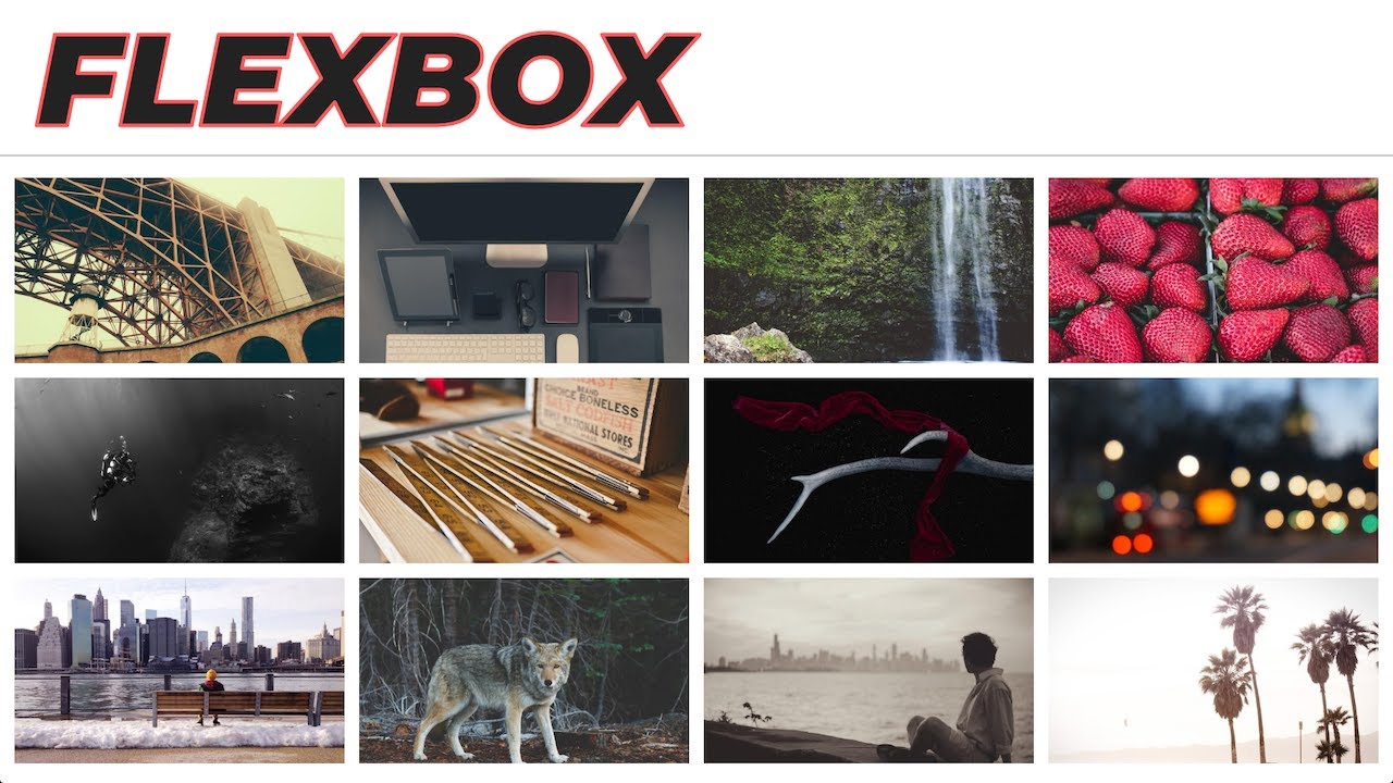
In Today’s video we create a responsive HTML and CSS gallery using CSS Flex / Flexbox. Flex has great website browser support and is more standard than CSS Grid. We use CSS Flex to create a responsive HTML image gallery that breaks down at specific media query breakpoints.
#html #css
12.40 GEEK