A Machine Learning Project Walk-Through in Python
Learn how to build a machine learning project in Python from start to finish, with this comprehensive walk-through. Discover the essential steps involved, from data preparation to model evaluation, with code examples and clear explanations.
In this article and the sequel, we’ll walk through a complete machine learning project on a “Data Science for Good” problem: predicting household poverty in Costa Rica. Not only do we get to improve our data science skills in the most effective manner — through practice on real-world data — but we also get the reward of working on a problem with social benefits.
A “Data Science for Good“ Machine Learning Project Walk-Through in Python: Part One: Solving a complete machine learning problem for societal benefit
Data science is an immensely powerful tool in our data-driven world. Call me idealistic, but I believe this tool should be used for more than getting people to click on ads or spend more time consumed by social media.
It turns out the same skills used by companies to maximize ad views can also be used to help relieve human suffering.
The full code is available as a Jupyter Notebook both on Kaggle (where it can be run in the browser with no downloads required) and on GitHub. This is an active Kaggle competition and a great project to get started with machine learning or to work on some new skills.
Problem and Approach
The Costa Rican Household Poverty Level Prediction challenge is a data science for good machine learning competition currently running on Kaggle. The objective is to use individual and household socio-economic indicators to predict poverty on a household basis. IDB, the Inter-American Development Bank, developed the problem and provided the data with the goal of improving upon traditional methods for identifying families at need of aid.

The Costa Rican Poverty Prediction contest is currently running on Kaggle.
The poverty labels fall into four levels making this a supervised multi-class classification problem:
- Supervised: given the labels for the training data
- Multi-Class Classification: labels are discrete with more than 2 values
The general approach to a machine learning problem is:
- Understand the problem and data descriptions
- Data cleaning / exploratory data analysis
- Feature engineering / feature selection
- Model comparison
- Model optimization
- Interpretation of results
While these steps may seem to present a rigid structure, the machine learning process is non-linear, with parts repeated multiple times as we get more familiar with the data and see what works. It’s nice to have an outline to provide a general guide, but we’ll often return to earlier parts of the process if things aren’t working out or as we learn more about the problem.
We’ll go through the first four steps at a high-level in this article, taking a look at some examples, with the full details available in the notebooks. This problem is a great one to tackle both for beginners — because the dataset is manageable in size — and for those who already have a firm footing because Kaggle offers an ideal environment for experimenting with new techniques.
Understanding the Problem and Data
In an ideal situation, we’d all be experts in the problem subject with years of experience to inform our machine learning. In reality, we often work with data from a new field and have to rapidly acquire knowledge both of what the data represents and how it was collected.
Fortunately, on Kaggle, we can use the work shared by other data scientists to get up to speed relatively quickly. Moreover, Kaggle provides a discussion platform where you can ask questions of the competition organizers. While not exactly the same as interacting with customers at a real job, this gives us an opportunity to figure out what the data fields represent and any considerations we should keep in mind as we get into the problem.
Some good questions to ask at this point are:
- Supervised: given the labels for the training data
- Multi-Class Classification: labels are discrete with more than 2 values
For example, after engaging in discussions with the organizers, the community found out the text string “yes” actually maps to the value 1.0 and that the maximum value in one of the columns should be 5 which can be used to correct outliers. We would have been hard-pressed to find out this information without someone who knows the data collection process!
Part of data understanding also means digging into the data definitions. The most effective way is literally to go through the columns one at a time, reading the description and making sure you know what the data represents. I find this a little dull, so I like to mix this process with data exploration, reading the column description and then exploring the column with stats and figures.
For example, we can read that meaneduc is the average amount of education in the family, and then we can plot it distributed by the value of the label to see if it has any noticeable differences between the poverty level .
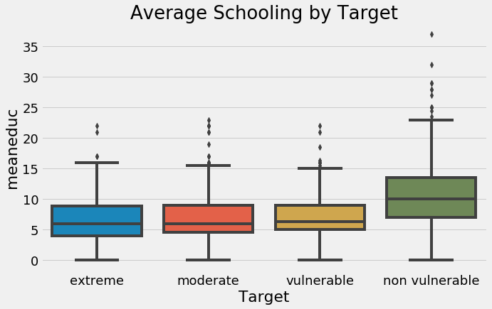
Average schooling in family by target (poverty level).
This shows that families the least at risk for poverty — non-vulnerable — tend to have higher average education levels than those most at risk. Later in feature engineering, we can use this information by building features from the education since it seems to show a different between the target labels.
There are a total of 143 columns (features), and while for a real application, you want to go through each with an expert, I didn’t exhaustively explore all of these in the notebook. Instead, I read the data definitions and looked at the work of other data scientists to understand most of the columns.
Another point to establish from the problem and data understanding stage is how we want to structure our training data. In this problem, we’re given a single table of data where each row represents an individual and the columns are the features. If we read the problem definition, we are told to make predictions for each household which means that our final training dataframe (and also testing) should have one row for each house. This point informs our entire pipeline, so it’s crucial to grasp at the outset.
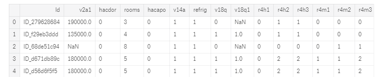
A snapshot of the data where each row is one individual.
Determine the Metric
Finally, we want to make sure we understanding the labels and the metric for the problem. The label is what we want to predict, and the metric is how we’ll evaluate those predictions. For this problem, the label is an integer, from 1 to 4, representing the poverty level of a household. The metric is the Macro F1 Score, a measure between 0 and 1 with a higher value indicating a better model.** **The F1 score is a common metric for binary classification tasks and “Macro” is one of the averaging options for multi-class problems.
Once you know the metric, figure out how to calculate it with whatever tool you are using. For Scikit-Learn and the Macro F1 score, the code is:
from sklearn.metrics import f1_score
# Code to compute metric on predictions
score = f1_score(y_true, y_prediction, average = 'macro')
Knowing the metric allows us to assess our predictions in cross validation and using a hold-out testing set, so we know what effect, if any, our choices have on performance. For this competition, we are given the metric to use, but in a real-world situation, we’d have to choose an appropriate measure ourselves.
Data Exploration and Data Cleaning
Data exploration, also called Exploratory Data Analysis (EDA), is an open-ended process where we figure out what our data can tell us. We start broad and gradually hone in our analysis as we discover interesting trends / patterns that can be used for feature engineering or find anomalies. Data cleaning goes hand in hand with exploration because we need to address missing values or anomalies as we find them before we can do modeling.
For an easy first step of data exploration, we can visualize the distribution of the labels for the training data (we are not given the testing labels).
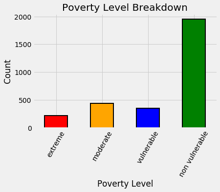
Distribution of training labels.
Right away this tells us we have an imbalanced classification problem, which can make it difficult for machine learning models to learn the underrepresented classes. Many algorithms have ways to try and deal with this, such as setting class_weight = "balanced" in the Scikit-Learn random forest classifier although they don’t work perfectly. We also want to make sure to use stratified sampling with cross validation when we have an imbalanced classification problem to get the same balance of labels in each fold.
To get familiar with the data, it’s helpful to go through the different column data types which represent different statistical types of data:
- Supervised: given the labels for the training data
- Multi-Class Classification: labels are discrete with more than 2 values
I’m using *statistical type *to mean what the data represents — for example a Boolean that can only be 1 or 0 — and *data type *to mean the actual way the values are stored in Python such as integers or floats. The statistical type informs how we handle the columns for feature engineering.
(I specified *usually *for each data type / statistical type pairing because you may find that statistical types are saved as the wrong data type.)
If we look at the integer columns for this problem, we can see that most of them represent Booleans because there are only two possible values:
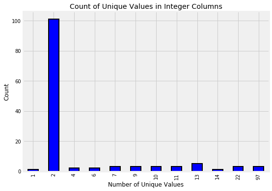
Integer columns in data.
Going through the object columns, we are presented with a puzzle: 2 of the columns are Id variables (stored as strings), but 3 look to be numeric values.
# Train is pandas dataframe of training data
train.select_dtypes('object').head()
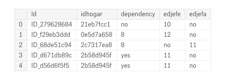
Object columns in original data.
This is where our earlier data understanding comes into play. For these three columns, some entries are “yes” and some are “no” while the rest are floats. We did our background research and thus know that a “yes” means 1 and a “no” means 0. Using this information, we can correct the values and then visualize the variable distributions colored by the label.
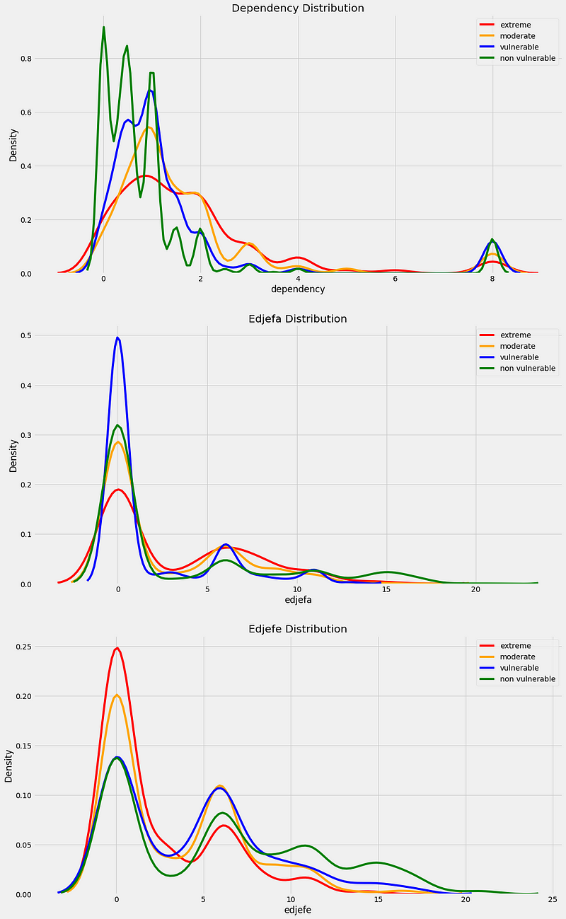
Distribution of corrected variables by the target label.
This is a great example of data exploration and cleaning going hand in hand. We find something incorrect with the data, fix it, and then explore the data to make sure our correction was appropriate.
Missing Values
A critical data cleaning operation for this data is handling missing values. To calculate the total and percent of missing values is simple in Pandas:
import pandas as pd
# Number of missing in each column
missing = pd.DataFrame(data.isnull().sum()).rename(columns = {0: 'total'})
# Create a percentage missing
missing['percent'] = missing['total'] / len(data)
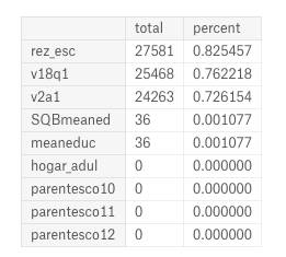
Missing values in data.
In some cases there are reasons for missing values: the v2a1 column represents monthly rent and many of the missing values are because the household owns the home. To figure this out, we can subset the data to houses missing the rent payment and then plot the tipo_ variables (I’m not sure where these column names come from) which show home ownership.
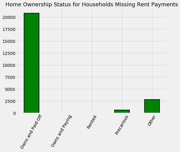
Home ownership status for those households with no rent payments.
Based on the plot, the solution is to fill in the missing rent payments for households that own their house with 0 and leave the others to be imputed. We also add a boolean column that indicates if the rent payment was missing.
The other missing values in the columns are dealt with the same way: using knowledge from other columns or about the problem to fill in the values, or leaving them to be imputed. Adding a boolean column to indicate missing values can also be useful because sometimes the *information that a value was missing *is important. Another crucial point to note is that for missing values, we often want to think about using information in other columns to fill in missing values such as we did with the rent payment.
Once we’ve handled the missing values, anomalies, and incorrect data types, we can move on to feature engineering. I usually view data exploration as an ongoing process rather than one set chunk. For example, as we get into feature engineering, we might want to explore the new variables we create.
It turns out the same skills used by companies to maximize ad views can also be used to help relieve human suffering.### Feature Engineering
If you follow my work, you’ll know I’m convinced automated feature engineering — with domain expertise — will take the place of traditional manual feature engineering. For this problem, I took both approaches, doing mostly manual work in the main notebook, and then writing another notebook with automated feature engineering. Not surprisingly, the automated feature engineering took one tenth the time and achieved better performance! Here I’ll show the manual version, but keep in mind that automated feature engineering (with Featuretools) is a great tool to learn.
In this problem, our primary objective for feature engineering is to aggregate all the individual level data at the household level. That means grouping together the individuals from one house and then calculating statistics such as the maximum age, the average level of education, or the total number of cellphones owned by the family.
Fortunately, once we have separated out the individual data (into the ind dataframe), doing these aggregations is literally one line in Pandas (with idhogar the household identifier used for grouping):
# Aggregate individual data for each household
ind_agg = ind.groupby('idhogar').agg(['min', 'max', 'mean', 'sum'])
After renaming the columns, we have a lot of features that look like:
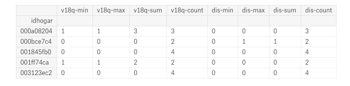
Features produced by aggregation of individual data.
The benefit of this method is that it quickly creates many features. One of the drawbacks is that many of these features might not be useful or are highly correlated (called collinear) which is why we need to use feature selection.
An alternative method to aggregations is to calculate features one at a time using domain knowledge based on what features might be useful for predicting poverty. For example, in the household data, we create a feature called warning which adds up a number of household “warning signs” ( house is a dataframe of the household variables):
# No toilet, no electricity, no floor, no water service, no ceiling
house['warning'] = 1 * (house['sanitario1'] +
                         (house['elec'] == 0) +
                         house['pisonotiene'] +
                         house['abastaguano'] +
                         (house['cielorazo'] == 0))
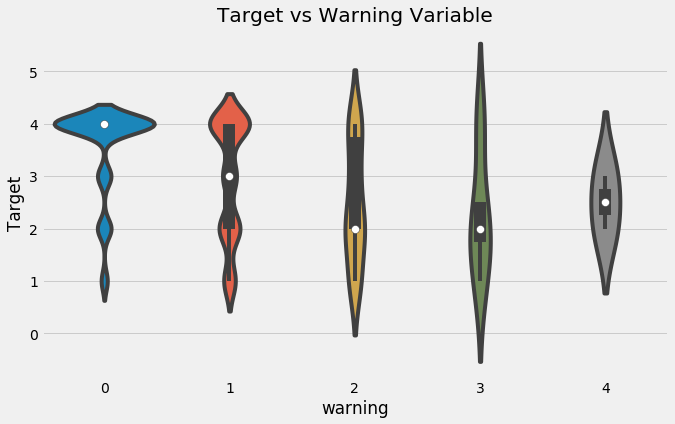
Violinplot of Target by Warning Value.
We can also calculate “per capita” features by dividing one value by another ( tamviv is the number of household members):
# Per capita features for household data
house['phones-per-capita'] = house['qmobilephone'] / house['tamviv']
house['tablets-per-capita'] = house['v18q1'] / house['tamviv']
house['rooms-per-capita'] = house['rooms'] / house['tamviv']
house['rent-per-capita'] = house['v2a1'] / house['tamviv']
When it comes to manual vs automated feature engineering, I think the optimal answer is a blend of both. As humans, we are limited in the features we build both by creativity — there are only so many features we can think to make — and time — there is only so much time for us to write the code. We can make a few informed features like those above by hand, but where automated feature engineering excels is when doing aggregations that can automatically build on top of other features.
It turns out the same skills used by companies to maximize ad views can also be used to help relieve human suffering.
(Featuretools is the most advanced open-source Python library for automated feature engineering. Here’s an article to get you started in about 10 minutes.)
Feature Selection
Once we have exhausted our time or patience making features, we apply feature selection to remove some features, trying to keep only those that are useful for the problem. “Useful” has no set definition, but there are some heuristics (rules of thumb) that we use to select features.
One method is by determining correlations between features. Two variables that are highly correlated with one another are called collinear. These are a problem in machine learning because they slow down training, create less interpretable models, and can decrease model performance by causing overfitting on the training data.
The tricky part about removing correlated features is determining the threshold of correlation for saying that two variables are too correlated. I generally try to stay conservative, using a correlation coefficient in the 0.95 or above range. Once we decide on a threshold, we use the below code to remove one out of every pair of variables with a correlation above this value:
import numpy as np
threshold = 0.95
# Create correlation matrix
corr_matrix = data.corr()
# Select upper triangle of correlation matrix
upper = corr_matrix.where(np.triu(np.ones(corr_matrix.shape), k=1).astype(np.bool))
# Find index of feature columns with correlation greater than 0.95
to_drop = [column for column in upper.columns if any(abs(upper[column]) > threshold)]
data = data.drop(columns = to_drop)
We are only removing features that are correlated with one another. We want features that are correlated with the target(although a correlation of greater than 0.95 with the label would be too good to be true)!
There are many methods for feature selection (we’ll see another one in the experimental section near the end of the article). These can be univariate — measuring one variable at a time against the target — or multivariate — assessing the effects of multiple features. I also tend to use model-based feature importances for feature selection, such as those from a random forest.
After feature selection, we can do some exploration of our final set of variables, including making a correlation heatmap and a pairsplot.
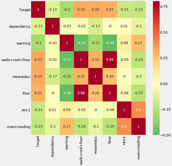
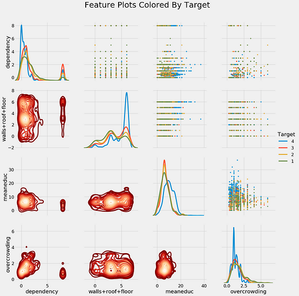
Correlation heatmap (left) and pairsplot colored by the value of the label (right).
One point we get from the exploration is the relationship between education and poverty: as the education of a household increases (both the average and the maximum), the severity of poverty tends to decreases (1 is most severe):
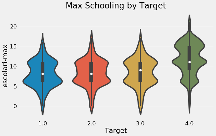
Max schooling of the house by target value.
On the other hand, as the level of overcrowding — the number of people per room — increases, the severity of the poverty increases:
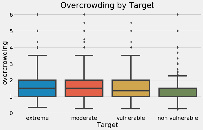
Household overcrowding by value of the target.
These are two actionable insights from this competition, even before we get to the machine learning: households with greater levels of education tend to have less severe poverty, and households with more people per room tend to have greater levels of poverty. I like to think about the ramifications and larger picture of a data science project in addition to the technical aspects. It can be easy to get overwhelmed with the details and then forget the overall reason you’re working on this problem.
It turns out the same skills used by companies to maximize ad views can also be used to help relieve human suffering.### Model Comparison
The following graph is one of my favorite results in machine learning: it displays the performance of machine learning models on many datasets, with the percentages showing how many times a particular method beat any others. (This is from a highly readable paper by Randal Olson.)
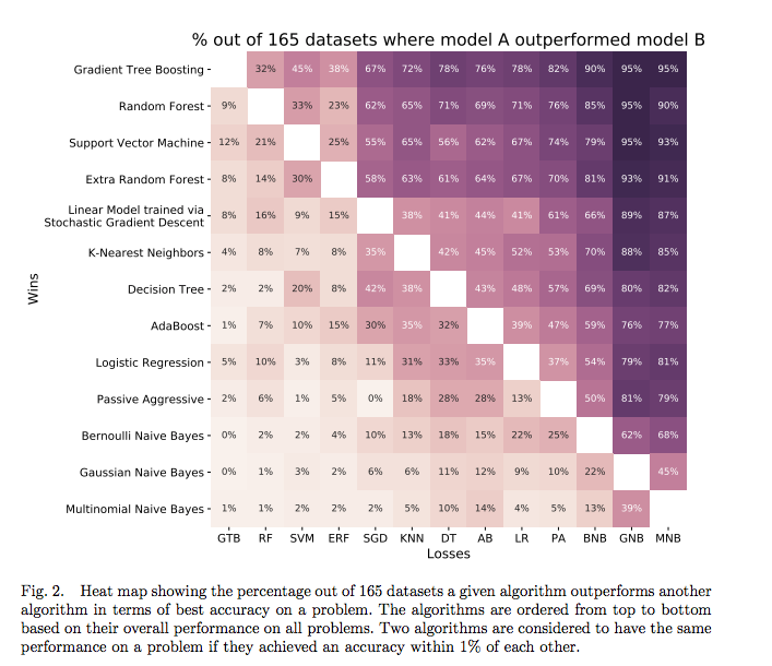
Comparison of many algorithms on 165 datasets.
What this shows is that there are some problems where even a simple Logistic Regression will beat a Random Forest or Gradient Boosting Machine. Although the Gradient Tree Boosting model generally works the best, it’s not a given that it will come out on top. Therefore, when we approach a new problem, the best practice is to try out several different algorithms rather than always relying on the same one. I’ve gotten stuck using the same model (random forest) before, but remember that no one model is always the best.
Fortunately, with Scikit-Learn, it’s easy to evaluate many machine learning models using the same syntax. While we won’t do hyperparameter tuning for each one, we can compare the models with the default hyperparameters in order to select the most promising model for optimization.
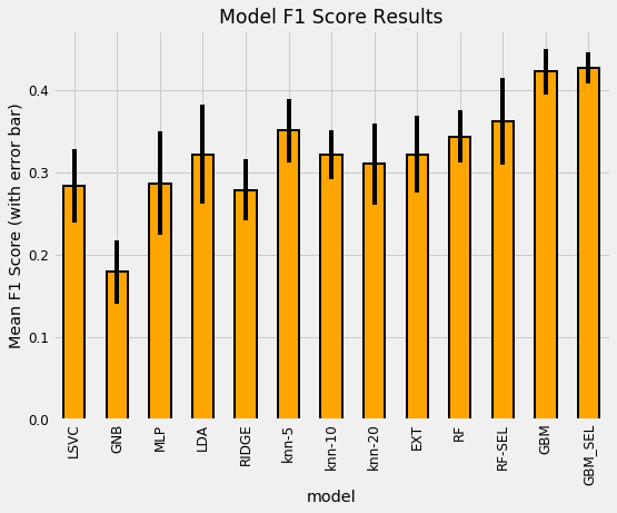
In the notebook, we try out six models spanning the range of complexity from simple — Gaussian Naive Bayes — to complex — Random Forest and Gradient Boosting Machine. Although Scikit-Learn does have a GBM implementation, it’s fairly slow and a better option is to use one of the dedicated libraries such as XGBoost or LightGBM. For this notebook, I used Light GBM and choose the hyperparameters based on what have worked well in the past.
To compare models, we calculate the cross validation performance on the training data over 5 or 10 folds. We want to use the training data because the testing data is only meant to be used once as an estimate of the performance of our final model on new data. The following plot shows the model comparison. The height of the bar is the average Macro F1 score over the folds recorded by the model and the black bar is the standard deviation:
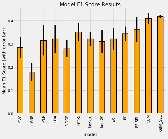
Model cross validation comparison results.
(To see an explanation of the names, refer to the notebook. RF stands for Random Forest and GBM is Gradient Boosting Machine with SEL representing the feature set after feature selection). While this isn’t entirely a level comparison — I did not use the default hyperparameters for the Gradient Boosting Machine — the general results hold: the GBM is the best model by a large margin. This reflects the findings of most other data scientists.
Notice that we cross-validated the data before and after feature selection to see its effect on performance. Machine learning is still largely an empirical field, and the only way to know if a method is effective is to try it out and then measure performance. It’s important to test out different choices for the steps in the pipeline — such as the correlation threshold for feature selection — to determine if they help. Keep in mind that we also want to avoid placing too much weight on cross-validation results, because even with many folds, we can still be overfitting to the training data. Finally, even though the GBM was best for this dataset, that will not always be the case!
Based on these results, we can choose the gradient boosting machine as our model (remember this is a decision we can go back and revise!). Once we decide on a model, the next step is to get the most out of it, a process known as model hyperparameter optimization.
Recognizing that not everyone has time for a 30-minute article (even on data science) in one sitting, I’ve broken this up into two parts. The second part covers model optimization, interpretation, and an experimental section.
Decision tree visualization from part two.
Conclusions
By this point, we can see how all the different parts of machine learning come together to form a solution: we first had to understand the problem, then we dug into the data, cleaning it as necessary, then we made features for a machine learning model, and finally we evaluated several different models.
We’ve covered many techniques and have a decent model (although the F1 score is relatively low, it places in the top 50 models submitted to the competition). Nonetheless, we still have a few steps left: through optimization, we can improve our model, and then we have to interpret our results because no analysis is complete until we’ve communicated our work.
A “Data Science for Good” Machine Learning Project Walk-Through in Python: Part Two: Getting the most from our model, figuring out what it all means, and experimenting with new techniques
Machine learning is a powerful framework that from the outside may look complex and intimidating. However, once we break down a problem into its component steps, we see that machine learning is really only a sequence of understandable processes, each one simple by itself.
In the first half of this series, we saw how we could implement a solution to a “data science for good” machine learning problem, leaving off after we had selected the Gradient Boosting Machine as our model of choice.
Model evaluation results from part one.
In this article, we’ll continue with our pipeline for predicting poverty in Costa Rica, performing model optimizing, interpreting the model, and trying out some experimental techniques.
The full code is available as a Jupyter Notebook both on Kaggle (where it can be run in the browser with no downloads required) and on GitHub. This is an active Kaggle competition and a great project to get started with machine learning or to work on some new skills.
Model Optimization
Model optimization means searching for the model hyperparameters that yield the best performance — measured in cross-validation — for a given dataset. Because the optimal hyperparameters vary depending on the data, we have to optimize — also known as tuning — the model for our data. I like to think of tuning as finding the best settings for a machine learning model.
There are 4 main methods for tuning, ranked from least efficient (manual) to most efficient (automated).
- Understand the problem and data descriptions
- Data cleaning / exploratory data analysis
- Feature engineering / feature selection
- Model comparison
- Model optimization
- Interpretation of results
Naturally, we’ll skip the first three methods and move right to the most efficient: automated hyperparameter tuning. For this implementation, we can use the Hyperopt library, which does optimization using a version of Bayesian Optimization with the Tree Parzen Estimator. You don’t need to understand these terms to use the model, although I did write a conceptual explanation here. (I also wrote an article for using Hyperopt for model tuning here.)
The details are a little protracted (see the notebook), but we need 4 parts for implementing Bayesian Optimization in Hyperopt
- Understand the problem and data descriptions
- Data cleaning / exploratory data analysis
- Feature engineering / feature selection
- Model comparison
- Model optimization
- Interpretation of results
The basic idea of Bayesian Optimization (BO) is that the algorithm reasons from the past results — how well previous hyperparameters have scored — and then chooses the *next *combination of values it thinks will do best. Grid or random search are *uninformed *methods that don’t use past results and the idea is that by reasoning, BO can find better values in fewer search iterations.
See the notebook for the complete implementation, but below are the optimization scores plotted over 100 search iterations.
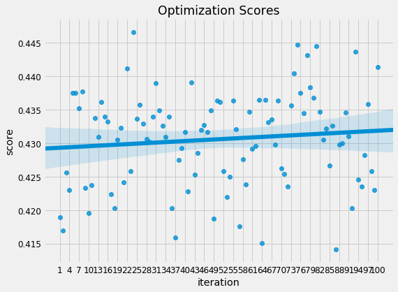
Model optimization scores versus iteration.
Unlike in random search where the scores are, well random over time, in Bayesian Optimization, the scores tend to improve over time as the algorithm learns a probability model of the best hyperparameters. The idea of Bayesian Optimization is that we can optimize our model (or any function) quicker by focusing the search on promising settings. Once the optimization has finished running, we can use the best hyperparameters to cross validate the model.
Optimizing the model will not always improve our test score because we are optimizing for the *training *data. However, sometimes it can deliver a large benefit compared to the default hyperparameters. In this case, the final cross validation results are shown below in dataframe form:
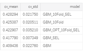
Cross validation results. Models without 10Fold in name were validated with 5 folds. SEL is selected features.
The optimized model (denoted by OPT and using 10 cross validation folds with the features after selection) places right in the middle of the non-optimized variations of the Gradient Boosting Machine (which used hyperparameters I had found worked well for previous problems.) This indicates we haven’t found the optimal hyperparameters yet, or there could be multiple sets of hyperparameters that performly roughly the same.
We can continue optimization to try and find even better hyperparameters, but usually the return to hyperparameter tuning is much less than the return to feature engineering. At this point we have a relatively high-performing model and we can use this model to make predictions on the test data. Then, since this is a Kaggle competition, we can submit the predictions to the leaderboard. Doing this gets us into the top 50 (at the moment) which is a nice vindication of all our hard work!
At this point, we have implemented a complete solution to this machine learning problem. Our model can make reasonably accurate predictions of poverty in Costa Rican households (the F1 score is relatively low, but this is a difficult problem). Now, we can move on to interpreting our predictions and see if our model can teach us anything about the problem. Even though we have a solution, we don’t want to lose sight of why our solution matters.
Note about Kaggle Competitions
The very nature of machine learning competitions can encourage bad practices, such as the mistake of optimizing for the leaderboard score at the cost of all other considerations. Generally this leads to using ever more complex models to eke out a tiny performance gain.
It turns out the same skills used by companies to maximize ad views can also be used to help relieve human suffering.
A simple model that is put in use is better than a complex model which can never be deployed. Moreover, those at the top of the leaderboard are probably overfitting to the testing data and do not have a robust model.
It turns out the same skills used by companies to maximize ad views can also be used to help relieve human suffering.### Interpret Model Results
In the midst of writing all the machine learning code, it can be easy to lose sight of the important questions: what are we making this model for? What will be the impact of our predictions? Thankfully, our answer this time isn’t “increasing ad revenue” but, instead, effectively predicting which households are most at risk for poverty in Costa Rica so they can receive needed help.
To try and get a sense of our model’s output, we can examine the prediction of poverty levels on a household basis for the test data. For the test data, we don’t know the true answers, but we can compare the relative frequency of each predicted class with that in the training labels. The image below shows the training distribution of poverty on the left, and the predicted distribution for the testing data on the right:
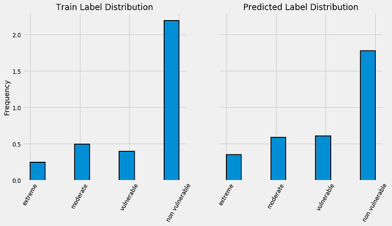
Training label distribution (left) and predicted test distribution (right). Both histograms are normalized.
Intriguingly, even though the label “not vulnerable” is most prevalent in the training data, it is represented less often on a relative basis for the predictions. Our model predicts a higher proportion of the other 3 classes, which means that it thinks there is more severe poverty in the testing data. If we convert these fractions to numbers, we have 3929 households in the “non vulnerable” category and 771 households in the “extreme” category.
Another way to look at the predictions is by the confidence of the model. For each prediction on the test data, we can see not only the label, but also the probability given to it by the model. Let’s take a look at the confidence by the value of the label in a boxplot.
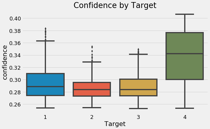
Boxplot of probability assigned to each label on testing data.
These results are fairly intuitive — our model is most confident in the most extreme predictions — and less confident in the moderate ones. Theoretically, there should be more separation between the most extreme labels and the targets in the middle should be more difficult to tease apart.
Another point to draw from this graph is that overall, our model is not very sure of the predictions. A guess with no data would place 0.25 probability on each class, and we can see that even for the least extreme poverty, our model rarely has more than 40% confidence. What this tells us is this is a tough problem — there is not much to separate the classes in the available data.
Ideally, these predictions, or those from the winning model in the competition, will be used to determine which families are most likely to need assistance. However, just the predictions alone do not tell us what may lead to the poverty or how our model “thinks”. While we can’t completely solve this problem yet, we can try to peer into the black box of machine learning.
In a tree-based model — such as the Gradient Boosting Machine — the feature importances represent the sum total reduction in gini impurity for nodes split on a feature. I never find the absolute values very helpful, but instead normalize the numbers and look at them on a relative basis. For example, below are the 10 most important features from the optimized GBM model.
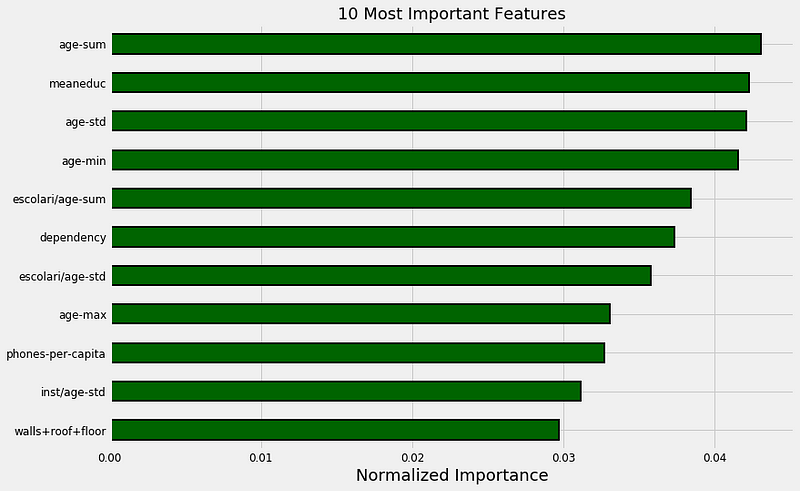
Most important features from optimized gradient boosting machine.
Here we can see education and ages of family members making up the bulk of the most important features. Looking further into the importances, we also see the size of the family. This echoes findings by poverty researchers: family size is correlated to more extreme poverty, and education level is *inversely *correlated with poverty. In both cases, we don’t necessarily know which causes which, but we can use this information to highlight which factors should be further studied. Hopefully, this data can then be used to further reduce poverty (which has been decreasing steadily for the last 25 years).

It’s true: the world is better now than ever and still improving (source).
In addition to potentially helping researchers, we can use the feature importances for further feature engineering by trying to build more features on top of these. An example using the above results would be taking the meaneduc and dividing by the dependency to create a new feature. While this may not be intuitive, it’s hard to tell ahead of time what will work for a model.
An alternative method to using the testing data to examine our model is to split the training data into a smaller training set and a validation set. Because we have the labels for all the training data, we can compare our predictions on the holdout validation data to the true values. For example, using 1000 observations for validation, we get the following confusion matrix:
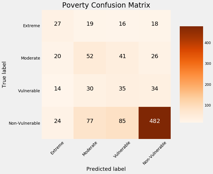
Confusion matrix on validation data.
The values on the diagonal are those the model *predicted correctly *because the predicted label is the same as the true label. Anything off the diagonal the model predicted incorrectly. We can see that our model is the best at identifying the non-vulnerable households, but is not very good at discerning the other labels.
As one example, our model incorrectly classifies 18 households as non-vulnerable which are in fact in extreme poverty. Predictions like these have real-world consequences because those might be families that as a result of this model, would not receive help. (For more on the consequences of incorrect algorithms, see Weapons of Math Destruction.)
Overall, this mediocre performance — the model accuracy is about 60% which is much better than random guessing but not exceptional — suggests this problem may be difficult. It could be there is not enough information to separate the classes within the available data.
One recommendation for the host organization — the Inter-American Development Bank — is that we need more data to better solve this problem. That could come either in the form of more features — so more questions on the survey — or more observations — a greater number of households surveyed. Either of these would require a significant effort, but the best return to time invested in a data science project is generally by gathering greater quantities of high-quality labeled data.
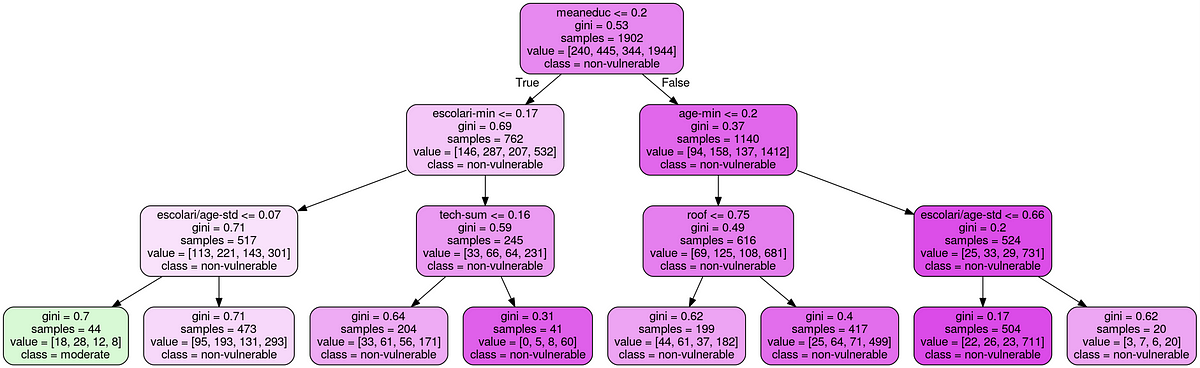
There are other methods we can use for model understanding, such as Local Interpretable Model-agnostic Explainer (LIME), which uses a simpler linear model to approximate the model around a prediction. We can also look at individual decision trees in a forest which are typically straightforward to parse because they essentially mimic a human decision making process.
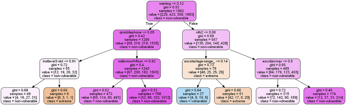
Individual Decision Tree in Random Forest.
It turns out the same skills used by companies to maximize ad views can also be used to help relieve human suffering.
Exploratory Techniques
We’ve already solved the machine learning problem with a standard toolbox, so why go further into exploratory techniques? Well, if you’re like me, then you enjoy learning new things just for the sake of learning. What’s more, the exploratory techniques of today will be the standard tools of tomorrow.
For this project, I decided to try out two new (to me) techniques:
- Supervised: given the labels for the training data
- Multi-Class Classification: labels are discrete with more than 2 values
Recursive Feature Elimination
Recursive feature elimination is a method for feature selection that uses a model’s feature importances — a random forest for this application — to select features. The process is a repeated method: at each iteration, the least important features are removed. The optimal number of features to keep is determined by cross validation on the training data.
Recursive feature elimination is simple to use with Scikit-Learn’s RFECV method. This method builds on an estimator (a model) and then is fit like any other Scikit-Learn method. The scorer part is required in order to make a custom scoring metric using the Macro F1 score.
from sklearn.metrics import f1_score, make_scorer
from sklearn.feature_selection import RFECV
from sklearn.ensemble import RandomForestClassifier
# Custom scorer for cross validation
scorer = make_scorer(f1_score, greater_is_better=True, average = 'macro')
# Create a model for feature selection
estimator = RandomForestClassifier(n_estimators = 100, n_jobs = -1)
# Create the object
selector = RFECV(estimator, step = 1, cv = 3,
scoring= scorer, n_jobs = -1)
# Fit on training data
selector.fit(train, train_labels)
# Transform data
train_selected = selector.transform(train)
test_selected = selector.transform(test)
While I’ve used feature importances for selection before, I’d never implemented the Recursive Feature Elimination method, and as usual, was pleasantly surprised at how easy this was to do in Python. The RFECV method selected 58 out of around 190 features based on the cross validation scores:
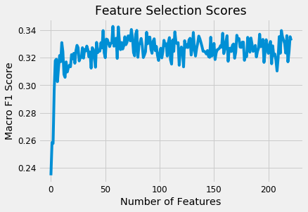
Recursive Feature Elimination Scores.
The selected set of features were then tried out to compare the cross validation performance with the original set of features. (The final results are presented after the next section). Given the ease of using this method, I think it’s a good tool to have in your skill set for modeling. Like any other Scikit-Learn operation, it can fit into a [Pipeline](http://scikit-learn.org/stable/modules/generated/sklearn.pipeline.Pipeline.html "Pipeline"), allowing you to quickly execute a complete series of preprocessing and modeling operations.
Dimension Reduction for Visualization
There are a number of unsupervised methods in machine learning for dimension reduction. These fall into two general categories:
- Supervised: given the labels for the training data
- Multi-Class Classification: labels are discrete with more than 2 values
Typically, PCA (Principal Components Analysis) and ICA (Independent Components Analysis) are used both for visualization and as a preprocessing step for machine learning, while manifold methods like t-SNE (t-Distributed Stochastic Neighbors Embedding) are used only for visualization because they are highly dependent on hyperparameters and do not preserve distances within the data. (In Scikit-Learn, the t-SNE implementation does not have a transform method which means we can’t use it for modeling).
A new entry on the dimension reduction scene is UMAP: Uniform Manifold Approximation and Projection. It aims to map the data to a low-dimensional manifold — so it’s an embedding technique, while simultaneously preserving global structure in the data. Although the math behind it is rigorous, it can be used like an Scikit-Learn method with a [fit](https://github.com/lmcinnes/umap "fit") and [transform](https://github.com/lmcinnes/umap "transform") call.
I wanted to try these methods for both dimension reduction for visualization, and to add the reduced components as *additional features. *While this use case might not be typical, there’s no harm in experimenting! Below shows the code for using UMAP to create embeddings of both the train and testing data.
import umap as UMAP
n_components = 3
# Use default parameters
umap = UMAP(n_components=n_components)
# Fit and transform
train_reduced = umap.fit_transform(train)
test_reduced = umap.transform(test)
The application of the other three methods is exactly the same (except TSNE which cannot be used to transform the testing data). After completing the transformations, we can visualize the reduced training features in 3 dimensions, with the points colored by the value of the target:
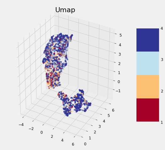
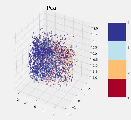
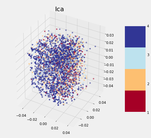
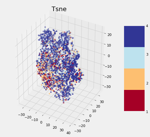
Dimension Reduction Visualizations
None of the methods cleanly separates the data based on the label which follows the findings of other data scientists. As we discovered earlier, it may be that this problem is difficult considering the data to which we have access. Although these graphs cannot be used to say whether or not we can solve a problem, if there is a clean separation, then it indicates that there is *something *in the data that would allow a model to easily discern each class.
As a final step, we can add the reduced features to the set of features after applying feature selection to see if they are useful for modeling. (Usually dimension reduction is applied and then the model is trained on just the reduced dimensions). The performance of every single model is shown below:
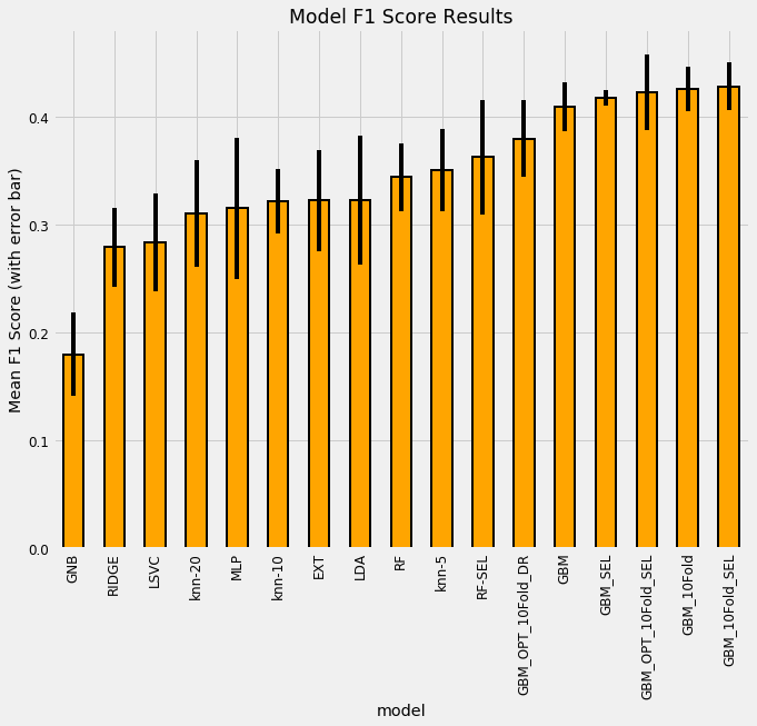
FInal model comparison results.
The model using the dimension reduction features has the suffix DR while the number of folds following the GBM refers to the number of cross validation folds. Overall, we can see that the selected set of features (SEL) does slightly better, and adding in the dimension reduction features hurts the model performance! It’s difficult to conclude too much from these results given the large standard deviations, but we *can say *that the Gradient Boosting Machine significantly outperforms all other models and the feature selection process improves the cross validation performance.
The experimental part of this notebook was probably the most enjoyable for me. It’s not only important to always be learning to stay ahead in the data science field, but it’s also enjoyable for the sake of learning something new.
It turns out the same skills used by companies to maximize ad views can also be used to help relieve human suffering.### Next Steps
Despite this exhaustive coverage of machine learning tools, we have not yet reached the end of methods to apply to this problem!
Some additional steps we could take are:
- Understand the problem and data descriptions
- Data cleaning / exploratory data analysis
- Feature engineering / feature selection
- Model comparison
- Model optimization
- Interpretation of results
The great part about a Kaggle competition is you can read about many of these cutting-edge techniques in other data scientists’ notebooks. Moreover, these contests give us realistic datasets in a non-mission-critical setting, which is a perfect environment for experimentation.
It turns out the same skills used by companies to maximize ad views can also be used to help relieve human suffering.
As one example of the ability of competitions to better machine learning methods, the ImageNet Large Scale Visual Recognition Challenge led to significant improvements in convolutional neural networks.
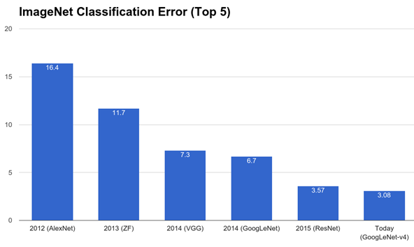
Imagenet Competitions have led to state-of-the-art convolutional neural networks.
Conclusions
Data science and machine learning are not incomprehensible methods: instead, they are sequences of straightforward steps that combine into a powerful solution. By walking through a problem one step at a time, we can learn how to build the entire framework. How we use this framework is ultimately up to us. We don’t have to dedicate our lives to helping others, but it is rewarding to take on a challenge with a deeper meaning.
In this article, we saw how we could apply a complete machine learning solution to a data science for good problem, building a machine learning model to predict poverty levels in Costa Rica.
Our approach followed a sequence of processes (1–4 were in part one):
- Understand the problem and data descriptions
- Data cleaning / exploratory data analysis
- Feature engineering / feature selection
- Model comparison
- Model optimization
- Interpretation of results
Finally, if after all that you still haven’t got your fill of data science, you can move on to exploratory techniques and learn something new!
As with any process, you’ll only improve as you practice. Competitions are valuable for the opportunities they provide us to employ and develop skills. Moveover, they encourage discussion, innovation, and collaboration, leading both to more capable individual data scientists and a better community. Through this data science project, we not only improve our skills, but also make an effort to improve outcomes for our fellow humans.
#machine-learning #data-science #python