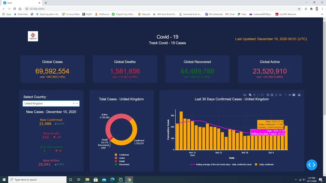
This dashboard is created in python using plotly dash library. There are cards in this dash web app. Cards display global cases and data is updated on the cards once in a day. Plotly indicators display new cases values for each country and any country is selected from the dash core component drop down list. Plotly donut chart displays total values for each country in this dash web app. Plotly combination of line and bar chart displays last thirty days daily confirmed values and rolling average of the last seven days for daily confirmed cases. Plotly scattermapbox chart displays total values for all countries in this dash web dashboard.
Download the code using the below GitHub link.
https://github.com/Mubeen31/Covid-19-Dashboard-in-Python-by-Plotly-Dash