Note from the editors:Towards Data Science_ is a Medium publication primarily based on the study of data science and machine learning. We are not health professionals or epidemiologists, and the opinions of this article should not be interpreted as professional advice. To learn more about the coronavirus pandemic, you can click here._
Data and the Pandemic
For most of us on planet earth at this time, going through a global pandemic is an unprecedented experience. Sometimes I think about the period between the next-most-recent global pandemic of 1918–1920 and the present day. These 100 years have encompassed some of the most dramatic changes the world has seen to this point in almost any area you can think of, including data and technology. I wonder how those living in 1918 got their information about the pandemic and its spread? Today we have many information sources available and ready access to data displays, including predictive models, that describe and project the pandemic’s trajectory. As a data scientist, though, you might find that, even after reviewing what’s available, you have questions that remain unanswered, and would like to have the ability to monitor the quickly-evolving situation for yourself. Fortunately, through an intensive effort by the Johns Hopkins Center for Systems Science and Engineering (https://systems.jhu.edu/research/public-health/ncov/) you can access daily Covid-19 case counts and fatalities globally by country or for the United States specifically by state, county or territory. You can then use this information to design the data reporting and displays that you need to best navigate difficult decisions. As an example, in this report I’ll show you how to:
1. Access the Covid-19 data from Johns Hopkins on Github,
2. Perform a few simple data manipulations to transform the data, and
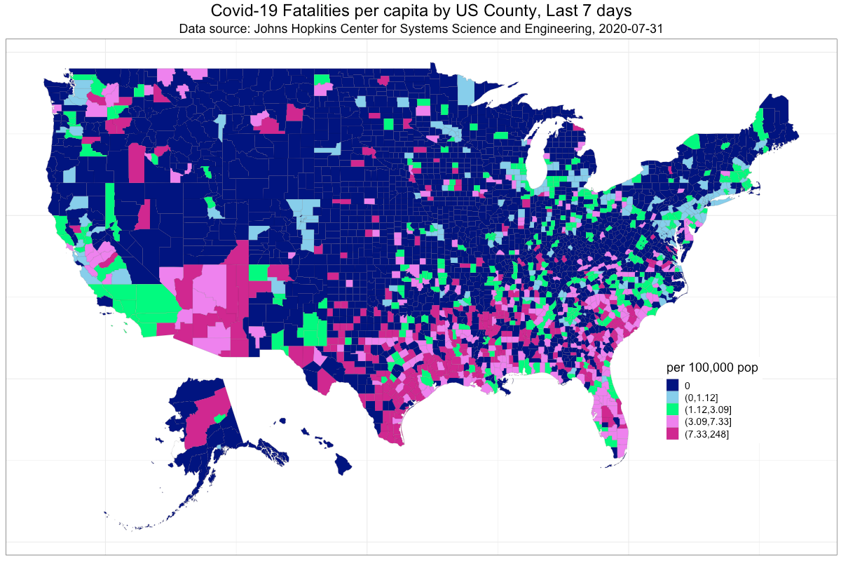
3. Construct a choropleth plot (https://rud.is/b/2016/03/29/easier-composite-u-s-choropleths-with-albersusa/) using the albersusa R package to display Covid-19 fatalities per capita by US County for the previous seven days.
Accessing Daily Covid-19 Data on Github
You can start by loading the packages below. Note that if you don’t have the albersusa package installed you can do that using the install_github() function from the devtools package.
# Data on COVID-19 from Johns Hopkins Center for Systems Science and Engineering
# https://systems.jhu.edu/research/public-health/ncov/
# https://github.com/CSSEGISandData/COVID-19

# Blog post to demonstrate chloroplot package
#https://rud.is/b/2016/03/29/easier-composite-u-s-choropleths-with-albersusa/
rm(list = ls())
library(tidyverse)
library(rgeos)
library(maptools)
library(ggplot2)
library(ggalt)
library(ggthemes)
library(albersusa) # devtools::install_github("hrbrmstr/albersusa")
library(scales)
library(gtools)
The data can be read using the following. Note that there are also data sets for US cases, and global cases and fatalities in the same or adjacent directories.
# read time series data on US deaths by county
urlfile='https://raw.githubusercontent.com/CSSEGISandData/COVID-19/master/csse_covid_19_data/csse_covid_19_time_series/time_series_covid19_deaths_US.csv'
cov19_us_dat<-read_csv(url(urlfile))
#data-visualization #ggplot2 #choropleth-map #data-science #covid19 #data analysis