Hello readers, a couple of weeks back one of the readers commented on my story asking me to write about TabBar and TabBarView widgets. So here it is, we will be talking about these two widgets and also we will be discussing the DefaultTabBarController and TabController as well.
If you are coming from Android Development you might agree with me on this that creating Tabbed layout in Android is not as easy as it is in Flutter. I am an Android Developer as well, and around 7 months back I started with Flutter development, well I struggled a bit at the start but when you compare it to Android development it is very easy to learn and I was actually zapped by the customizations you can do in Flutter. We will go through it all and a lot more in this story on TabBar and TabBarView.
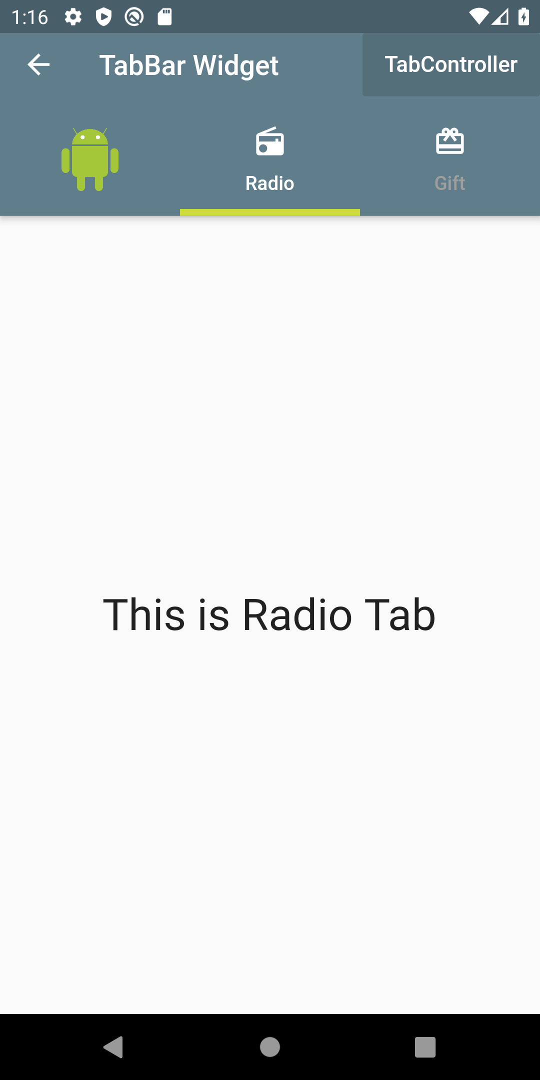
Look at the image below to get an overview of what TabBar looks like.

TabBar Layout Overview
Now let us look at the constructor of TabBar first, which is pretty long, but I will bifurcate it into 3 parts so that it is easier to understand.
TabBar(
  indicatorColor: Colors.white,
  indicatorWeight: 2.0,
  indicatorPadding: EdgeInsets.zero,
  indicatorSize: TabBarIndicatorSize.label,
  indicator: BoxDecoration(),
  ------------------------------------------------
  labelColor: Colors.white,
  labelStyle: TextStyle(),
  labelPadding: EdgeInsets.only(top: 10.0),
  unselectedLabelColor: Colors.grey,
  unselectedLabelStyle: TextStyle(),
  ------------------------------------------------
  isScrollable: false,
  controller: _tabController,  // only  if DefaultTabContoller is not used.
  dragStartBehavior: DragStartBehavior.start,
  mouseCursor: SystemMouseCursors.noDrop,
  physics: ScrollPhysics(parent: AlwaysScrollableScrollPhysics()),
  onTap: (){},
  tabs: [Tab(),]                 // @required list of Tabs
If you look closely at the constructor above I have grouped it into three parts, there are five properties pertaining to the indicator and another five related to label, and the last 7 properties are applicable to the behaviour of the TabBar.
Step 1:
Now to build the TabBar layout in your application the first thing you will need is the Controller. There are two ways to do it either you can use the DefaultTabController or you can build your own TabController.
tip: if you are using a stateless widget then using the DefaultTabController is the best approach. If you are using a stateful widget then you should be building your own TabController.
The DefaultTabController has 3 parameters and you need to wrap your Scaffold inside the DefaultTabController.
return DefaultTabController(
  initialIndex: 1,     // default is 0
  length: 3,           // Number of Tabs
  child: Scaffold()    // Main Layout
);
Step 2:
The next step is the TabBar itself which I discussed earlier, customize your TabBar the way that best suits you according to the parameters mentioned above in the constructor. In the above TabBar constructor, I have mentioned what value each takes in or what widget needs to be used along with that property. Additionally, the onTap() function can be used if you want to alert users by showing a dialogBox or a snackBar or route to another page.
Step 3:
As a required property of TabBar is a list of Tabs, it basically means how many pages are you create accordingly you need to add the Tabs and customize the Icon and Label of the Tabs with the constructor given below and refer to the image of TabBar layout overview.
Tab(
  text: 'Radio',                  // label of the Tab
  icon: Icon(                     // Icon above the label
    Icons.radio,
    color: Colors.white,
  ),
  iconMargin: EdgeInsets.only(bottom: 10.0),  // default margin
  child:
),
tip: there are three main parameters of the Tab widget, the text, icon and iconMargin. If you would like to further customize your Tab then you can use the child property, for example, add an image instead of text and icon. The child property can only be used if you haven’t mentioned text and icon, otherwise, your app will throw an error.
Tab(
  child: Image.asset('images/android.png'),
),
Tab(
  text: 'Radio',
  icon: Icon(
    Icons.radio,
    color: Colors.white,
  ),
  iconMargin: EdgeInsets.only(bottom: 10.0),
),
Tab(
  text: 'Gift',
  icon: Icon(
    Icons.card_giftcard,
    color: Colors.white,
  ),
  iconMargin: EdgeInsets.only(bottom: 10.0),
),
Step 4:
The next step is the TabBarView, this is where you will be creating the layout for each Tab, this where you will be adding all your other widgets, basically setting up your page that you want to display when each Tab is selected. The important thing to remember here is that you need to be careful about the index. The children in the TabBarView should be added according to the Tabs created. For example, if you look at the image above, the Tab says Radio and it is at index 1, then the child at index 1 inside the TabBarView should be about Radio as well, otherwise, your Tab will be mention something and the page that is being displayed will be different. Let me explain with some code…
--------------------------- Constructor ------------------------
TabBarView({
  children: [],
  controller: _tabController,  // only if DefaultTabController is not used
  physics: ScrollPhysics(parent: AlwaysScrollableScrollPhysics()),
  dragStartBehavior: DragStartBehavior.start,    // default
})-------------------- Related to above Tab Code ------------------
 TabBarView(
  children: [
    Center(
        child: Text(
      'This is Android Image Tab',              /// Index:0
      style: TextStyle(fontSize: 32),
    )),
    Center(
        child: Text(
      'This is Radio Tab',                     /// Index:1
      style: TextStyle(fontSize: 32),
    )),
    Center(
        child: Text(
      'This is Gift Tab',                      /// Index:2
      style: TextStyle(fontSize: 32),
    )),
  ],
),
Compare closely the code between the Tab and children of TabBarView, index of every child widget in TabBarView is in accordance with the index of the Tab.
Until now all the above code was written using the DefaultTabController. Now if you want to create your own Controller then, first you need is a stateful widget and TabController object which will be then initialized inside the controller property of TabBar and TabBarView.
#flutter #mobile-apps #web-development #programming #developer