Introduction to Data Visualization
Data visualization is the process of creating interactive visuals to understand trends, variations, and derive meaningful insights from the data. Data visualization is used mainly for data checking and cleaning, exploration and discovery, and communicating results to business stakeholders. Most of the data scientists pay little attention to graphs and focuses only on the numerical calculations which at times can be misleading. To understand the importance of visualization let’s take a look at Anscombe’s Data Quartet in Figures 1 and 2 below.
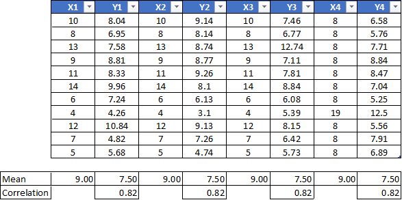
Figure 1. Anscombe’s Data Quartet showing how a pair of X and Y can have different values yet have different central tendency and correlation values. Data Credits — Anscombe, Francis J. (1973)
The same data points, when represented using visualization in Figure 2 below, depicts a different trend altogether.
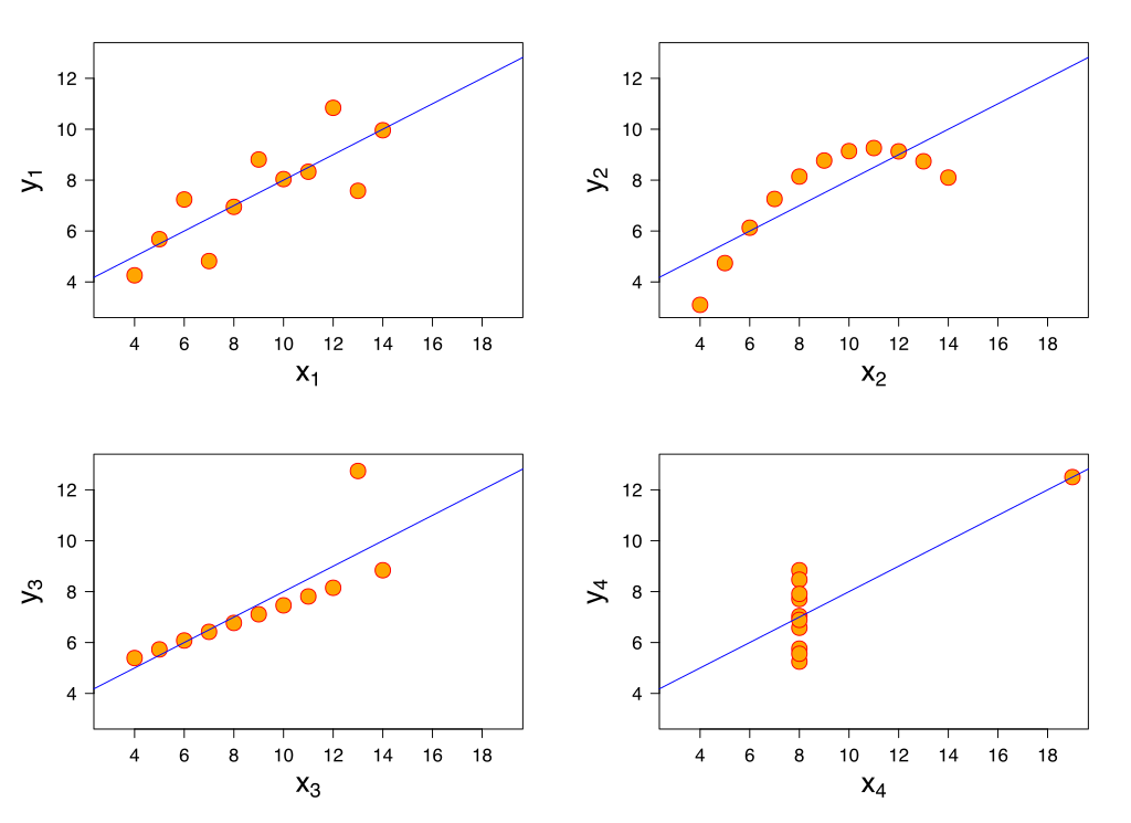
Figure 2. Illustrates how four identical datasets when examined using simple summary statistics look similar but vary considerably when graphed. Image Credits — Anscombe, Francis J. (1973)
It is important to visualize the data before any calculations are carried out. The visual representation can convey much more information when compared to descriptive statistics.
#analytics #visualization #data-science #data-visualization #python