In this series of articles, I’m looking at the characteristics of different Python plotting libraries by making the same multi-bar plot in each one. This time I’m focusing on Bokeh (pronounced “BOE-kay”).
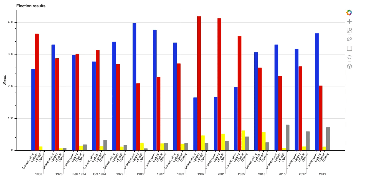
Plotting in Bokeh is a little more complicated than in some of the other plotting libraries, but there’s a payoff for the extra effort. Bokeh is designed both to allow you to create your own interactive plots on the web and to give you detailed control over how the interactivity works. I’ll show this by adding a tooltip to the multi-bar plot I’ve been using in this series. It plots data from UK election results between 1966 and 2020.
Making the multi-bar plot
Before we go further, note that you may need to tune your Python environment to get this code to run, including the following.
- Running a recent version of Python (instructions for Linux, Mac, and Windows)
- Verify you’re running a version of Python that works with these libraries
The data is available online and can be imported using pandas:
import pandas as pd
df = pd.read_csv('https://anvil.works/blog/img/plotting-in-python/uk-election-results.csv')
Now we’re ready to go.
To make the multi-bar plot, you need to massage your data a little.
The original data looks like this:
>> print(long)
    year    party seats
0   1966 Conservative  253
1   1970 Conservative  330
2 Feb 1974 Conservative  297
3 Oct 1974 Conservative  277
4   1979 Conservative  339
..   ...     ...  ...
103  2005    Others  30
104  2010    Others  29
105  2015    Others  80
106  2017    Others  59
107  2019    Others  72

[60 rows x 3 columns]
You can think of the data as a series of **seats** values for each possible **(year, party)** combination. That’s exactly how Bokeh thinks of it. You need to make a list of **(year, party)** tuples:
# Get a tuple for each possible (year, party) combination
x = [(str(r[1]['year']), r[1]['party']) for r in df.iterrows()]

# This comes out as [('1922', 'Conservative'), ('1923', 'Conservative'), ... ('2019', 'Others')]
These will be the x-values. The y-values are simply the seats:
y = df['seats']
Now you have data that looks something like this:
x               y
('1966', 'Conservative')    253
('1970', 'Conservative')    330
('Feb 1974', 'Conservative')  297
('Oct 1974', 'Conservative')  277
('1979', 'Conservative')    339
 ...   ...         ...
('2005', 'Others')       30
('2010', 'Others')       29
('2015', 'Others')       80
('2017', 'Others')       59
('2019', 'Others')       72
Bokeh needs you to wrap your data in some objects it provides, so it can give you the interactive functionality. Wrap your x and y data structures in a **ColumnDataSource** object:
   from bokeh.models import ColumnDataSource

  source = ColumnDataSource(data={'x': x, 'y': y})
Then construct a **Figure** object and pass in your x-data wrapped in a **FactorRange** object:
   from bokeh.plotting import figure
   from bokeh.models import FactorRange

  p = figure(x_range=FactorRange(*x), width=2000, title="Election results")
You need to get Bokeh to create a colormap—this is a special **DataSpec** dictionary it produces from a color mapping you give it. In this case, the colormap is a simple mapping between the party name and a hex value:
   from bokeh.transform import factor_cmap

  cmap = {
     'Conservative': '#0343df',
     'Labour': '#e50000',
     'Liberal': '#ffff14',
     'Others': '#929591',
   }
  fill_color = factor_cmap('x', palette=list(cmap.values()), factors=list(cmap.keys()), start=1, end=2)
Now you can create the bar chart:
p.vbar(x='x', top='y', width=0.9, source=source, fill_color=fill_color, line_color=fill_color)
Visual representations of data on Bokeh charts are referred to as glyphs, so you’ve created a set of bar glyphs.
Tweak the details of the graph to get it looking how you want:
  p.y_range.start = 0
  p.x_range.range_padding = 0.1
  p.yaxis.axis_label = 'Seats'
  p.xaxis.major_label_orientation = 1
  p.xgrid.grid_line_color = None
And finally, tell Bokeh you’d like to see your plot now:
  from bokeh.io import show

  show(p)
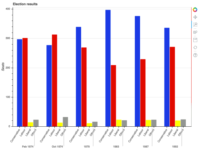
This writes the plot to an HTML file and opens it in the default web browser. Here’s the result:
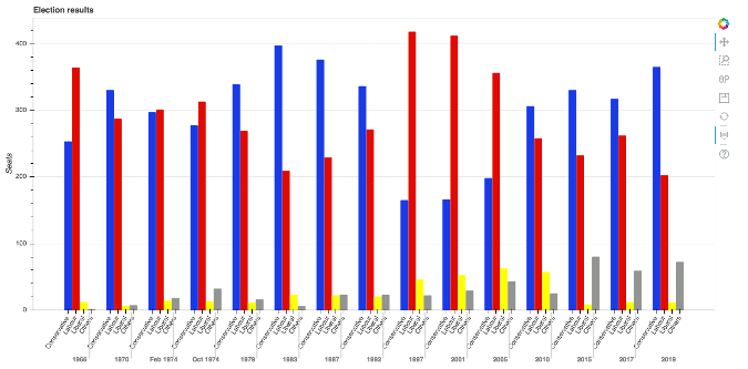
This already has some interactive features, such as a box zoom:
But the great thing about Bokeh is how you can add your own interactivity. Explore that in the next section by adding tooltips to the bars.
#python #bokeh