Last weekend, I took the opportunity to work on the website of a local and very talented photographer. One of the main requirements of this website is to be responsive. This means that the navigation bar should work well on mobile phones, which means it should be creative in the way it uses screen space.
On large monitors, there is a lot of space to display navigation links on a navigation bar. However, space is limited on tablets — even more so on mobile devices. We cannot show every detail of the page immediately. It would just be a horrible user experience. In the front-end world, we like to put those navigation links behind a hamburger menu.
In this article, you’ll read how you can create this hamburger menu yourself. We’ll try to avoid any unneeded work, so don’t worry about CSS! Instead of reinventing the wheel, we’ll be using a library. I’ll guide you through my solution and show you how to open/close a menu with the use of Angular. Don’t worry, I promise that it will take less time to implement your own hamburger menu than to collect your hamburger menu elsewhere. Watch and learn, fast food companies.
Note: The “hamburger menus” name dates back to 1981 and designer Norm Cox. It indicates that the icon contains a list of items.

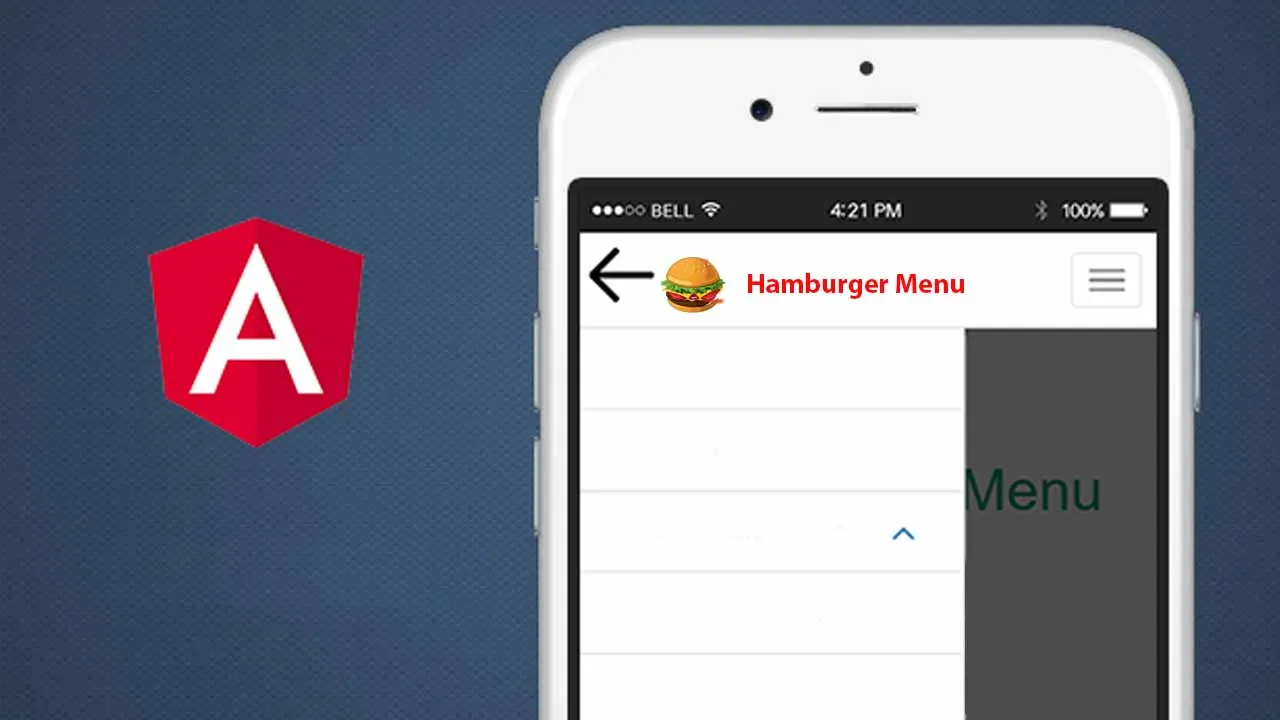
A screenshot of the famous “hamburger menu
#typescript #angular #programming #javascript