Drawing Density Charts in Flutter
Introduction
When working with small spaces like a mobile application, it’s very easy to run out of room when trying to visualize large datasets. We get stuck with charts that have overlapping data points, making it almost impossible to discover patterns in the data. The more data we try to visualize, the more apparent this issue becomes. One solution is to sample or filter our data, but we still run into the risk of hiding patterns to our users.
In this article, we’re going to try and visualize the locations of all shots made by the Colorado Avalanche for the 2018–2019 NHL season. We’ll be using the data collected by the folks at MoneyPuck, which is an amazing resource for hockey analytics. Since we’ll be dealing with roughly 2,500 points of data, we’ll be building a simple backend service in Python to access and modify our shot data. This saves us from having to store a ton of data on the client, and will help us in the long run when we start dealing with more advanced charts. Our backend will be a simple Flask application on a local machine that will include a couple of endpoints for our Flutter app.
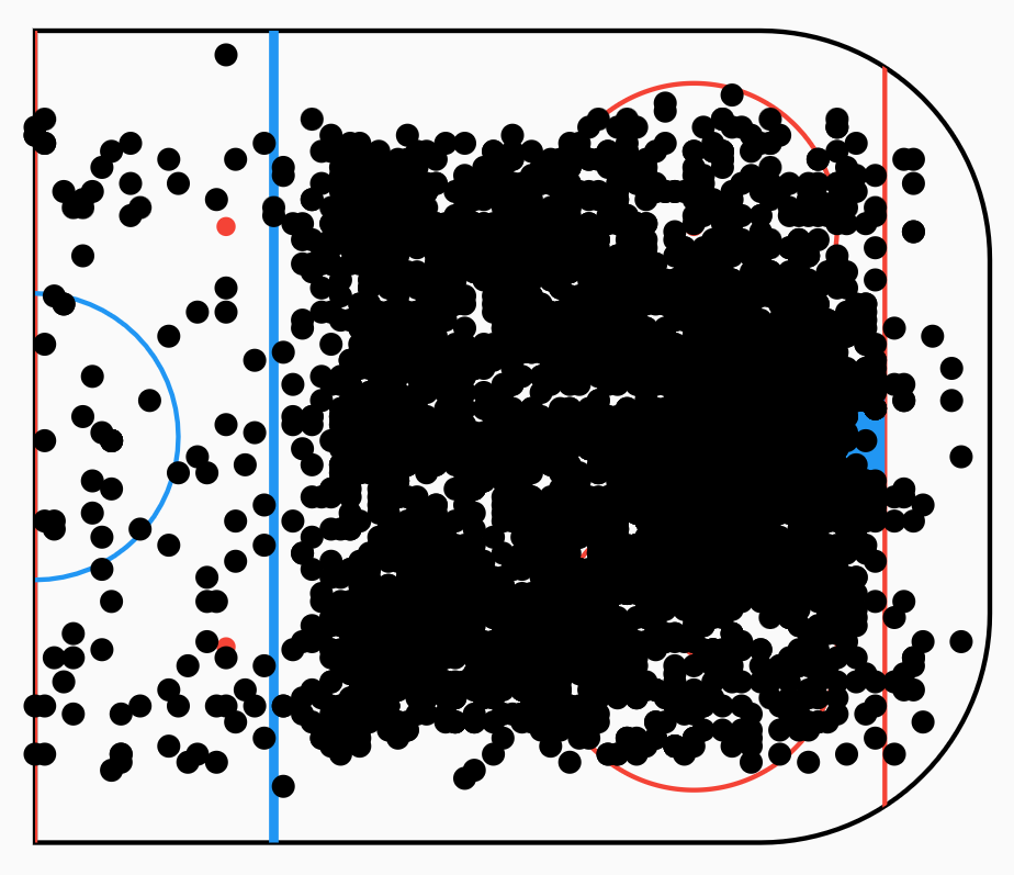
Our first attempt will be a scatter plot, a chart generally used to explore the relationship between two numerical variables (x and y coordinates of the rink). As we build our chart, we’ll find that scatter charts are easily susceptible to overplotting. By plotting each data point as a circle, our chart on a mobile device would end up looking something like this:

Fortunately, there are several workarounds that we can use to reduce this type of overplotting. We’ll take some of these ideas, and see what we can do with Flutter to build a chart that can inspire meaningful insights. This article dives straight into code, so some basic knowledge of Dart and Python is recommended.
Building the chart
We leveraged Flutter’s CustomPainter to draw a radar chart by painting lines and shapes onto a canvas. The logic behind this chart was pretty straightforward, and only required some trig functions from dart:math to figure out the position and angle of the charts. We’ll run through the same approach for our charts, and try to separate our logic into separate reusable components.
Starting with the rink
The awesome dataset provided by MoneyPuck contains the physical coordinates for each shot taken. Instead of using a boring Cartesian chart, we can take the x/y coordinates of our data points and plot them directly onto a rink outline.
The quickest approach to building our rink would be to simply use an image. We could overlay the data points on top of the image using a Stack widget. Our data points should fall in the correct spot if we can ensure the dimensions/ratio of the image matches the standard NHL rink dimensions. Another approach would be to leverage our CustomPainter skills and build the rink outline ourselves. Using the standard dimensions, we can easily define the positions of our rink features (face-off circles, lines, goal crease, etc.) We’d have full control in the design of the rink, and would be able to adjust the outline during run-time. We can also guarantee that we’ll never run into any resolution issues. Since this is an article around CustomerPainter, it’s only fitting that we use this approach :)
We mainly care about the location of a shot relative to the opponent’s net, so we only need to paint half a rink. The following code snippet should give you a good start on building a rink outline with CustomPainter.
class IceRinkOutlineChartPainter extends CustomPainter {
  @override
  void paint(Canvas canvas, Size size) {
    var xScale = size.width / rinkWidth;
    var yScale = size.height / rinkHeight;

    paintRinkOutline(canvas, xScale, yScale);
    paintFaceoffCircles(canvas, xScale, yScale);
    paintGoalCrease(canvas, xScale, yScale);
  }

  void paintRinkOutline(Canvas canvas, double xScale, yScale) {
    var redLinePaint = Paint()
      ..color = Colors.red
      ..style = PaintingStyle.stroke
      ..strokeWidth = 0.5 * xScale;

    var blueLinePaint = Paint()
      ..color = Colors.blue
      ..style = PaintingStyle.stroke
      ..strokeWidth = xScale;

    var centerIceCirclePaint = Paint()
      ..color = Colors.blue
      ..style = PaintingStyle.stroke
      ..strokeWidth = 0.5 * xScale;

    var rinkOutlinePaint = Paint()
      ..color = Colors.black
      ..style = PaintingStyle.stroke
      ..strokeWidth = 0.5 * xScale;

    var rinkOutline = RRect.fromRectAndCorners(
      Rect.fromLTRB(0, 0, rinkWidth * xScale, rinkHeight * xScale),
      topRight: Radius.circular(rinkCornerRadius * xScale),
      bottomRight: Radius.circular(rinkCornerRadius * xScale),
    );

    canvas.drawRRect(rinkOutline, rinkOutlinePaint);
    canvas.clipRRect(rinkOutline, doAntiAlias: true);

    canvas.drawLine(Offset(0, 0), Offset(0, rinkHeight * yScale), redLinePaint);
    canvas.drawLine(Offset(25 * xScale, 0),
        Offset(25 * xScale, rinkHeight * yScale), blueLinePaint);
    canvas.drawLine(Offset(89 * xScale, 0),
        Offset(89 * xScale, rinkHeight * yScale), redLinePaint);

    canvas.drawArc(
      Rect.fromCenter(
          center: Offset(0, rinkHeight / 2 * yScale),
          width: 30 * xScale,
          height: 30 * yScale),
      pi,
      2 * pi,
      false,
      centerIceCirclePaint,
    );
  }

  void paintGoalCrease(Canvas canvas, double xScale, yScale) {
    var goalCreasePaint = Paint()
      ..color = Colors.blue
      ..style = PaintingStyle.fill;

    final goalCreaseOutlinePaint = Paint()
      ..color = Colors.red
      ..style = PaintingStyle.stroke
      ..strokeWidth = 0.5 * xScale;

    canvas.drawArc(
      Rect.fromCenter(
          center: Offset(89 * xScale, rinkHeight / 2 * yScale),
          width: 12 * xScale,
          height: 12 * yScale),
      pi / 2,
      pi,
      false,
      goalCreaseOutlinePaint,
    );

    canvas.drawArc(
      Rect.fromCenter(
          center: Offset(89 * xScale, rinkHeight / 2 * yScale),
          width: 12 * xScale,
          height: 12 * yScale),
      pi / 2,
      pi,
      false,
      goalCreasePaint,
    );
  }

  void paintFaceoffCircles(Canvas canvas, double xScale, double yScale) {
    final faceoffCirclePaint = Paint()
      ..color = Colors.red
      ..style = PaintingStyle.stroke
      ..strokeWidth = 0.5 * xScale;

    final faceoffDotPaint = Paint()
      ..color = Colors.red
      ..style = PaintingStyle.fill;

    canvas.drawCircle(
        Offset(20 * xScale, 20.5 * yScale), xScale, faceoffDotPaint);

    canvas.drawCircle(
        Offset(20 * xScale, 64.5 * yScale), xScale, faceoffDotPaint);

    canvas.drawCircle(
        Offset(69 * xScale, 20.5 * yScale), xScale, faceoffDotPaint);

    canvas.drawCircle(
        Offset(69 * xScale, 64.5 * yScale), xScale, faceoffDotPaint);

    canvas.drawCircle(
        Offset(69 * xScale, 20.5 * yScale), 15 * xScale, faceoffCirclePaint);

    canvas.drawCircle(
        Offset(69 * xScale, 64.5 * yScale), 15 * xScale, faceoffCirclePaint);
  }

  @override
  bool shouldRepaint(CustomPainter oldDelegate) {
    return false;
  }
}
We can wrap our rink outline custom painter in a CustomPaint widget that fits the width and height of its parent. We can use the handy AspectRatio widget to force our chart to maintain the rink ratio of 100/85 (we’re plotting half a rink).

Grabbing our data
As previously mentioned, we’ll be using a simple Flask server to retrieve our data points. We’ll be using the pandas library to read the data from a .csv file, and transform it into x/y coordinates. We’ll start with a single GET endpoint that will fetch the shots data for a given team (all shots are grabbed if a team is not specified.) We’ll need to adjust the location of our data points to ensure that we’re plotting against a single net. Our data points should range from [0:100] on the x-axis, and [-51:50] on the y-axis. We can provide a team_code query parameter so that we can filter through the .csv file. For Colorado, we can use the COL team code.
from flask import Flask, jsonify, request
import numpy as np
import pandas as pd

shots = pd.read_csv('example/python/shots_2018.csv')
x_range = [0, 100]
y_range = [-51, 50]

app = Flask(__name__)

@app.route('/shots')
def get_shots():
    team_code = request.args.get('team')
    team_shots = get_team_shots(team_code)

    return team_shots.to_json(orient='records')

def get_team_shots(team_code):
    if team_code is not None:
        team_shots = shots[(shots.awayTeamCode == team_code) & (shots.isHomeTeam == 0) | (
            shots.homeTeamCode == team_code) & (shots.isHomeTeam == 1)][['arenaAdjustedXCord', 'arenaAdjustedYCord']]
    else:
        team_shots = shots[['arenaAdjustedXCord', 'arenaAdjustedYCord']]

    team_shots.columns = ['x', 'y']
    team_shots[team_shots['x'] < 0] = team_shots[team_shots['x'] < 0] * -1

    return team_shots

app.run()
On the Flutter side, we can leverage the popular http package to communicate with our new GET endpoint. The package is Future based, so we can easily write an async method for each endpoint. For simplicity, I have used ngrok to open a public URL to the Python Flask server. This allows me to use the same URL to connect to my mobile device or an Android emulator. You could also simply point to your localhost endpoint or use the 10.0.0.2 proxy with an emulator. I’m also using the vector_math package to serialize the shots data, which is helpful when dealing with 2-D / 3-D data points.
  Future<List<Vector2>> getData(String teamCode) async {
    final response = await httpClient.get('$baseUrl?team=$teamCode');
    final dataJson = json.decode(response.body) as List;

    return dataJson.map((pointJson) {
      var x = pointJson['x'] as double;
      var y = pointJson['y'] as double;

      return Vector2(x, y);
    }).toList();
  }
Building the scatter plot
To accurately plot our data points over our rink outline, we’ll need to scale the points to fit the height and width of our canvas. This will be a common problem across all of our charts, so we’ll build a re-usable abstract custom painter that can scale our data points into offsets.
abstract class CartesianPlotPainter extends CustomPainter {
  final List<Vector2> points;
  final Range defaultXRange;
  final Range defaultYRange;

  CartesianPlotPainter(
    this.points, {
    this.defaultXRange,
    this.defaultYRange,
  });

  Range _xRange;
  Range get xRange {
    if (_xRange != null) return _xRange;
    if (defaultXRange != null) return _xRange = defaultXRange;

    var xPoints = points.map((point) => point.x).toList()..sort();

    return _xRange = Range(xPoints.first, xPoints.last);
  }

  Range _yRange;
  Range get yRange {
    if (_yRange != null) return _yRange;
    if (defaultYRange != null) return _yRange = defaultYRange;

    var yPoints = points.map((point) => point.y).toList()..sort();

    return _yRange = Range(yPoints.first, yPoints.last);
  }

  List<Offset> getOffsetsForCanvas(Size size) {
    return points
        .map((point) => Offset(
              (point.x - xRange.min) * getHorizontalScaleForCanvas(size),
              (point.y - yRange.min) * getVerticalScaleForCanvas(size),
            ))
        .toList();
  }

  double getHorizontalScaleForCanvas(Size size) {
    return size.width / (xRange.max - xRange.min);
  }

  double getVerticalScaleForCanvas(Size size) {
    return size.height / (yRange.max - yRange.min);
  }
}
The implementation of our scatter plot painter becomes pretty easy: draw a circle for each scaled data point. Once we have our painter, we can now overlay our scatter plot on top of our rink outline chart.
lass ScatterPlotPainter extends CartesianPlotPainter {
  final List<Vector2> points;
  final Range defaultXRange;
  final Range defaultYRange;

  ScatterPlotPainter(this.points, {this.defaultXRange, this.defaultYRange})
      : super(
          points,
          defaultXRange: defaultXRange,
          defaultYRange: defaultXRange,
        );

  @override
  void paint(Canvas canvas, Size size) {
    var scatterPlotPaint = Paint()
      ..color = Colors.black.withAlpha(50)
      ..style = PaintingStyle.fill;

    getOffsetsForCanvas(size)
        .forEach((offset) => canvas.drawCircle(offset, 2.0, scatterPlotPaint));
  }

  @override
  bool shouldRepaint(CustomPainter oldDelegate) {
    return true;
  }
}
class IceRinkChart extends StatelessWidget {
  final List<Vector2> points;

  const IceRinkChart({Key key, this.points}) : super(key: key);

  @override
  Widget build(BuildContext context) {
    return AspectRatio(
      aspectRatio: 100 / 85,
      child: Container(
        child: CustomPaint(
          painter: IceRinkOutlineChartPainter(),
          size: Size(double.infinity, double.infinity),
          child: CustomPaint(
            painter: ScatterPlotPainter(
              points,
              defaultXRange: Range(0, 100),
              defaultYRange: Range(-51, 50),
            ),
            size: Size(double.infinity, double.infinity),
          ),
        ),
      ),
    );
  }
}

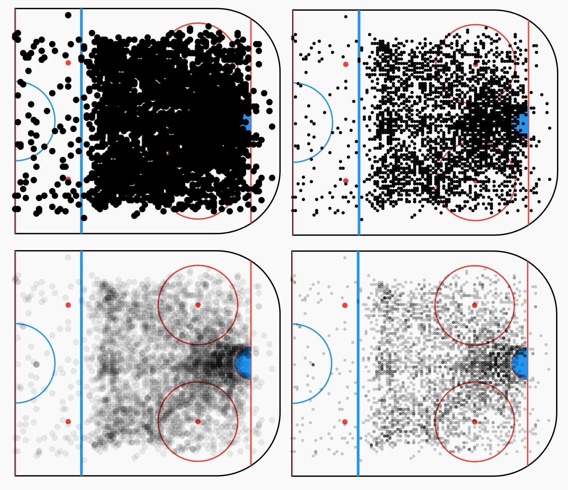
The first scatter plot is pretty much unreadable. Without any notable peaks, it’s impossible to determine the actual frequency and distribution of our shots. We can start to reduce the overplotting by adding some transparency or reducing the size of our circles. Reducing the circle size allows us to fit more data points before they start overlapping. Transparency allows the overlap in our circles to display as darker areas in the chart, making it easier to identify the common shot locations. Looking at the bottom two scatter plots, we can start to see that most shots are located near the inner slot of the rink.
Taking the next step with density charts
If we tried to increase our dataset (i.e. including shots from other teams or other seasons), we’d eventually end up with our first over-plotted scatter plot. Instead of trying to shove thousands of data points into a tiny chart, let’s try and build a 2-D histogram. We can split the dataset into evenly size intervals (bins), and count the number of data points that land inside each interval. We can then normalize the frequency within a range of [0:1], generate a color gradient, and assign a color to each bin. The implementation of our new histogram density painter could look something like this:
class HistogramDensityPainter extends CartesianPlotPainter {
  final List<Vector2> points;
  final int divisions;
  final List<Color> colors;
  final Range defaultXRange;
  final Range defaultYRange;

  HistogramDensityPainter(
    this.points, {
    this.defaultXRange,
    this.defaultYRange,
    this.divisions = 20,
    this.colors = const [Colors.white, Colors.green],
  }) : super(
          points,
          defaultXRange: defaultXRange,
          defaultYRange: defaultXRange,
        );

  @override
  void paint(Canvas canvas, Size size) {
    var histogramBinPaint = Paint()..style = PaintingStyle.fill;
    var binWidth = size.width / divisions;
    var binHeight = size.height / divisions;

    var bins = List<List<int>>.generate(
        divisions, (i) => List<int>.generate(divisions, (j) => 0));

    var maxBinCount = 0;

    getOffsetsForCanvas(size).forEach((offset) {
      var xBin = min((offset.dx / binWidth).floor(), divisions - 1);
      var yBin = min((offset.dy / binHeight).floor(), divisions - 1);

      bins[xBin][yBin]++;

      maxBinCount =
          bins[xBin][yBin] > maxBinCount ? bins[xBin][yBin] : maxBinCount;
    });

    bins.asMap().forEach((rowIndex, row) {
      row.asMap().forEach((colIndex, col) {
        var left = binWidth * rowIndex;
        var top = binHeight * colIndex;
        var right = binWidth * (rowIndex + 1);
        var bottom = binHeight * (colIndex + 1);

        var color = getColor(colors, col / maxBinCount);

        canvas.drawRRect(RRect.fromLTRBR(left, top, right, bottom, Radius.zero),
            histogramBinPaint..color = color);
      });
    });
  }

  @override
  bool shouldRepaint(CustomPainter oldDelegate) {
    return true;
  }
}
In our main rink chart, we can now simply swap our ScatterPlotPainter with our new HistogramDensityPainter:

Getting there! Regardless of the size of our data-set, we should be able to get a good picture of our shot distribution. Using a color gradient with sharper contrasts (used in the fourth chart) can further help us emphasize the peaks in our distribution.
We can still do better.
The shape of our distribution is pretty rough, and increasing the number of intervals only dilutes the number of shots that fall within each interval. Let’s take the next step, and try to “smooth” our density chart using kernel density estimation (or KDE). This algorithm produces a probability density function based on the data points that allow us to estimate the density of shots at any location in the rink. We can now increase the number of divisions in our chart without diluting the data. While the algorithm is currently unavailable in Dart and Flutter, we can leverage our Python backend server and use the KDE function available in the SciPy library. We can build a new endpoint that generates a “density” value at each coordinate of the rink. We’ll return a 3-D vector for each shot (x,y, and z as our density value).
@app.route('/shots/kde')
def get_shots_kde():
    team_code = request.args.get('team')
    divisions = int(request.args.get('divisions') or 10)
    team_shots = get_team_shots(team_code)

    team_shots = team_shots.to_numpy()
    X, Y, Z = get_kde_data(team_shots[:, 0], team_shots[:, 1], divisions)
    positions = np.vstack([X.ravel(), Y.ravel()])
    points = []

    for i in range(len(positions[0, :])):
        points.append({
            'x': float(positions[0, i]),
            'y': float(positions[1, i]),
            'z': Z[i]
        })

    return jsonify(points)
Our 2-D histogram can now be simplified, since we don’t need to group our shots data into bins. We’ll draw a “pixel” for each density value calculated by our KDE function. The more pixels we generate, the smoother our graph is going to look, but the longer our chart takes to render. We’ll stop at 100 divisions (10,000 pixels), since we start incurring heavy rendering times with diminishing returns on the smoothness of the chart.
class KernelDensityEstimationPainter extends DensityPlotPainter {
  final List<Vector3> pointsWithDensity;
  final List<Color> colors;
  final Range defaultXRange;
  final Range defaultYRange;
  final Range defaultZRange;
  final Function clipRRect;

  KernelDensityEstimationPainter(
    this.pointsWithDensity, {
    this.colors = const [Colors.white, Colors.green],
    this.defaultXRange,
    this.defaultYRange,
    this.defaultZRange,
    this.clipRRect,
  }) : super(pointsWithDensity,
            defaultXRange: defaultXRange,
            defaultYRange: defaultYRange,
            defaultZRange: defaultZRange);

  @override
  void paint(Canvas canvas, Size size) {
    var width = size.width / sqrt(points.length);
    width += width / sqrt(points.length);

    var height = size.height / sqrt(points.length);
    height += height / sqrt(points.length);

    clipRRect(canvas, size);

    getOffsetsWithDensityForCanvas(size).forEach((point) {
      var color = getColor(colors, point.density);

      var paint = Paint()
        ..color = color
        ..style = PaintingStyle.fill;

      canvas.drawRect(
          Rect.fromCenter(
            center: point.offset,
            width: width,
            height: height,
          ),
          paint);
    });
  }

  @override
  bool shouldRepaint(CustomPainter oldDelegate) {
    return true;
  }
}

abstract class DensityPlotPainter extends CartesianPlotPainter {
  final List<Vector3> pointsWithDensity;
  final Range defaultXRange;
  final Range defaultYRange;
  final Range defaultZRange;

  DensityPlotPainter(
    this.pointsWithDensity, {
    this.defaultXRange,
    this.defaultYRange,
    this.defaultZRange,
  }) : super(
          pointsWithDensity.map((point) => point.xy).toList(),
          defaultXRange: defaultXRange,
          defaultYRange: defaultXRange,
        );

  Range _zRange;
  Range get zRange {
    if (_zRange != null) return _zRange;
    if (defaultZRange != null) return _zRange = defaultZRange;

    var zPoints = pointsWithDensity.map((point) => point.z).toList()..sort();

    return _zRange = Range(zPoints.first, zPoints.last);
  }

  List<OffsetWithDensity> getOffsetsWithDensityForCanvas(Size size) {
    var zScale = 1 / (zRange.max - zRange.min);

    return pointsWithDensity
        .map((point) => OffsetWithDensity(
            Offset(
              (point.x - xRange.min) * getHorizontalScaleForCanvas(size),
              (point.y - yRange.min) * getVerticalScaleForCanvas(size),
            ),
            (point.z - zRange.min) * zScale))
        .toList();
  }
}

Contouring for the final touch
With our KDE function, we can leverage another Python library, matplotlib, to generate contour outlines. A contour chart allows us to visualize the topography of our shots distribution without the need to color in each coordinate of the ice rink. This will ultimately remove the rendering performance hit that we incur when trying to draw more than 2,500 pixels. The contour functionality in matplotlib takes in our ice rink coordinates, as well as the associated density value generated by the KDE function. The contour function returns an allsegs property which includes the data for each contour outline. The contour function also returns levels property which holds the density value at each contour line. We can send this data back to our Flutter app with one more endpoint!
@app.route('/shots/kde/contour')
def get_contour_data():
    team_code = request.args.get('team')
    divisions = int(request.args.get('divisions') or 10)
    team_shots = get_team_shots(team_code)
    team_shots = team_shots.to_numpy()
    X, Y, Z = get_kde_data(team_shots[:, 0], team_shots[:, 1], divisions)
    Z = np.reshape(Z.T, X.shape)

    fig, ax = plt.subplots()
    contour_levels = ax.contour(X, Y, Z).allsegs
    contour_paths_json = []

    for contour_level in contour_levels:
        if len(contour_level) == 0:
            continue

        for contour_path in contour_level:
            contour_path_json = []

            for point in contour_path:
                contour_path_json.append({
                    'x': point[0],
                    'y': point[1]
                })

            contour_paths_json.append(contour_path_json)

    return jsonify(contour_paths_json)
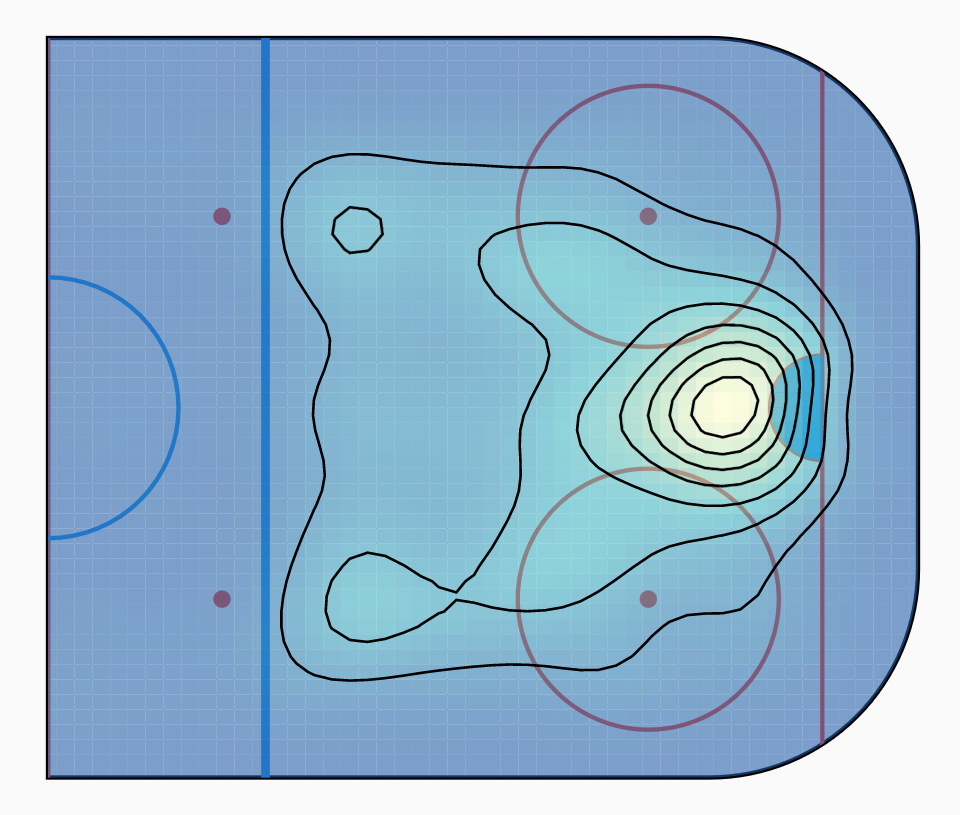
Our new endpoint returns a list of points for each contour, so we’ll need to build a painter that can draw a line through the points. We’ll build a painter that can draw an outline for a single contour, and we’ll use the Stack widget to sandwich all contours together in a single chart. Drawing the contour lines on top of our density chart, we get our final chart.
class ContourChart extends StatelessWidget {
  final List<List<Vector2>> contours;
  final Range defaultXRange;
  final Range defaultYRange;

  const ContourChart(
    this.contours, {
    Key key,
    this.defaultXRange,
    this.defaultYRange,
  }) : super(key: key);

  @override
  Widget build(BuildContext context) {
    var contourPainters = contours.map((contour) {
      return CustomPaint(
        painter: ContourChartPainter(
          contour,
          defaultXRange: defaultXRange,
          defaultYRange: defaultYRange,
        ),
        size: Size(double.infinity, double.infinity),
      );
    }).toList();

    return Stack(children: contourPainters);
  }
}

class ContourChartPainter extends CartesianPlotPainter {
  final List<Vector2> points;
  final Range defaultXRange;
  final Range defaultYRange;

  ContourChartPainter(
    this.points, {
    this.defaultXRange,
    this.defaultYRange,
  }) : super(
          points,
          defaultXRange: defaultXRange,
          defaultYRange: defaultYRange,
        );

  @override
  void paint(Canvas canvas, Size size) {
    var paint = Paint()
      ..color = Colors.black
      ..style = PaintingStyle.stroke
      ..strokeWidth = 1.0
      ..isAntiAlias = true;

    var path = Path();
    var offsets = getOffsetsForCanvas(size);

    offsets.asMap().forEach((index, offset) {
      if (index == 0) {
        path.moveTo(offset.dx, offset.dy);
      } else {
        path.lineTo(offset.dx, offset.dy);
      }
    });

    canvas.drawPath(path, paint);
  }

  @override
  bool shouldRepaint(CustomPainter oldDelegate) {
    return true;
  }
}

Conclusion
When dealing with a small dataset, a simple scatter-plot is more than enough. However, we’ve seen how a scatter plot fails once we start plotting more than 2,000 points on a chart scaled for a mobile screen. With a little bit of help from Python’s statistic libraries, we’ve been able to build a chart that can handle a large dataset while still providing meaningful insights. We’ve been able to port advanced charting functionality that isn’t currently available in any Flutter or Dart library. The approaches taken in this article are pretty commonplace in the world of data visualization and can be applied across all mobile frameworks. Flutter and CustomPainter just make it easier :)
I’ve interspersed my code throughout this article, but please take a look at my repository if you want to see the full end to end solution.
#flutter #mobile-app
