How to Pivot your Data in Jupyter Notebooks
In this post, i like to show you an alternative way to pivot your data in Jupyter Notebooks. After mastering this approach, you’ll easily generate interactive reports in no time.
How to make pivoting data in Python interactive
The greatest thing about the approach I’m going to show is that you can save the resulting notebook with interactive data visualization components to HTML and send it to your friends and teammates. They can open it in the browser, play with the pivot table and pivot charts, gain their personal insights, save the report they configured and resend it to you. This may make the entire data analysis experience more productive.
We’ll be working in JupyterLab since it’s an extremely comfy environment to run your notebooks in. JupyterLab is simply a user-interface for Jupyter Notebooks. Everything you use in a classical Jupyter is here: notebooks, file browser. But JupyterLab offers more extended functionality: you can install extensions, expand and collapse cells, drag and drop them — the feature you may lack in Jupyter. Also, the text editor provides a tab auto-complete feature.
Building a report in JupyterLab
So, run your JupyterLab and let’s start!
First and foremost, let’s import the Python libraries we need. These include pandas, json, and the display module from IPython. All these libraries are shipped with Anaconda distribution, but if you’re not working with it, you may need to install these libraries globally or within your virtual environment.
- pandas is a must-have library for working with data structures in Python.
- IPython is an API for interactive and parallel computing in Python. display is its module that presents API for display tools in IPython.
- json library provides an API for JSON encoding and decoding. If you’ve ever used
marshalorpicklemodules, its API will be familiar to you.
For data visualization, we’ll be using Flexmonster Pivot Table & Charts, which is a JavaScript library.
What about data? For the demonstration purposes, I’ve chosen an ‘Avocado Prices’ dataset from Kaggle. It’s lightweight and contains a reasonable number of fields. Instead, you can choose any data set you like.
▶ Load your data.Using pandas, read CSV data to the dataframe. Drop the column Unnamed: 0 — an index column that often appears when reading CSV files.
df = pd.read_csv('avocado.csv')
df.drop(columns=['Unnamed: 0'], inplace=True)
▶ Call the to_json() method on the dataframe to convert it to a JSON string and save it to the json_data variable.
json_data = df.to_json(orient='records')
The 'orient' parameter defines the expected JSON string format. Here we set it to the ‘records’ value. This value translates the object into a list-like structure, namely [{column -> value}, … , {column -> value}]. This is exactly the format that Flexmonster works with.
▶ Now let’s create an instance of Flexmonster using a nested dictionary. Here we specify all the necessary initialization parameters and pass the decoded data to the component. For decoding JSON, we use json.loads() method.
flexmonster = {
    "container": "#pivot-container",
    "componentFolder": "https://cdn.flexmonster.com/",
    "width": "100%",
    "height": 430,
    "toolbar": True,
    "report": {
        "dataSource": {
            "type": "json",
            "data": json.loads(json_data) # decoding JSON
        },
        "slice": {
        "reportFilters": [
            {
                "uniqueName": "Date.Year",
                "filter": {
                    "members": [
                        "date.year.[2018]"
                    ]
                }
            },
            {
                "uniqueName": "Date.Month",
                "filter": {
                    "members": [
                        "date.month.[january]"
                    ]
                }
            }
        ],
        "rows": [
            {
                "uniqueName": "region"
            },
            {
                "uniqueName": "type"
            }
        ],
        "columns": [
            {
                "uniqueName": "[Measures]"
            }
        ],
        "measures": [
            {
                "uniqueName": "Total Volume",
                "aggregation": "sum"
            },
            {
                "uniqueName": "Total Bags",
                "aggregation": "sum"
            }
        ],
        "sorting": {
            "column": {
                "type": "desc",
                "tuple": [],
                "measure": {
                    "uniqueName": "Total Volume",
                    "aggregation": "sum"
                }
            }
        }
    },
    "options": {
        "grid": {
            "type": "classic"
        }
    },
    "formats": [
        {
            "name": "",
            "decimalPlaces": 2
        }
    ]
}
}
As you see, we set the slice, options, and formats at once. We could skip this step and then the pivot table would display the default slice, but I think it’s better to learn how to do it from the very start.
▶ Now we encode Python object into JSON using json.dumps():
flexmonster_json_object = json.dumps(flexmonster)
▶ The next step is to define a function that renders the pivot table directly into the cell. For this, we’ll define a multi-line string and pass it to the imported HTML function:
def render_pivot_table(json_component):
    layout = '''
      <script src="https://cdn.flexmonster.com/flexmonster.js"></script>
      <h1>Flexmonster Integration with Jupyter Notebook</h1>
      <div id="pivot-container"></div>
      <script>
      new Flexmonster({0});
      </script>
      '''.format(json_component)
    return HTML(layout)
▶ Finally, we can pass the JSON to this rendering function and call it:
render_pivot_table(flexmonster_json_object)
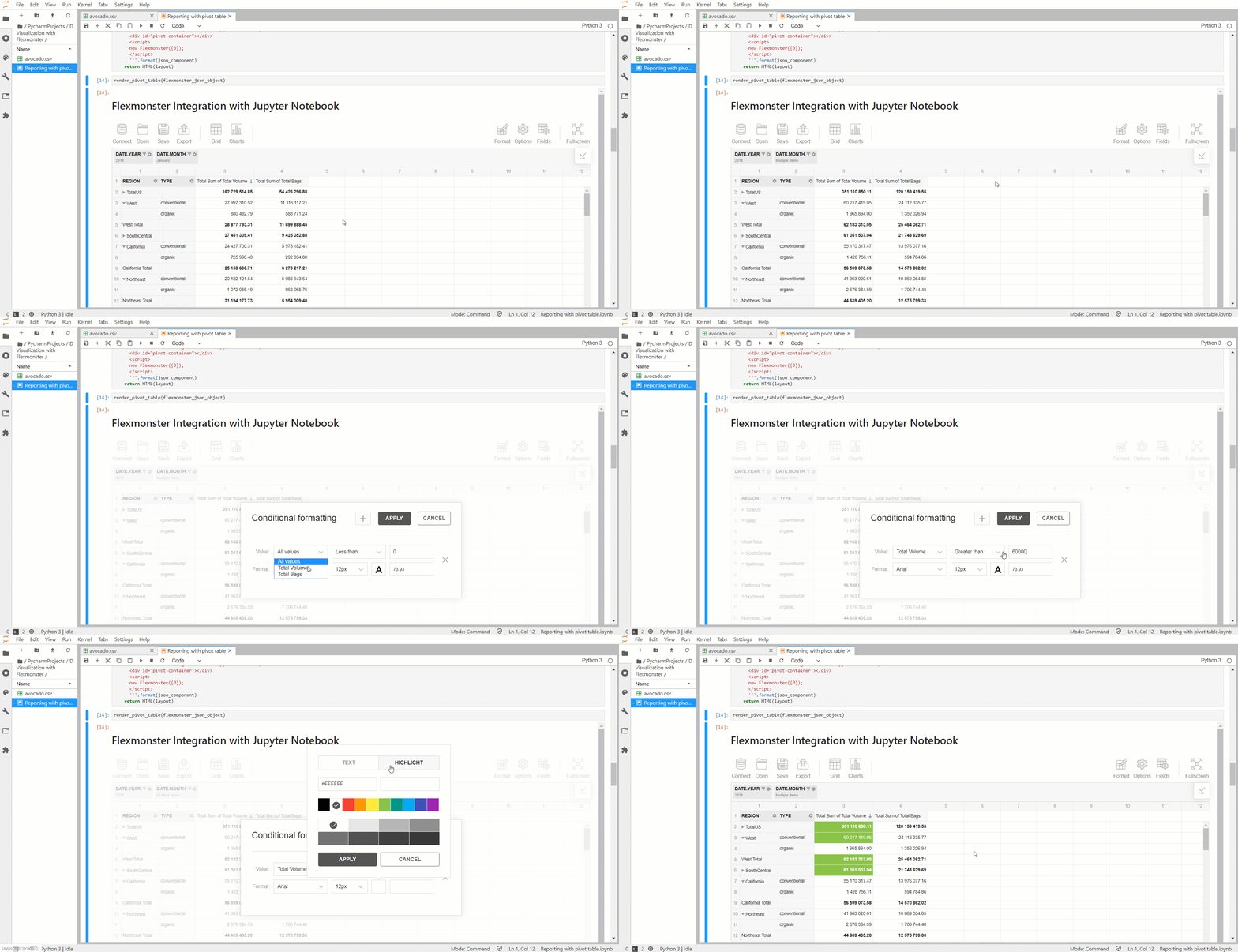
You see the interactive pivot table on the page. And the data set is ready to work with: you can rearrange the fields on the grid, change aggregations, set filtering and sorting, format values, and do everything to create your unique report. Besides, if you miss the way records were displayed within the dataframe, you can switch from the pivot mode to the flat view. This way you’ll see the data as it comes from the source, but with interactive functionality.
Here’s how the pivot table looks like now:

Additionally, you can try applying conditional formatting to focus on the values that matter most.
Making a dashboard in Jupyter Notebook
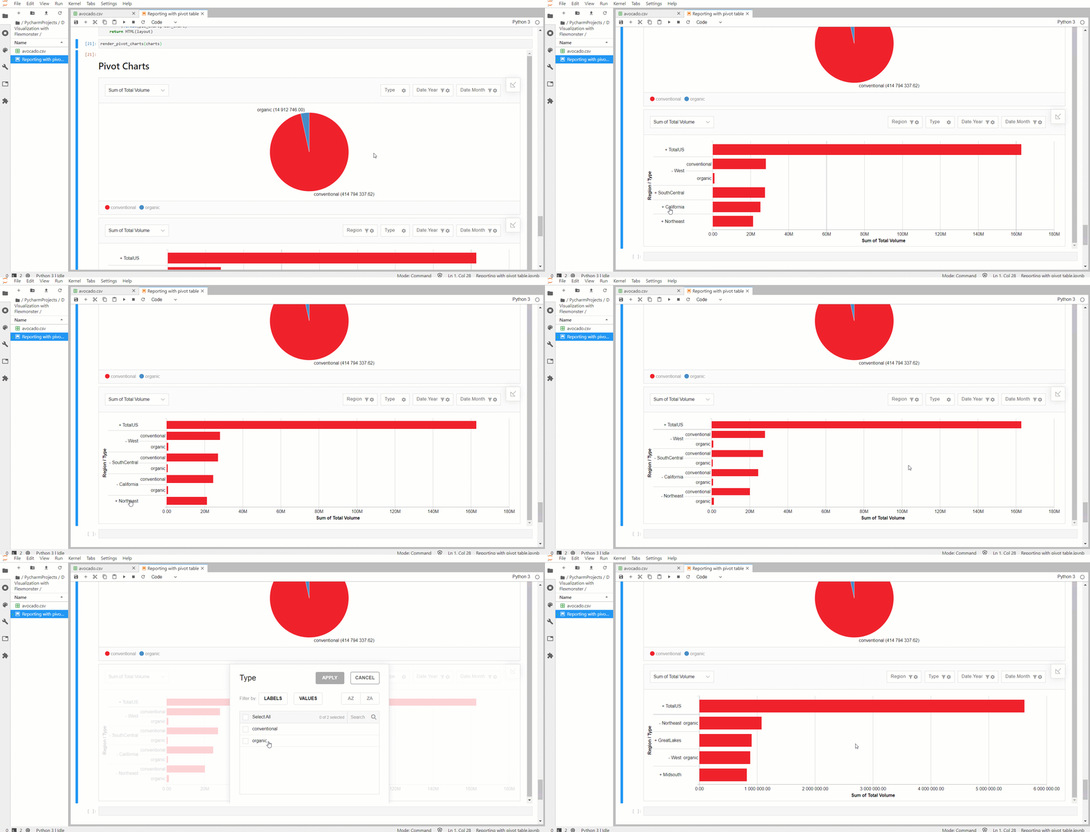
Now, let’s complicate our logic a bit by adding more elements to the notebook. Two pivot charts will make our data visualization more versatile. For this, we’ll define an extra function that accepts multiple JSON components and renders them on the page. Its logic is the same as for a single pivot table. Pivot charts components are defined in the same way as for a pivot table.
In the report slices for pivot charts, we can set Top X filters, which are comfy for limiting the number of categories displayed on the pivot charts. This makes them more neat and compact.

Now you can enjoy an interactive dashboard inside your Jupyter Notebook! Don’t hesitate to generate a report on your data analysis and share it.
Final thoughts
Todaywe tried a new way of manipulating and presenting data in Jupyter Notebook, using Python and a JavaScript data visualization library. As you see, it takes not too much code and time to set everything up.
Once you do it, you can explore your data right in the workspace you’ve got used to.
This approach frees you from rewriting bits of code each time you need to look differently at the data. And it goes hand-in-hand__with the central idea of Jupyter Notebooks — to make the data visualization and data analysis interactive and flexible.
You can find the full code on GitHub.
Thank you for reading!
#python #jupyter notebook #javascript
