The Ultimate Guide to CSS Grid
You are probably already familiar with the CSS box model, so let’s begin this tutorial with a similar bird’s eye view representation of CSS Grid.
CSS Grid Anatomy is composed of the primary container which is just your standard
To make a parent CSS grid container out of any element add display: grid to it. Grid’s items are children nested inside the parent container. They are usually defined as a list of elements that could represent a header, sidebar, footer or similar website layout elements, depending on your application’s design.
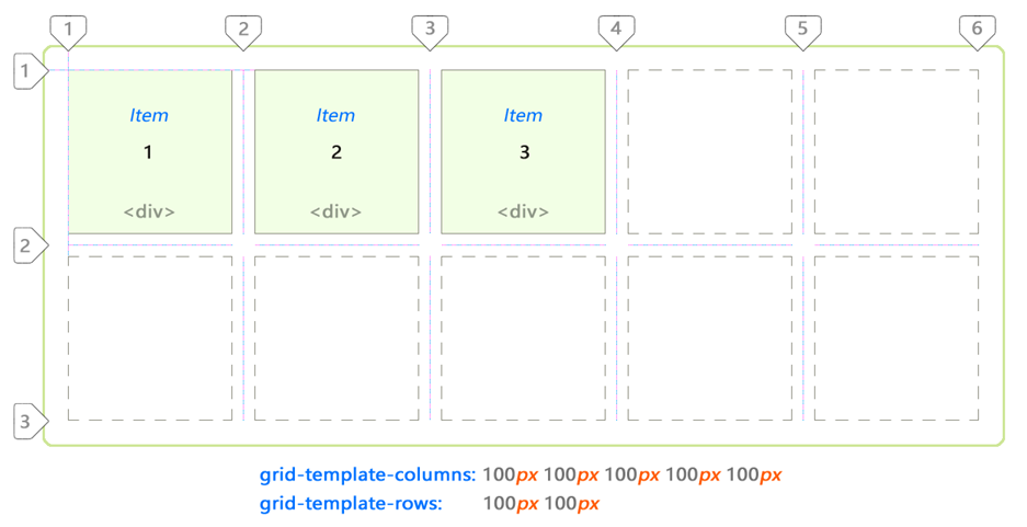
In this case there are 3
Notice that lines can also be counted backwards using the negative coordinate system.
The grid above is 5 by 4 cells in dimension. It is defined as follows:
div#grid {               /* This is our CSS grid parent container */
  display: grid;
  grid-template-columns: 100px 100px 100px 100px 100px; /* 5 cols */
  grid-template-rows:    100px 100px 100px 100px;       /* 4 rows */
}
Number of rows and columns is assumed implicitly by number of values set.
In between each cell there is a line and an optional gap.
Rows and columns between the lines are referred to as the grid’s tracks.
There are always [cell + 1] lines per dimension.
Therefore 5 columns will have 6 lines whereas 4 rows will have 5 lines.
In the following example there are 7 columns and only 1 row:
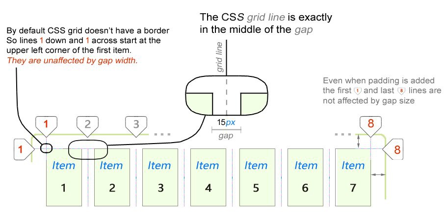
The first important thing you will notice about CSS grid is that outer lines are not affected by gap size, only inner lines. We will take a deeper dive into this a bit later in this tutorial when we look at fractional (fr) units.
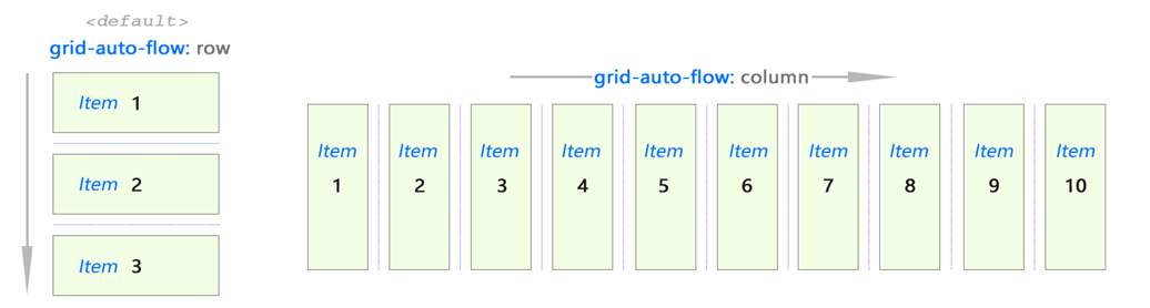
The CSS grid is bi-directional. Its items can flow either horizontally (column) or vertically (row). Set the value with grid-auto-flow property.
It works kind of like Flex:
Think about the grid in this abstract way:
Okay — so that’s the basic idea of how it works.
The creative part comes in when you are faced with the problem of actually juggling the item placements to create a sensible application layout. CSS Grid offers several properties to accomplish just that. We’ll take a look at them in the next section in this tutorial.
Let’s cement our knowledge so far by looking at these examples:
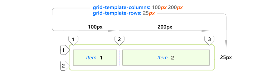
I only used two
Implicit and Explicit Content Placement
But what happens if we add one more item to the list?

Adding item 3 to the same layout will automatically extend it (blue item.)
This new spacing is created automatically by copying values from first row.
Let’s add Item 4:

And again our CSS grid has made a decision to stretch Item 4 across the remaining space in second row. This is because grid-template-rows specified enough space only for 1 row. The rest are automatic.
Placement of blue items is not explicitly specified by you. This is implicit (automatic) placement. They kind of just fall into that space.
Explicit Content Placement
This is just what you would expect from grid cells if you set custom values for all items on the list:
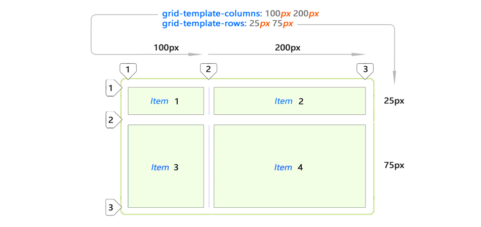
Basically you can gain control over the space on all consecutive rows by adding more values to grid-template-rows property. Notice the items are no longer implicit here. You defined them to be exact. (25px 75px).
Automatic Spacing
CSS Grid offers a few properties to automatically stretch its cells across variable / unknown amount of space.
Here are the key examples for both column and row auto flow cases:

The bottom example demonstrates the usage of the auto keyword. This just means that cell will stretch to fill up however much space is left in parent container after it has already been populated by explicitly placed items.
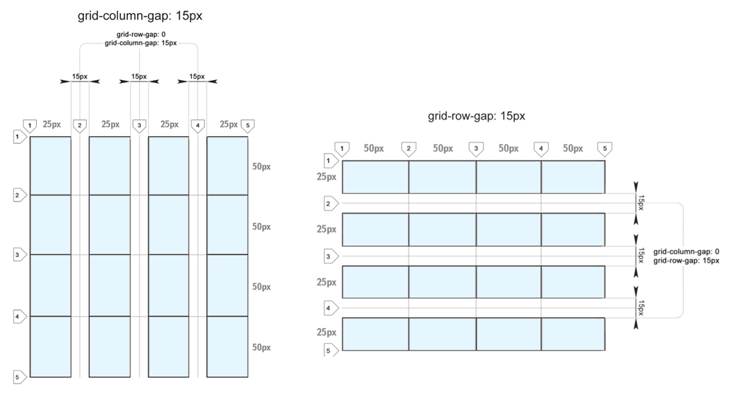
CSS Grid Gaps
Talking about CSS grid you can’t escape talking about gaps. Gaps are the horizontal and vertical spaces between grid cells.
#grid {
    grid-column-gap: 15px;
    grid-row-gap: 15px;
}
Gaps are controlled using grid-column-gap and grid-row-gap properties:
You can use varying gaps in both dimensions. This can be useful for creating video or image galleries:

Gaps across dimensions (columns and rows) can differ in size. But gap size is specified once for all gaps in the grid in a given dimension. As you can see here, gaps of varying size within the same dimension are not allowed:
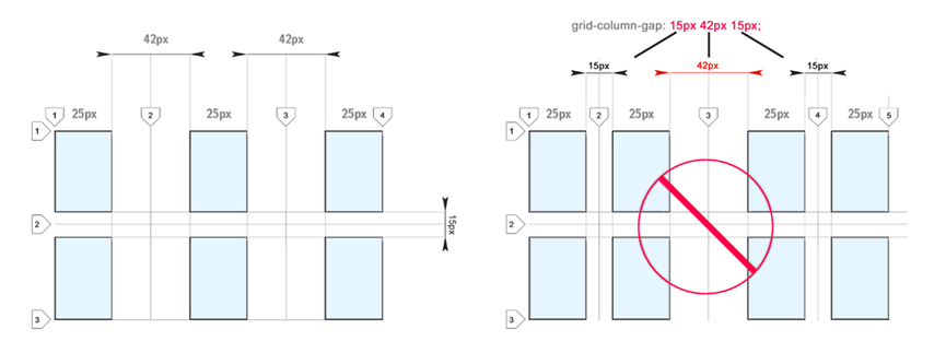
I really wish gaps of varying size were possible. I can see how this can actually be useful. Some suggest to use empty tracks in order to achieve a similareffect.
FR units (Fractional Units)
Fractional (fr) units are unique to CSS grid.
#grid {
    grid-template-columns: 1fr 1fr 1fr
}
A fractional unit allocates relative to all other elements in the parent:
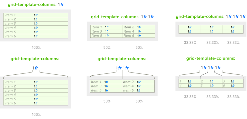
The behavior changes but 1fr remains the same whenever different values are used. Fractional units work similar to % values but they are easier and more intuitive to divide space with:

Behavior of fractional units (fr unit) changes based on all values provided in either dimension.
In this example only column-wise behavior is shown for simplicity’s sake. But it works the same for rows too. Simply use grid-template-rows property.
Fractional Units / Their Relationship To Gaps
Space defined using fractional units changes based on gaps. The same 1fr within the same parent will shrink to a smaller size when gaps are added:
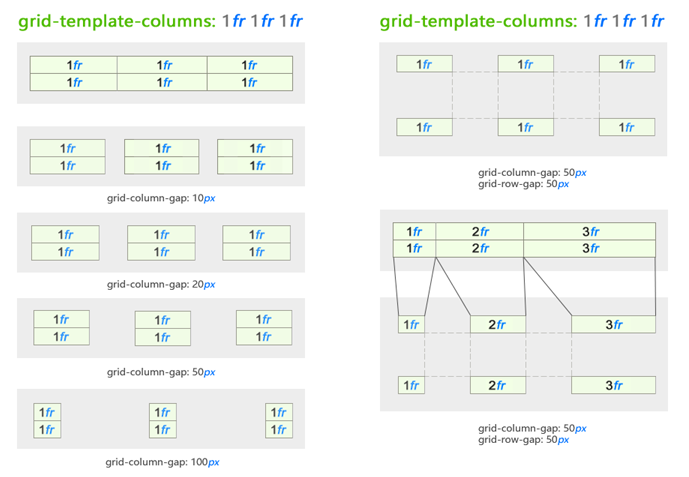
Here we added gaps to cells specified using fr units.
As you can see, this gives you a pretty good set of properties to space content basically in any way you wish without worrying about pixel values.
These new dynamics render pixel-perfect design as a thing of the past. We will now think about layout design using the intuitive approach!
Finally, to give you a better idea of using non-whole fractional units here is a fun grid I created. You can specify them using floating point numbers too:

#grid {
    grid-template-rows: 1fr 1fr 1.4fr 2.0fr 2.5fr 2.0fr 1.5fr 1fr
    grid-template-columns: 1fr 1fr 1.5fr 2.0fr 2.5fr 2.0fr 1.5fr 1fr
}
Content Placement
We’ve just dissected the CSS Grid anatomy. Hopefully you have a better idea of how CSS grid structures content. But now we need to get creative and actually place some items inside it. How it’s done might modify default behavior of the CSS grid. We’ll explore how this happens in this section.
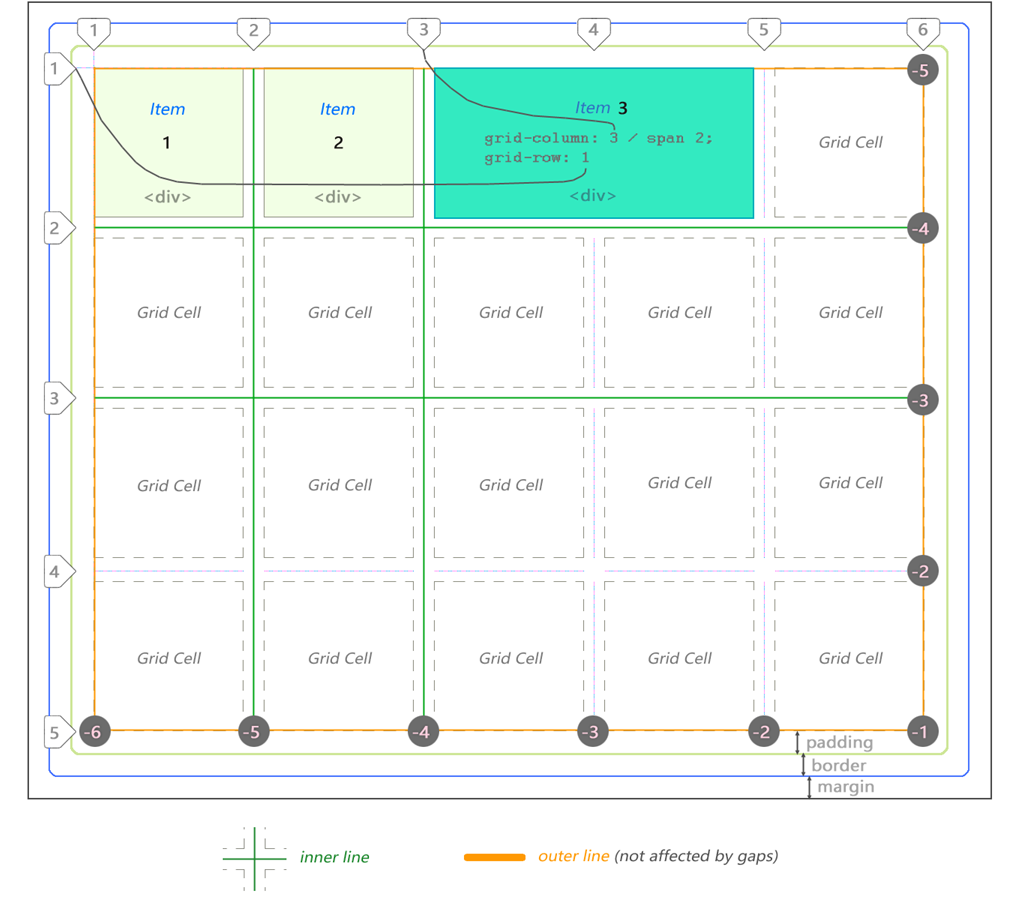
To arrange your items across cells or template areas on the grid you will refer to them by lines between cells. Not -like spans.
CSS grid does allow using spans for determining width and height of the content area (in cell space) just like tables. We’ll explore that in just a bit. But you still can and probably should specify the starting cell using line numbers or named lines (more on this in a bit.) This depends on your preference.
As far as content placement across multiple cells goes the most obvious and tempting thing is cell spanning.
Cell Content Spanning
You can span an item across multiple cells.
Important: Spanning changes location of the surrounding items.
Spanning using grid-column and grid-row
Using grid-column and grid-row properties on the item element itself:

The blue items changed location after making Item 7 span across multiple cells. And orange items were bumped down a row.
There is another way of doing the same thing.
Spanning using grid-column-start
With grid-column-end, grid-row-start and grid-row-end you can specify actual starting and ending points across which you want to span cell content.
I removed the items past 15 (orange ones) because we no longer need them:
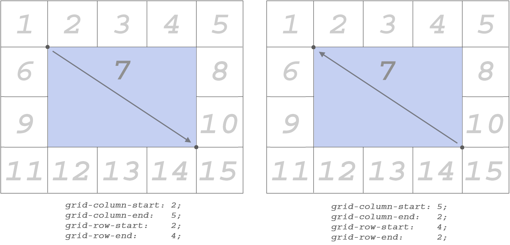
Type these properties directly into the item you wish to be affected by them.
Stretching content across column and row lines works in both directions.
min-content and max-content
The values min-content and max-content are supplied to grid-template-columns or grid-template-rows properties just like any other size-related value (for example px, 1fr, etc.)

Let’s take a look at this specimen. It is our starting point. We’ll change things around a bit to see how min/max values affect cells.
Let’s see what type of results will be produced if we switch one of the columns to min-content and max-content:

With one-word text there’s no difference between the results observed whether we use min-content or max-content. Here it is because hello is a single word. Its min and max values are exactly the same.
But things get interesting with more complex text. The following example will demonstrate the basic idea behind min-content and max-content:

Here min-content used longest word in the sentence (stranger) as its base width.
When using max-content the entire text string with spaces filled the space.
But what happens if we apply min-content or max-content to all cells?

I noticed that by default the text was centered whenever I used min-content on it although text-align: centerwas not set on the item.
Images and max-content
I placed the image of this blue rose into the cell.
And just as expected, the grid expanded to allocate enough space:
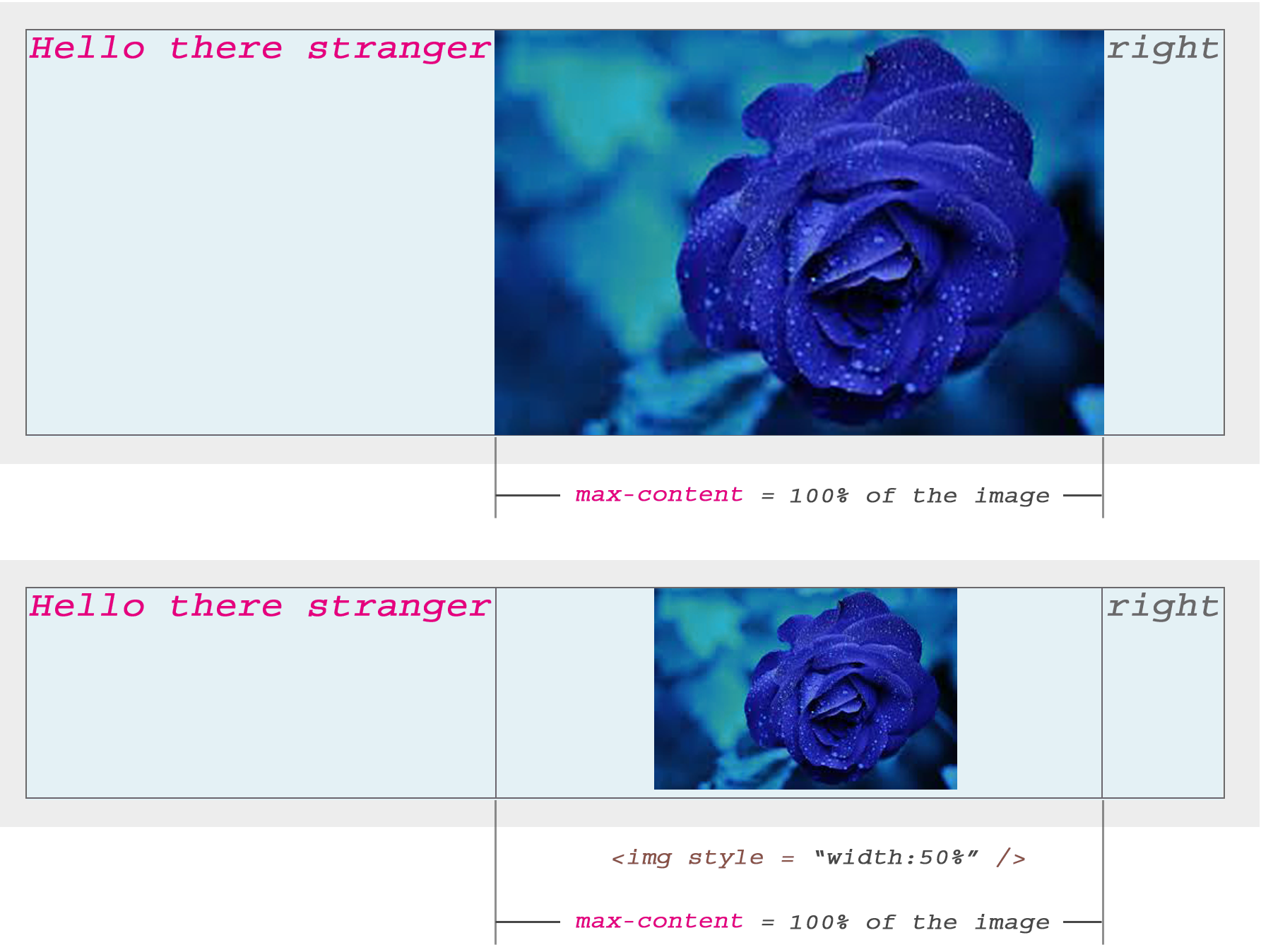
When I explicitly set the width of the image to 50% just to see what happens CSS Grid still kept the cell width to 100% of the image but displayed the image at 50% width (as expected) and auto-centered it horizontally within the cell.
Both text and images (or any content) will be automatically centered within CSS Grid’s cells by default.
Content Positioning
Up until this point we’ve talked about Grid’s structure in general.
In the next section, we’ll take a look at how to achieve “multi-directional” float inside cells. We won’t be using float property here of course.
Multi-directional 360° float
I don’t think CSS Grid specification calls it that. But, indeed it is possible to create exactly that – a 360-degree floating behavior.
This works on both inline and blocking elements! And I think this is my favorite feature from the entire CSS Grid’s set of abilities.
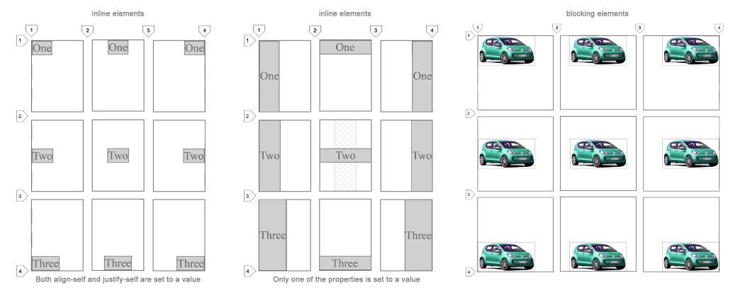
All 9 combinations are possible using align-self and justify-self properties.
They are explained below.
Align Self (align-self)
This property helps you position content vertically.
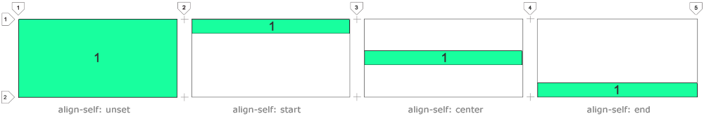
Use align-self: start to align content to the upper edge of the cell.
Use align-self: center to align content to its vertical middle.
Use align-self: end to align content to the bottom of the cell.
Justify Self (justify-self)
This property helps you position content horizontally.
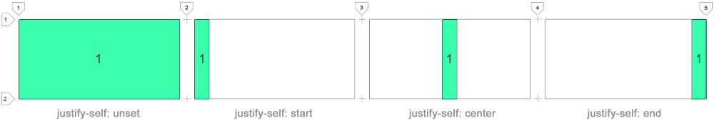
Use justify-self: start to align content to the left edge of the cell.
Use justify-self: center to align content to its horizontal middle.
Use justify-self: end to align content to the right edge of the cell.
You can use any of the 9 justify-self x align-self combinations to align anything anywhere aka multi-directional float.
Template Areas
Template areas are defined using grid-template-areas property.
Note, template areas for each row are enclosed in double quotes.
Each column is separated by space.
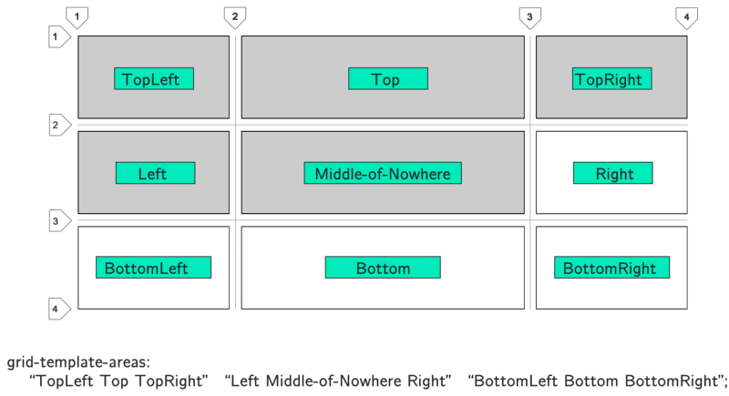
In this example I simply explained how to name ares. To take real advantage of template areas you need to categorize rectangular blocks of cells by same name.
Tetris blocks are not allowed. You can only use rectangles:

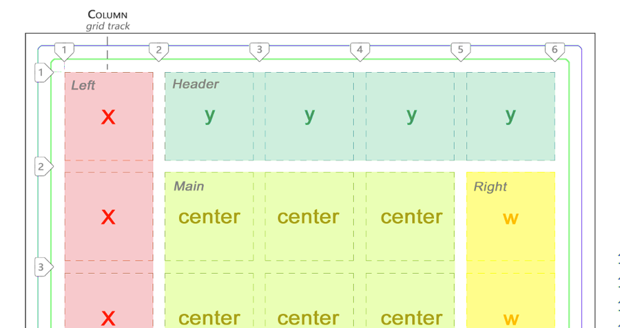
Here Left is one area spanning 3 cells down. CSS Grid automatically treats it as a single block. The same goes for Right. In this simple example I created two columns. But you get the idea. Block out larger areas by naming them.
To place an item into that area simply add grid-area: TemplateName. In this case it is grid-area: Left or grid-area: Right.
Template area names cannot use spaces. I used dashes here.
Practical Example of CSS Grid Template Areas
We now understand how to block out rectangular areas. Let’s take a look at a potentially real-world scenario. Here I’ll demonstrate a very basic layout.
I blocked a very simple website layout with two sidebars, a header and footer areas. The main area is in the center occupying 3 x 2 cell space:

grid-template-areas: 'z y y y y'
                     'x center center center w'
                     'x center center center w'
                     'x z z z z';
Grid template areas, CSS style.
<div id = "grid">
    <div style = "grid-area: x">Left</div>
    <div style = "grid-area: y">Header</div>
    <div style = "grid-area: z">Footer</div>
    <div style = "grid-area: w">Right</div>
    <div style = "grid-area: center">Main</div>
</div>
HTML
We only need 5 items here. Add any more and they would be pushed outside of the main grid area into implicit cells.
Just make sure to always keep your areas square or rectangular.
Naming Lines
Instead of always referring to lines by their number, you can also name them. This way they will be easy to remember for stretching items across multiple cells. Numbers can get tedious!
Below is a representation of what it looks like:

Use square brackets to name your lines. Then use these names when specifying the length your items need to span across using / slash.
Use Cases
Your layout depends on the purpose of your website.
Now that we know basic CSS grid features let’s apply them in a practical example.
We’ll build a mobile-first layout using the following guidelines:
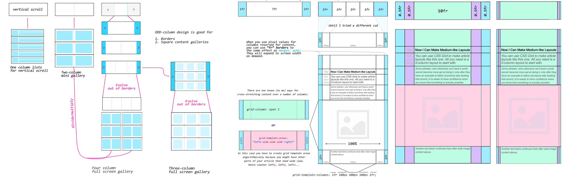

Basic Ideas Behind Column Division
I tried to figure out what we actually gain from each column division.
One-column designs help us put all of our content into long vertical list.
Two-column designs are okay for mini (tablet?) image galleries/portfolios.
Tree-column designs are the first of its kind to offer borders (margins).
Four-column designs work well as full-screen image galleries.
I noticed odd-number column layouts (≥ 1) work for border-basedlayouts.
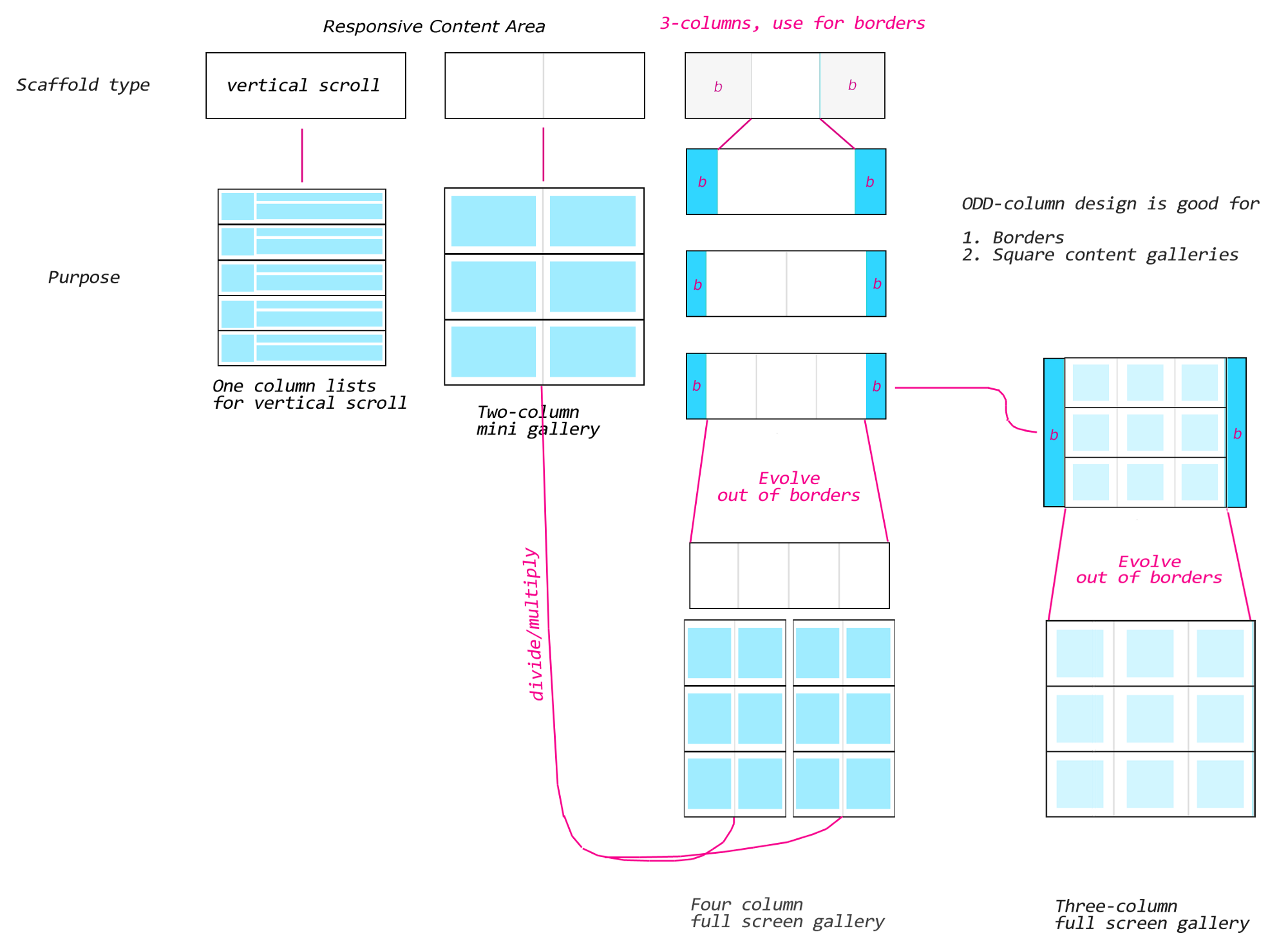
Use frunits to make them expand like you would with margin: auto on regular elements. It doesn’t matter if it’s 1fr or 2fr or n-fr for borders, as long as the primary content is specified using pixels or a large® frvalue (10fr, 20fr, etc):

Responsive Grid and Going Mobile
So far we created the primary scaffold. But what about responsivedesign?
CSS Grid makes things easier than you think!
Remember: responsive content != responsive borders. The two techniques should be dealt with separately. But often, as in this case, it is possible to solve the responsive content problem by solving the responsive border problem.
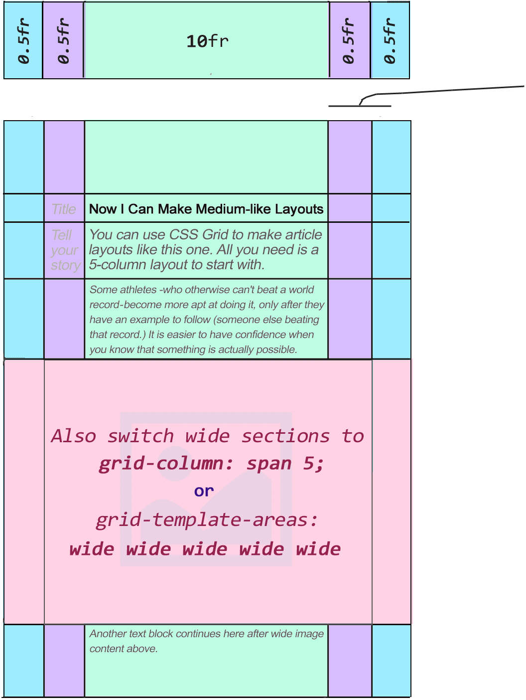
If you can use your creativity to solve multiple problems by using one technique, all the better. Having said this, in this case, we can solve it simply by switching the outer lanes of your template to 0.5fr (the purple and blue ones). Also, switching either span or the template areas to expand into multiple columns making a wide content space (the pink area above). You can do this via media queries or JavaScript.
Finally, change the main lane (green) to 10fr. (You can use a similar value, but ≥10 usually will work fine.) This will automatically scale your main (green) lane to the current screen resolution. Since both borders are now 0.5fr, everything including borders and content will scale properly.
If you need to remove 0.5fr borders completely, you can set them to 0fr. But I personally like to have a tiny border on mobile views. It just makes the content lane look better in my opinion.
Once all of the steps above are followed, when squeezed to a smaller space you should arrive at something like this:

Lesson Learned Here?
Always try to find the most graceful solution. Meaning, it’s clean, uncomplicated, and if possible solves multiple problems by applying a single change (or two). This is not as hard as it may sound.
- Is this the only solution? No.
- Is this a perfect solution? No.
- But it solves the problem, and it works— sufficiently enough for creating simple mobile layouts.
And all that is a good thing to aim for. The approach shown in this tutorial is:
1. More rewarding and fun
2. It’s respectable.
3. It invites you to actually understand how and why something works.
4. It’s simple, hence, creates easy-to-maintain code.
5. It produces clean code.
6. Keeps your conscience clean.
The last thing you want to do is to start “hacking” together code — trying to solve problems by trial and error, often without understanding how it actually works. You will still get things done this way, but it won’t be any fun.
In Conclusion
CSS Grid is a comprehensive subject, so this is nota complete CSS Grid tutorial on how to build actual CSS layouts. I simply used one example for each separate part as a starting point for someone new to the grid.
Hopefully the information here was insightful and inspired interest in building websites using CSS Grid.
CSS Grid isn’t just an HTML element. It’s an entire system for building responsive websites and web applications.
Its __properties__and values describe the conglomerate of techniques learned from over a decade building websites using common HTML tags.
Originally published by JavaScript Teacher at https://www.freecodecamp.org
#css #web-development