My goal was to get a better understanding of how to work with tabular data so I challenged myself and started with the Titanic -project. I think this was an excellent way to learn the basics of data analysis with python.
You can find the competition here: https://www.kaggle.com/c/titanic
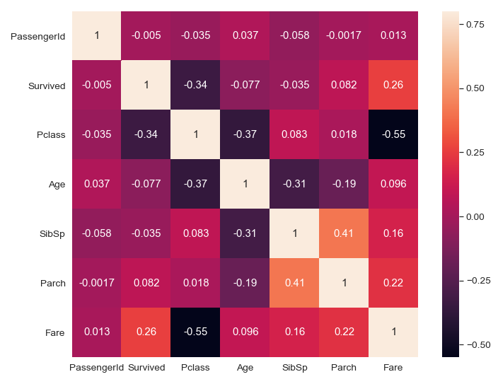
I really recommend you to try it yourself if you want to learn how to analyze the data and build machine learning models.
I started by uploading the packages:
import pandas as pd
import numpy as np
import matplotlib.pyplot as plt
import seaborn as sns
Pandas is a great package for tabular data analysis. Numpy provides a high-performance multidimensional array object and tools for working with these arrays. Matplotlib packages help you to generate plots, histograms, power spectra, bar charts, etc., with just a few lines of code. Seaborn is developed based on the Matplotlib library and it can be used to create attractive and informative statistical graphics.
After loading these packages I loaded the data:
df=pd.read_csv("train.csv")
Then I had a quick look at the data:
df.head()
#This prints you the first 5 rows of the table
#If you want to print 10 rows of the table instead of 5, then use
df.head(10)

Screenshot of the first rows
df.tail()
This prints you out the last five rows of the table
I recommend starting with a look at the data so that you can be sure everything is as it should be. This is how you can avoid stupid mistakes in further analysis.
df.shape
#This prints you the number of rows and columns
It is a good habit to print out the shape of the data in the beginning so you can check the number of columns and rows and be sure you haven’t missed any data during the analysis.#titanic-dataset #kaggle #python #data-analysis #data analysis