A recent project came with some big challenges. The client wanted a demo experience that would display a range of different websites within a branded ‘container’. These demo websites would be interactive within a mock desktop or mobile device, each with its own individual theme. In this article, I will dive deeper into:
- How we set up the project files
- Theming using Styled Components
This was challenging enough, but on top of this, we needed to give the user the ability to toggle between the mocked ‘desktop’ display and ‘mobile’ display modes, all within this static container, without using media queries. I will address this challenge in a follow up article.
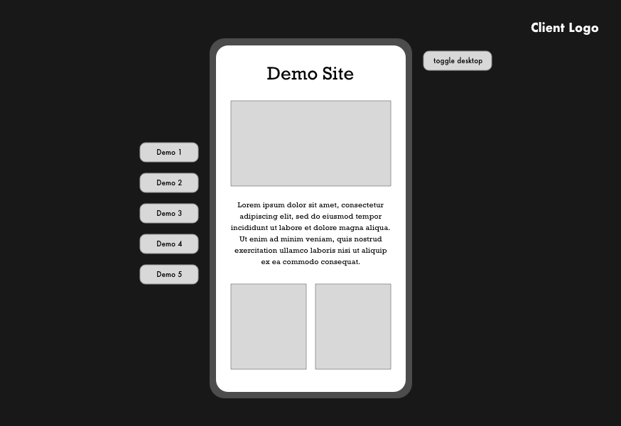
Here are two illustrations of what we produced:
Mobile view
Desktop View
How many themes do we need? 💭
The first step here was figuring out how many themes we were going to need, and secondly, how to set up these themes. It was crucial that we set this up correctly from the beginning, to save us a lot of grief in the long run.
- Here we need one theme for the static container, which will stay the same regardless of the active demo. This is going to have a branded dark theme to match the Client’s style guide.
- We also need one theme per ‘demo’, which will change depending on which demo is active. So three demos would mean three more themes, etc.
#programming #typescript #javascript #styled-components #react