At this year’s Codecation, we had an activity planned to break up the programming sessions. As a group of 17 people, it’s hard to accommodate everybody’s wishes so we organized a session where we voted for what we wanted to do. The poll included 8 alternatives:
🚴 Biking
🏖 Beach
🧗 Gibraltar Rock
👟 Hike (mountains)
👀 Village watching
🕵️ ️Escape Room
🏸 Paddle
🍷 Wine Tasting
Everybody was asked to prioritize the activities between 1 (most preferred) and 8 (least preferred). This is a powerful voting system since you can also specify what you do not want to do. Below is the distribution of votes for each activity.
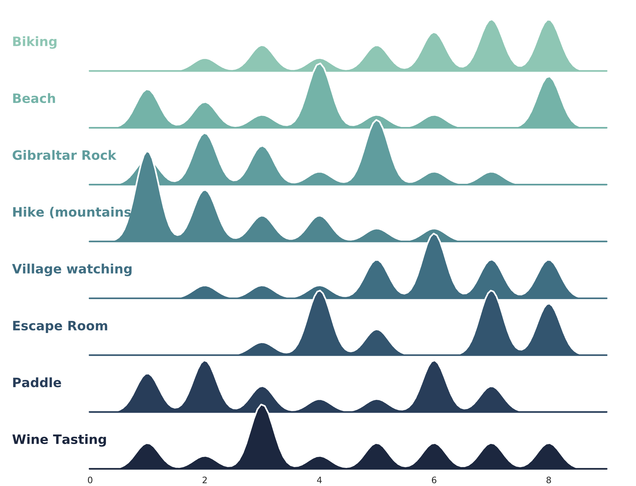
We can see that nobody wanted to go biking, most people were interested in mountain hiking, and wine tasting was a typical third alternative while people had polarized views on paddle tennis.
If we were to make a decision about what activity to do based on the above plot and our intuition, it would be hiking. We can further strengthen our intuition by plotting densities for each activity:

In the above violin plot, we can see that the mean score is lowest for hiking, and there’s very low standard deviation in the votes (orange horizontal line), compared to the other activities. If a violin looks like an hourglass, it means that people had polarized views on that activity.
Deciding for the entire group to go hiking would be a decision that no one can blame you for, but we can do better. For example, the same people that didn’t prioritize hiking could rate the same, other activity as a priority. That would mean that no one gets upset if we split up. People were okay with splitting into two groups. But how do we make such a split?
#data-science #startup #adventure #visualization #decision-making