Modern file-upload Components & Hooks for React
Modern file-upload components & hooks for React.
Intro
React-Uploady is a lightweight library - enabling you to build (client-side) file-upload features with just a few lines of code. RU provides the foundations needed to upload files from the browser - The rest is up to you.

The philosophy behind this library is that it should be as simple as possible to use, yet customizable at every point. You can start simple, or you can can configure just about every aspect of the upload flow. For this purpose, RU provides components, hooks, and plenty of features. You get to choose which ones you need and only install the dependencies required (See Packages details below)
RU has a small footprint (by design) with very few (and small) dependencies.
| Bundle | Minified size | GZipped size |
|---|---|---|
| core | 32.8KB | 10.7KB |
| core + ui | 43.9KB | 13.5KB |
| core + ui + chunked support | 53.6KB | 16.0KB |
| everything | 78.7KB | 22.9KB |
Documentation
Getting Started
We recommend checking out the Uploady README first to understand how to configure your uploads and how to access upload data (using the provided hooks or events).
It’s also worth reading the Important Concepts section below for some key concepts.
In case you need UI components (like an upload button), check out the UI packages.
Additional Resources
Our Storybook has many examples, both simple and advanced.
Checkout our Guides section for additional examples & information.
Changelog
For a list of versions and changes, see the CHANGELOG
Installation
React-uploady is a mono-repo, and as such provides multiple packages with different functionality.
For React applications, at the very least, you will need the Uploady provider:
#Yarn:
   $ yarn add @rpldy/uploady

#NPM:
   $ npm i @rpldy/uploady
If you wish to use the uploading mechanism (no UI), at the very least, you will need the Uploader:
#Yarn:
  $ yarn add @rpldy/uploader

#NPM:
  $ npm i @rpldy/uploader
After that, you can add additional packages as needed. See below for more details.
Packages
Main Packages
- @rpldy/uploader - The processing and queuing engine
- @rpldy/uploady - The context provider for react-uploady and hooks (lots of hooks)
UI Packages
- @rpldy/upload-button - Upload button component and asUploadButton HOC
- @rpldy/upload-preview - Image&video preview component for files being uploaded
- @rpldy/upload-url-input - Input component to send URL as upload info (ex: Cloudinary)
- @rpldy/upload-drop-zone - (Drag&)Drop zone to upload files and folder content
- @rpldy/retry-hooks - Hooks to interact with the retry mechanism
Providers
- @rpldy/chunked-uploady - Wrapper for Uploady with support for chunked uploads
- @rpldy/tus-uploady - Wrapper for Uploady with support for tus(resumable) uploads
Senders
- @rpldy/sender - Uploady’s main file sender (XHR)
- @rpldy/chunked-sender - add chunked uploads support on top of the XHR Sender
- @rpldy/tus-sender - add TUS resumable upload support
- @rpldy/mock-sender - use Mock sender for testing purposes
Extra
- @rpldy/retry - Add support for retrying failed uploads
Shared Packages
- @rpldy/shared - Internal set of utils+types that all packages require
- @rpldy/shared-ui - Internal set of utils+types that all UI packages require
- @rpldy/live-events - provides cancellable pub/sub “events”
- @rpldy/safe-storage - safe (don’t throw) versions of local and session storage
- @rpldy/simple-state - deep proxy object, so it’s only updateable through an update method
React Native
- @rpldy/native-uploady - Uploay for React Native (no react-dom)
Examples
For specific usage, see documentation in the relevant package README file.
For upload options see the @rpldy/uploady docs.
Simple Upload Button
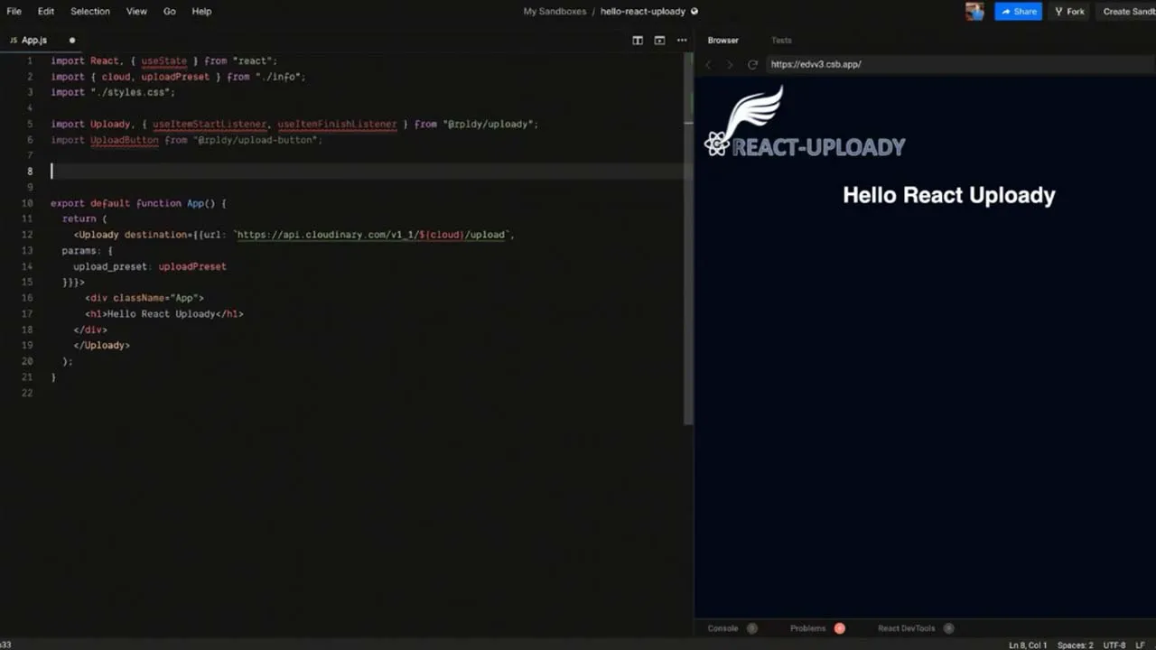
This examples shows how you add Uploady and UploadButton to your app. This is all it takes to get file uploading to work in your React application.
import React from "react";
import Uploady from "@rpldy/uploady";
import UploadButton from "@rpldy/upload-button";

const App = () => (<Uploady
    destination={{ url: "https://my-server/upload" }}>
    <UploadButton/>
</Uploady>);
Custom Upload Button
In case you want to use your own component as the upload trigger, use the asUploadButton HOC:
import React from "react";
import Uploady from "@rpldy/uploady";
import { asUploadButton } from "@rpldy/upload-button";

const DivUploadButton = asUploadButton((props) => {
    return <div {...props} style={{ cursor: "pointer" }}>
        DIV Upload Button
    </div>
});

const App = () => (<Uploady
    destination={{ url: "https://my-server/upload" }}>
    <DivUploadButton/>
</Uploady>);
Progress Hook
import React from "react";
import Uploady, { useItemProgressListener } from "@rpldy/uploady";
import UploadButton from "@rpldy/upload-button";

//must be rendered inside <Uploady>
const LogProgress = () => {
    useItemProgressListener((item) => {
        console.log(`>>>>> (hook) File ${item.file.name} completed: ${item.completed}`);
    });

    return null;
}

const App = () => (<Uploady
    destination={{ url: "https://my-server/upload" }}>
    <LogProgress/>
    <UploadButton/>
</Uploady>);
Add support for resumable(tus) uploads
 import React from "react";
 import TusUploady from "@rpldy/tus-uploady";
 import UploadButton from "@rpldy/upload-button";

 const App = () => (<TusUploady
     destination={{ url: "https://my-tus-server/upload" }}
     chunkSize={2142880}
     sendDataOnCreate>
     <UploadButton/>
 </TusUploady>);
Add support for chunked uploads
Can be used with servers that support chunked uploads
import React from "react";
import ChunkedUploady from "@rpldy/chunked-uploady";
import UploadButton from "@rpldy/upload-button";

const App = () => (<ChunkedUploady
    destination={{ url: "https://my-server/upload" }}
    chunkSize={5242880}>

    <UploadButton/>
</ChunkedUploady>);
Important Concepts
Upload Options
These are the options that are passed to the uploader to configure aspects of the upload process. For example, whether files can be grouped in a single request (by default, no).
Upload Options are typically passed to the Uploady instance. But these can be overriden. For example, by props passed to the upload button. Or even during upload processing.
Destination
Passed as a part of the upload options. It’s an object that is used to configure the end-point where the files will be uploaded to. It’s type is defined here.
See more information in the Uploady README.
At the very least, a destination should contain a URL property with the server endpoint.
Enhancer
(uploader: UploaderType, trigger: Trigger<mixed>) => UploaderType
Enhancers are functions that can enhance an uploader instance. They are also passed as part of the options given to the Uploady instance.
As they are applied when the uploader instance is created, they can change the way uploader does things or pass different defaults.
See this guide for practical information and sample code.
Batch
When a file or files are handed over to the uploader, they are grouped into a batch. This batch will have its own lifetime events. With a batch ID, it is possible to cancel all files that are part of it. It can also be used to retry all files in the batch (see @rpldy/retry).
BatchItem
Each file (or URL) added to the uploader are wrapped by a BatchItem object. They will have a unique ID within the life-time of the uploader instance. A BatchItem has its own lifetime events.
Resumable Uploads
RU supports resumable uploads through the tus protocol. Instead of using from @rpldy/uploady, use from @rpldy/tus-uploady and you will have resumable upload support on the client side. Your server will also have to support the same protocol for this to work of course.
See the @rpldy/tus-uploady documentation for more details.
UMD Bundles
React-uploady is also available on CDNs such as unpkg.com and jsdelivr.com
See this guide for more information on how to use.
jsDelivr
You will most likely need the polyfill (core js) bundle as well (load it first):
- core bundles -> https://cdn.jsdelivr.net/npm/@rpldy/uploady/umd/polyfills-bundle.js
- everything bundle -> https://cdn.jsdelivr.net/npm/@rpldy/uploady/umd/polyfills-all-bundle.js
unpkg
| Bundle | URL |
|---|---|
| core | https://unpkg.com/@rpldy/uploader/umd/rpldy-core.umd.min.js |
| core + ui | https://unpkg.com/@rpldy/uploady/umd/rpldy-ui-core.umd.min.js |
| core + ui + chunked support | https://unpkg.com/@rpldy/chunked-uploady/umd/rpldy-ui-core-chunked.umd.min.js |
| everything | https://unpkg.com/@rpldy/uploady/umd/rpldy-all.umd.min.js |
You will most likely need the polyfill (core js) bundle as well (load it first):
- core bundles -> https://unpkg.com/@rpldy/uploady/umd/polyfills-bundle.js
- everything bundle -> https://unpkg.com/@rpldy/uploady/umd/polyfills-all-bundle.js
Note that unpkg does a redirect to the latest version in case the URL doesn’t already contain it. So don’t copy any of the URLs above into your code. Instead, load them in the browser first and then copy the final URL from there (after the redirect).
Acknowledgements
logo’s wing thanks to Illustration Vectors by Vecteezy
Download Details:
Author: rpldy
Source Code: https://github.com/rpldy/react-uploady
#react #reactjs #javascript