The iPhone X screen became 20% taller compared to iPhone 8/8 Plus that is equal to 145pt of additional space. So, be ready to use artboards sized 375 x 812 in your favorite UI design software.
Apple reveals new iPhones every year but usually they don’t influence user experience as much as the iPhone X did. For designers, its edge-to-edge screen with no home button means they have to build a convenient and easy-to-use iPhone X app design despite the fact users have never been faced with anything similar before.
No doubt, the only sure way to create the well-tailored app designs for iPhone X lays through the path of trial and errors. Still, there are several tips facilitating this way which we would like to share with you in this article.
iPhone X screen size: Take pixels under control
Obviously that the main changes that affect the process of design start with phone’s edge-to-edge 5.8-inch display.
The iPhone X screen became 20% taller compared to iPhone 8/8 Plus that is equal to 145pt****of additional space. So, be ready to use artboards sized 375 x 812 in your favorite UI design software.
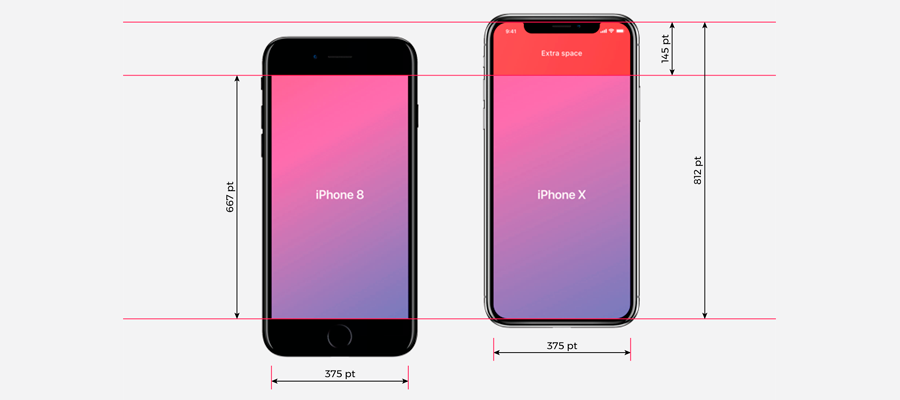
iPhone X screen dimensions compared to the iPhone 8
Let’s skip to our piece of advice on how to better deal with iPhone X screen resolution while designing.
1. Realign the interface elements
If exclude all these standard bars on iOS that take some extra place on the iPhone X screen, we get an impressive 641pt of ‘pure’ height where you can place the content of your app. Why is it a big deal? Because the iPhone 8 has about 570pt of useful space for comparison.

iPhone X resolution if compared to the iPhone 8
In terms of adapting app design for iPhone X, such resolution changes mean that you should rearrange the layout of interface elements if you want to preserve a pixel-perfect design of your app on the iPhone X. In other case, the elements may be placed too close to the notch that’ll make the design look inappropriate.
#design #iphone-x #ux-design #application #web-development #iphone #ios #ios-app-development