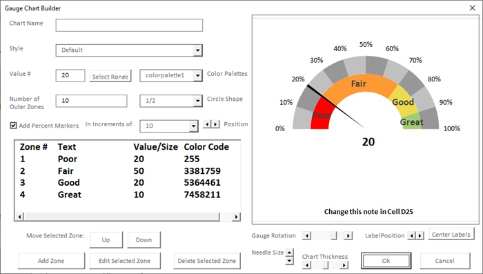
Create a Gauge Chart in Excel
Learn how to create gauge charts in Excel with this step-by-step guide. This is a great way to visualize data and make it more understandable.
In this quick Microsoft Excel tutorial video, learn how to create a Gauge chart in Excel.
Here are the steps on how to create a gauge chart in Excel:
- Enter your data in a table. The data should be in two columns, with the first column containing the values that you want to plot on the gauge chart, and the second column containing the labels for the values.
Sample data for a gauge chart in Excel
- Select the data that you want to use for the gauge chart.
- Click on the Insert tab.
- In the Charts group, click on the Gauge chart type.
- Select the Circular Gauge chart type.

Circular Gauge chart type in Excel
- Excel will create the gauge chart for you.
- You can customize the gauge chart by changing the colors, the labels, and the formatting.
Here are some tips for creating gauge charts in Excel:
- Use a consistent data range for all of your gauge charts. This will make it easier to compare the charts to each other.
- Use clear labels for your gauge charts. The labels should be easy to read and understand.
- Use different colors for different categories of data. This will help to make the data more visually appealing.
- Customize the formatting of your gauge charts to match your needs. You can change the fonts, the colors, and the borders to make the charts look the way you want them to.
Gauge charts are a great way to visualize data and make it more understandable. They are especially useful for data that is continuous, such as temperature, pressure, or speed. By following these steps, you can create gauge charts in Excel that will help you to communicate your data effectively.
#excel

2.50 GEEK