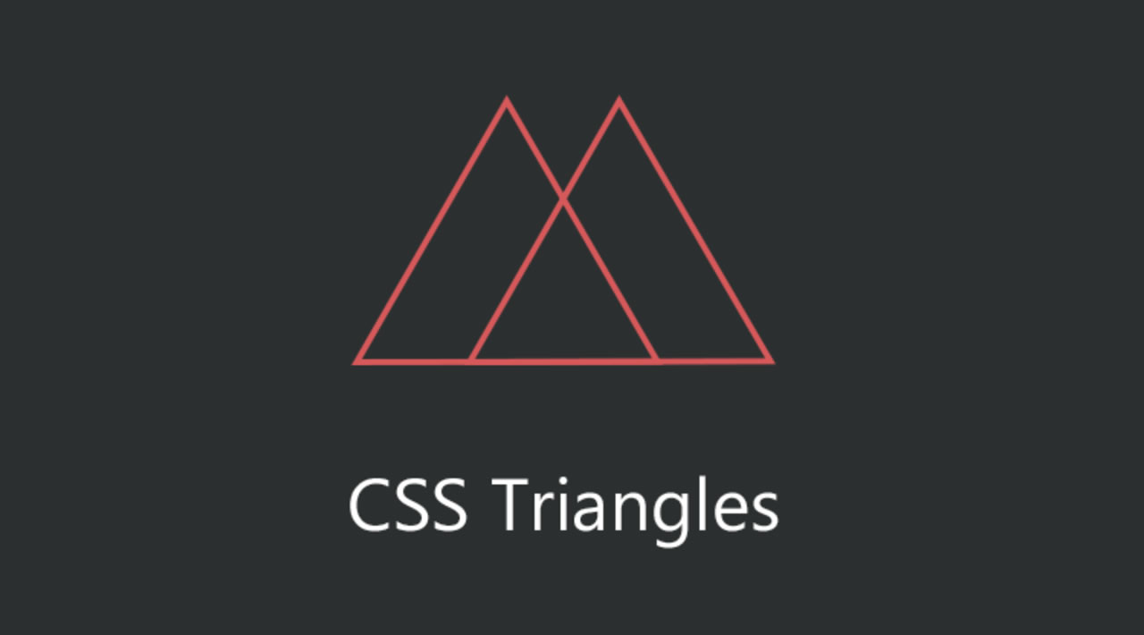
In this article I would talk all about triangles in CSS. As you already know everything in CSS is built on the box model so everything in CSS is shaped like a box. This makes creating triangles difficult, but with clever use of the border property we can create perfect triangles in CSS.
How To Create A Triangle
The first way you probably think of to make a triangle in CSS would be to take a square and rotate it 45 degrees. This would give you a diamond and then if you cover half of that diamond you are left with a triangle sticking out.
.triangle {
  position: relative;
  background-color: red;
  width: 100px;
  height: 100px;
}

.triangle::before {
  content: '';
  position: absolute;
  right: -20px;
  top: calc(50% - 20px);
  width: 40px;
  height: 40px;
  background-color: blue;
  transform: rotate(45deg);  z-index: -1;}
Now this works great until you no longer can use something else to hide the other half of the diamond you created. In order to build a pure CSS triangle we need to manipulate CSS borders. Take for example the following element.
div {
  width: 150px;
  height: 150px;
  background-color: purple;
  border-width: 50px;
  border-style: solid;
  border-top-color: red;  border-bottom-color: green;  border-left-color: blue;  border-right-color: pink;}
#css #web-development #developer