Top 5 Interactive CSS Grid Layout Generators for Beginners
Learn how to create responsive CSS grid layouts with ease using these interactive generators. With their beginner-friendly interfaces, you can create beautiful and functional layouts without writing a single line of code.
For as long as CSS has existed, web developers have struggled to design layouts with it. Positioning elements on a page has never been easy and usually involved a workaround like using floats or tables, instead of having a CSS system designed just for that purpose.
All that changes with the advent of CSS grids, which have only recently been adopted by all major browsers. Finally, there exists an easy way to create two-dimensional layouts on a webpage, and position elements within them. No more convoluted workarounds for such a simple issue.
There’s just one problem with CSS grids: many developers, especially newer ones, are having trouble learning how to use them!
Luckily, other developers are here to save the internet with their grid layout generators. Just point and click or fill out some boxes and you have a frame to work with.
Here’s a collection of a few great grid generators, from very simple layout makers to ones that touch on much more complex features of the CSS system.
1. CSS Grid Generator
First up is the simple but effective CSS Grid Generator. No frills or confusing addons, just create a grid, tweak some numbers, and stick the code in your website, simple as that. If you’re new to CSS grids, this is a great tool to get started with.
2. Griddy
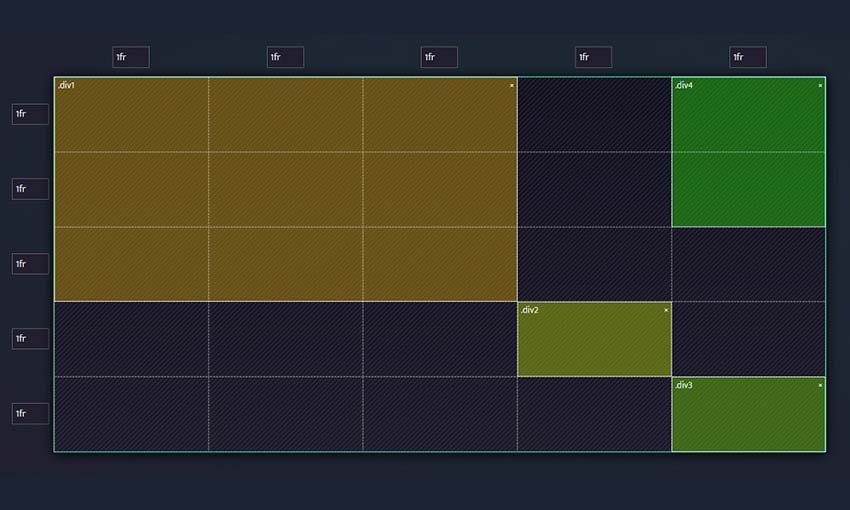
Griddy is a helpful CSS grid generator which allows you to add as many elements as you want and size them based on row or column size. You can size them on fractionals (fr), pixels, percent, or auto – and you’re not locked to using one unit for the whole grid. Have two columns using fr and carefully size the others with pixels!
3. LayoutIt
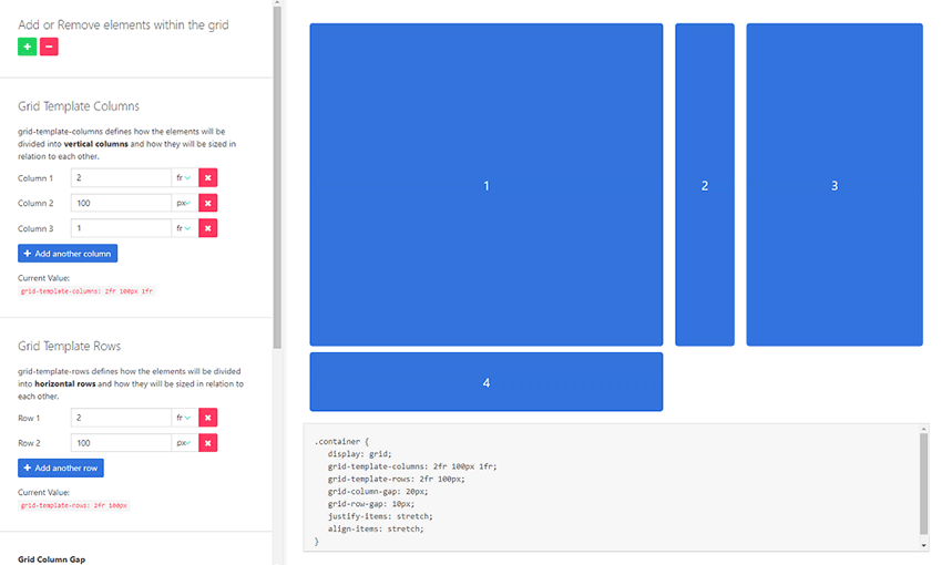
With LayoutIt you can easily create grids of any size, and even place grids inside other grids. Add more columns and rows as you need them, inside and outside individual boxes, and get full control over the layouts you create.
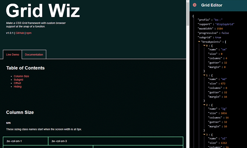
4. Grid Wiz
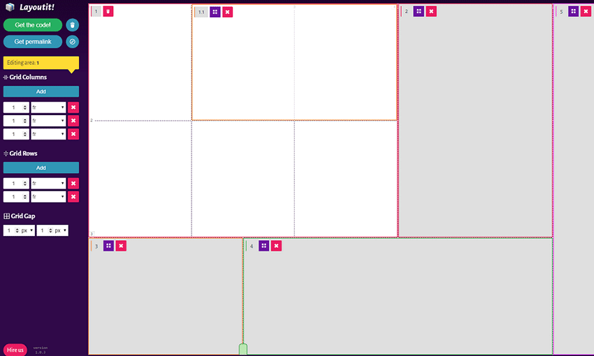
This is a tool for advanced users ready to learn more about CSS grids. Grid Wiz isn’t just a simple generator. You can edit code right in the sidebar and see it update in real time. Then download it, or add Grid Wiz as a dependency and compile it.
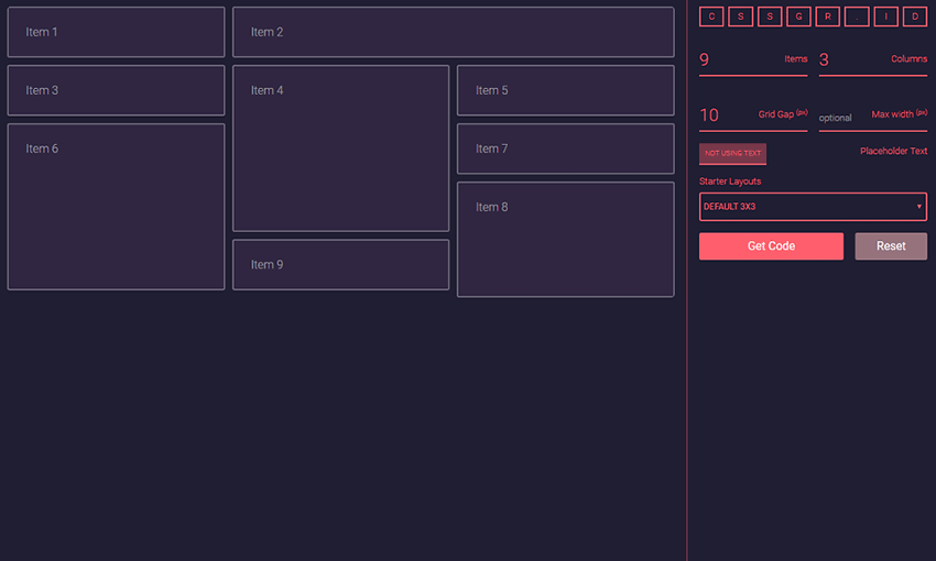
5. cssgr.id
One of the most flexible CSS layout generators out there, cssgr.id presents you with plenty of options to get started. There are five starter layouts to begin with, and you can add as many items, columns, and rows as you want. There’s even a placeholder text option so you can see how this layout will look in action.
Easily Make Grids in CSS
Web developers are always making strides towards a better, more efficient internet backend. CSS grids are just among the latest developments, and it’s finally solved a long-standing issue that’s plagued CSS designers.
CSS grids have actually been around since they were proposed in 2011, but it wasn’t until 2017 that all the major browsers finally adopted support for them.
Now that developers no longer have to be wary of using them, there’s been a ton of CSS grid guides, tutorials, and resources made, just like these layout generators. So, if you’re still using a workaround like flexboxes or even floats to design webpages, consider trying out grids instead. There’s plenty of support online to help you learn them.
Thanks for reading !
#css
