How to Implement Striped Backgrounds with CSS
This tutorial will show you 5 ways to create striped backgrounds with CSS gradient functions and customize them with animations and additional layers.
Backgrounds should never outshine the main elements on the page — they aren’t the main focus. As a result, most backgrounds are subtle, with soft, plain colors.
Detailed or patterned backgrounds can be tricky, especially stripes. Stripes can be quite uncomfortable to look at for extended periods because they sometimes cause visual distortions. But, if you can get it right, you can really enhance the visual appeal of the webpage.
In this tutorial, you’ll learn how to implement striped backgrounds with CSS. We’ll cover five different ways of doing this using gradients. We’ll also go over how to customize the striped background with animations and additional layers.
Table of contents:
linear-gradient()striped backgroundrepeating-linear-gradient()striped backgroundradial-gradient()striped backgroundrepeating-radial-gradient()striped backgroundconic-gradient()striped background- Customizing a striped background
- Browser support
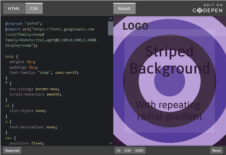
You can check out examples for each CSS striped background method in this CodePen collection. Let’s dive in!
linear-gradient() striped background
A linear-gradient has two or more colors transitioning in a straight line. Stripes are bands of solid color, while a gradient has colors progressively blend into each other.
Normally, in a gradient, you can’t tell when one color ends and the other begins. So, how are we going to create a striped pattern? By using color stops.
You can specify where each color starts by using a percentage or px value. The number of stripes will determine the percentage values for the color stops. Whatever number of stripes you want, divide 100 by that number to get the percentage value for the first color stop and progress from there.
For example, if we want four stripes, you can use percentage values for the color stops like so:
0%to25%25%to5050% to75%75%to100%
Setting two color stops at the same percentage value creates a hard stop, which is a sharp edge between the two colors. That’s what creates the striped pattern.
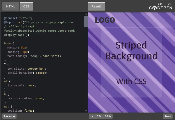
Here’s a simple HTML markup for this tutorial:
<section id="main">
<div class="content">
<h1>Striped Background</h1>
<p>With linear-gradient</p>
</div>
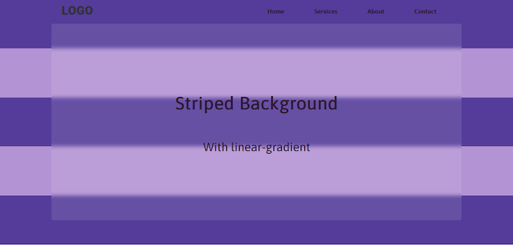
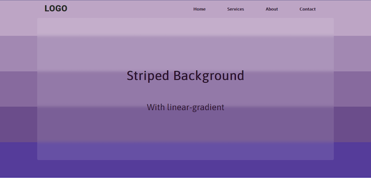
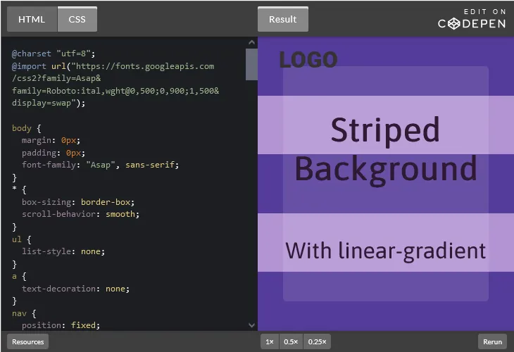
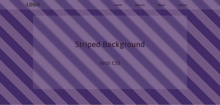
</section>We’ll use two colors — #553c9a and #b393d3 — for this example. We’re going for five evenly spaced stripes:
#main {
  width: 100%;
  min-height: 100vh;
  position: relative;
  background-image: linear-gradient(
    #553c9a 0%,
    #553c9a 20%,
    #b393d3 20%,
    #b393d3 40%,
    #553c9a 40%,
    #553c9a 60%,
    #b393d3 60%,
    #b393d3 80%,
    #553c9a 80%,
    #553c9a 100%
  );
  background-size: cover;
  background-attachment: fixed;
}
Here’s a screenshot of how it looks:
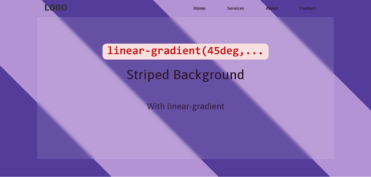
By default, a linear-gradient moves from top to bottom. You can change the direction to create more interesting patterns. You can specify the direction of a linear-gradient using angles or keywords.
Here’s an example of how to use angles to specify the linear-gradient direction:
background-image: linear-gradient(
  45deg,
  #553c9a 0%,
  #553c9a 20%,
  #b393d3 20%,
  #b393d3 40%,
  #553c9a 40%,
  #553c9a 60%,
  #b393d3 60%,
  #b393d3 80%,
  #553c9a 80%,
  #553c9a 100%
  );
The result of the code above should look like this:
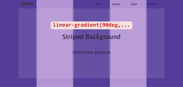
The pattern will move in the direction of whatever angle you specify. Here’s the same pattern with the angle changed to 90deg:
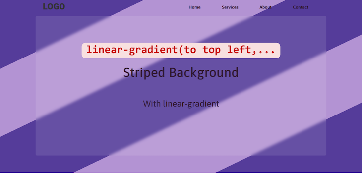
Besides angles, there are four keywords you can use to specify the direction of a linear-gradient:
to topto bottomto leftto right
Using any of these keywords will produce a gradient that flows in a vertical or horizontal line. To get diagonal stripes, you’ll need to combine keywords like so:
to top leftto top rightto bottom leftto bottom right
Here’s an example:
background-image: linear-gradient(
  to top left,
  #553c9a 0%,
  #553c9a 20%,
  #b393d3 20%,
  #b393d3 40%,
  #553c9a 40%,
  #553c9a 60%,
  #b393d3 60%,
  #b393d3 80%,
  #553c9a 80%,
  #553c9a 100%
  );
You can see the result below:
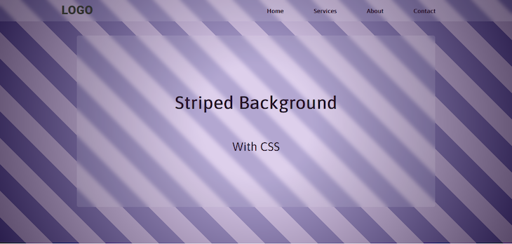
Now, what if you want a striped gradient pattern instead of having two distinct colors? You can use shades of the same color arranged from light to dark, like so:
background-image: linear-gradient(
  #bda5c5 0%,
  #bda5c5 20%,
  #a288b2 20%,
  #a288b2 40%,
  #876a9e 40%,
  #876a9e 60%,
  #6b4d8b 60%,
  #6b4d8b 80%,
  #553c9b 80%,
  #553c9b 100%
);
Here’s how the result would look:
You can also mix up the colors so they’re not progressive:
background-image: linear-gradient(
  #bda5c5 0%,
  #bda5c5 20%,
  #a288b2 20%,
  #a288b2 40%,
  #301934 40%,
  #301934 60%,
  #bda5c5 60%,
  #bda5c5 80%,
  #957dad 80%,
  #957dad 100%
);
The result would look like this:
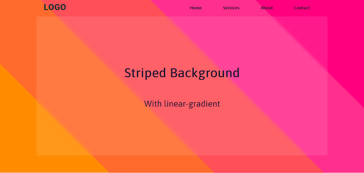
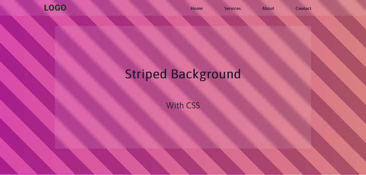
Let’s add more colors — just because:
background-image: linear-gradient(
   45deg,
   #db7773 0%,
   #db7773 20%,
   #d4595b 20%,
   #d4595b 40%,
   #c51c2b 40%,
   #c51c2b 60%,
   #dfb4a3 60%,
   #dfb4a3 80%,
   #e2968b 80%,
   #e2968b 100%
);
The color palette would result in the following striped background:
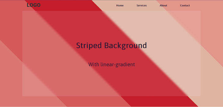
Let’s look at another example for good measure:
background-image: linear-gradient(
  45deg,
  #ff8c00 0%,
  #ff8c00 20%,
  #ff6b2d 20%,
  #ff6b2d 40%,
  #ff4f58 40%,
  #ff4f58 60%,
  #ff2f8e 60%,
  #ff2f8e 80%,
  #ff007f 80%,
  #ff007f 100%
);
Here’s the result:
And that’s how you can create a striped background with linear-gradient. Be sure to use a color palette that isn’t too harsh on the eyes.
Here’s a CodePen for our striped background example using linear-gradient for you to interact with:
repeating-linear-gradient() striped background
One disadvantage of using linear-gradient to create your striped background is that if you want more stripes, you’ll need more color stops. This will mean more code — and more work for you.
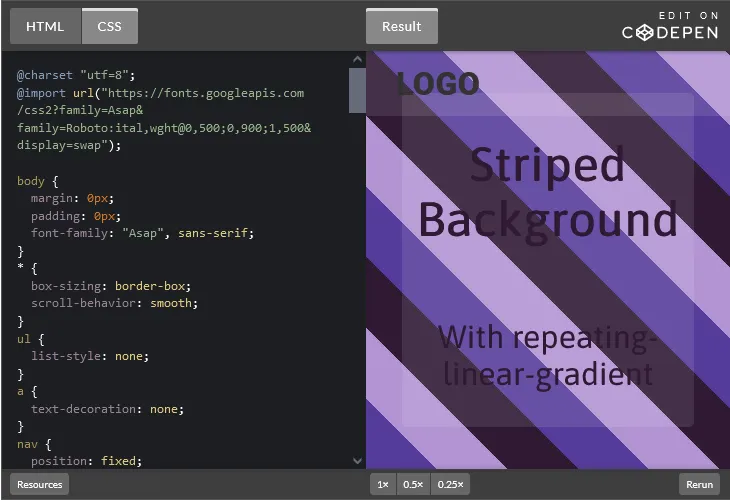
A different way to create a background with more stripes is by using a repeating-linear-gradient instead. You just need to add in enough color stops to set your desired pattern, and it’ll repeat the gradient pattern throughout the background:
background-image: repeating-linear-gradient(
45deg,
#553c9a,
#553c9a 50px,
#b393d3 50px,
#b393d3 100px
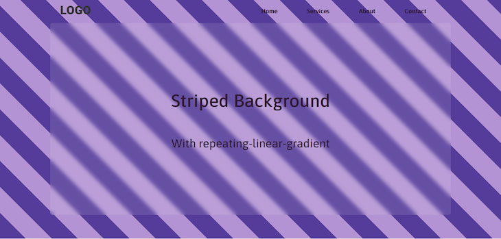
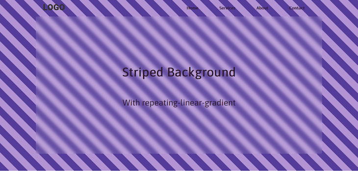
);In the example above, we’re using px to give us more control over the size of our stripes. Here’s how it looks:
Using just four color stops, you get a striped pattern that repeats throughout the background. If you want smaller stripes, reduce the width of the colors:
background-image: repeating-linear-gradient(
  45deg,
  #553c9a,
  #553c9a 25px,
  #b393d3 25px,
  #b393d3 50px
);
Here’s the result:
This is a lot easier than typing out all those color stops, don’t you think?
You can add more colors to change the pattern. The code below will produce a tricolor striped pattern:
background-image: repeating-linear-gradient(
  45deg,
  #553c9a,
  #553c9a 50px,
  #b393d3 50px,
  #b393d3 100px,
  #301934 100px,
  #301934 150px
);
Here’s the result:
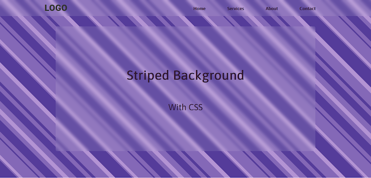
You can also adjust the size of the stripes, making one wider than the other. This can be used to create a pinstripe pattern:
background-image: repeating-linear-gradient(
  #301934 0px,
  #301934 5px,
  #b393d3 5px,
  #b393d3 100px
);
Notice that we also removed the 45deg angle, resulting in a simple horizontal pinstripe pattern:
With repeating-linear-gradient, you don’t have to add as many color stops when you want a large number of stripes. There are so many possible striped patterns you can create for a background using this method.
You can interact with the CodePen for our example striped background using repeating-linear-gradient:
repeating-linear-gradient() striped background
One disadvantage of using linear-gradient to create your striped background is that if you want more stripes, you’ll need more color stops. This will mean more code — and more work for you.
A different way to create a background with more stripes is by using a repeating-linear-gradient instead. You just need to add in enough color stops to set your desired pattern, and it’ll repeat the gradient pattern throughout the background:
background-image: repeating-linear-gradient(
  45deg,
  #553c9a,
  #553c9a 50px,
  #b393d3 50px,
  #b393d3 100px
);
In the example above, we’re using px to give us more control over the size of our stripes. Here’s how it looks:
Using just four color stops, you get a striped pattern that repeats throughout the background. If you want smaller stripes, reduce the width of the colors:
background-image: repeating-linear-gradient(
  45deg,
  #553c9a,
  #553c9a 25px,
  #b393d3 25px,
  #b393d3 50px
);
Here’s the result:
This is a lot easier than typing out all those color stops, don’t you think?
You can add more colors to change the pattern. The code below will produce a tricolor striped pattern:
background-image: repeating-linear-gradient(
  45deg,
  #553c9a,
  #553c9a 50px,
  #b393d3 50px,
  #b393d3 100px,
  #301934 100px,
  #301934 150px
);
Here’s the result:
You can also adjust the size of the stripes, making one wider than the other. This can be used to create a pinstripe pattern:
background-image: repeating-linear-gradient(
  #301934 0px,
  #301934 5px,
  #b393d3 5px,
  #b393d3 100px
);
Notice that we also removed the 45deg angle, resulting in a simple horizontal pinstripe pattern:
With repeating-linear-gradient, you don’t have to add as many color stops when you want a large number of stripes. There are so many possible striped patterns you can create for a background using this method.
You can interact with the CodePen for our example striped background using repeating-linear-gradient:
radial-gradient() striped background
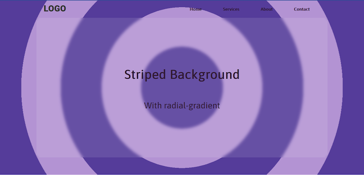
The radial-gradient function is used to create circular gradients in CSS. This is a gradient that radiates out from a center point. You can control the size and shape of the gradient.
Here’s how to create a circular striped background for our background:
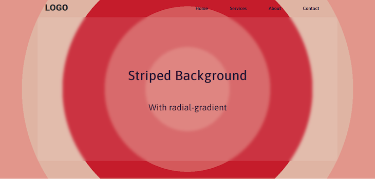
background-image: radial-gradient(
  circle at center,
  #553c9a 0,
  #553c9a 20%,
  #b393d3 20%,
  #b393d3 40%,
  #553c9a 40%,
  #553c9a 60%,
  #b393d3 60%,
  #b393d3 80%,
  #553c9a 80%,
  #553c9a 100%
);
Here’s how the code above should look:
And, just like the linear-gradient striped pattern, you can use colors to change the look of the background:
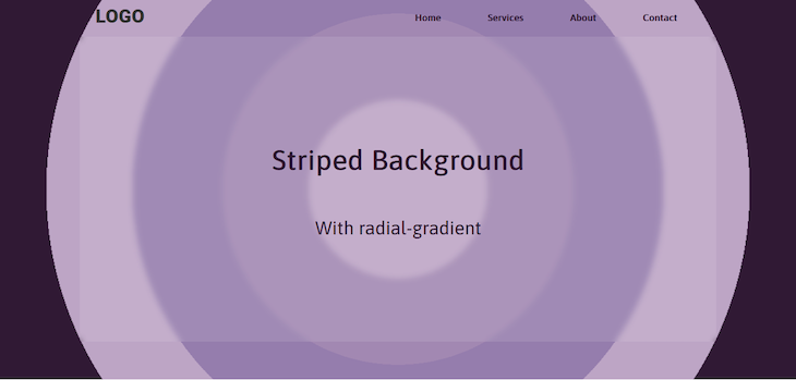
background-image: radial-gradient(
  circle at center,
  #bda5c5 0%,
  #bda5c5 20%,
  #a288b2 20%,
  #a288b2 40%,
  #957dad 40%,
  #957dad 60%,
  #bda5c5 60%,
  #bda5c5 80%,
  #301934 80%,
  #301934 100%
);
Here’s how this should look:
Let’s look at another example with different colors:
background-image: radial-gradient(
  circle at center,
  #db7773 0%,
  #db7773 20%,
  #d4595b 20%,
  #d4595b 40%,
  #c51c2b 40%,
  #c51c2b 60%,
  #dfb4a3 60%,
  #dfb4a3 80%,
  #e2968b 80%,
  #e2968b 100%
);
Here’s the result:
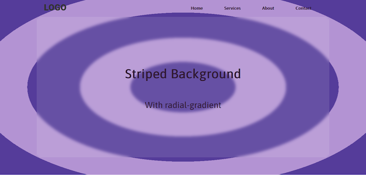
Notice that we set a circle at center value for our last two radial-gradient function examples, resulting in the ending shape of a circle positioned at the center of our background. You can also make it an ellipse, which is actually the default shape of a radial-gradient:
background-image: radial-gradient(
  ellipse at center,...
);
Here’s the result:
The default position of a radial-gradient is center. You can adjust this position horizontally or vertically using percentage or px values. Using only one value applies it to both directions. Here’s an example using percentages to set a circle at 10% 20% position:
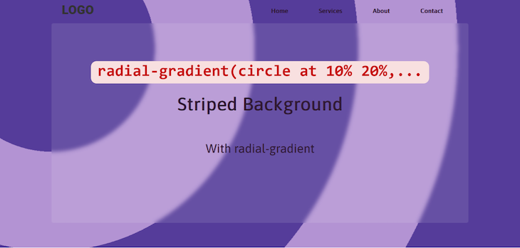
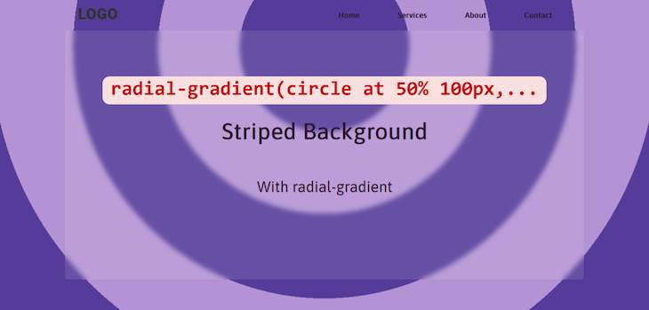
Meanwhile, here’s what would happen if you set the position using only one px value:
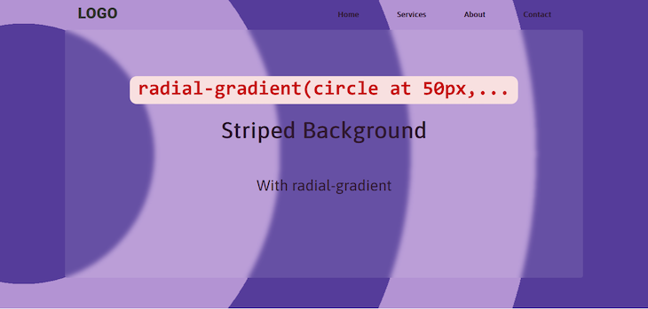
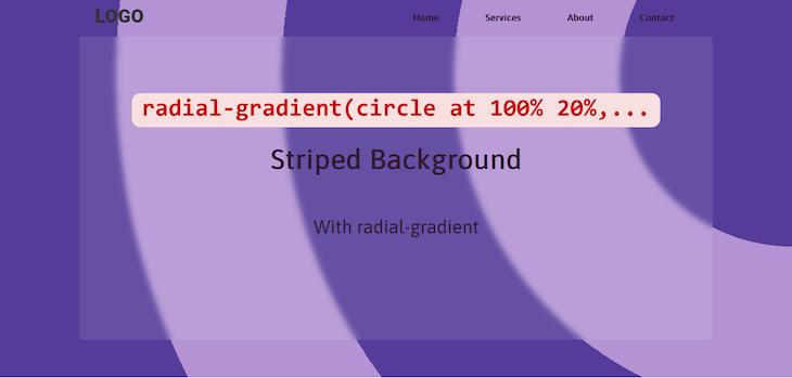
Remember that when using multiple values, you’re setting the horizontal position first, then the vertical position. You can see this more clearly in this example with the position set at 100% 20%:
You can also mix px and percentage values when setting the radial-gradient position, like so:
You can set the position in the same way when the shape of our radial-gradient is an ellipse.
Here’s a CodePen with one of our circular striped background examples for you to interact with:
repeating-radial-gradient striped background
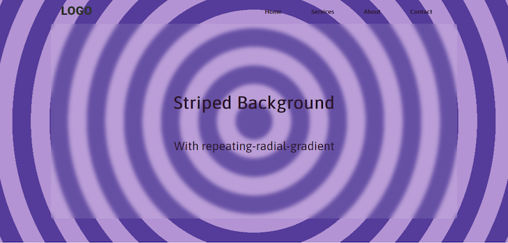
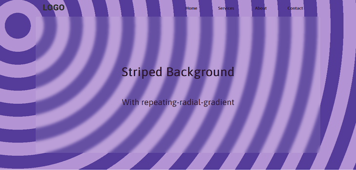
As we learned with linear-gradient and repeating-linear-gradient, repeating gradients require fewer color stops. Just like before, we’ll use four color stops and specify the shape and position, this time using the repeating-radial-gradient function:
background-image: repeating-radial-gradient(
  circle at center,
  #553c9a,
  #553c9a 50px,
  #b393d3 50px,
  #b393d3 100px
  );
These four color stops give us many stripes, like so:
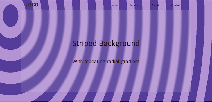
You can change the shape of the gradient and its position along the x- and y-axes of the background just like we did with the radial-gradient function. Additionally, there are four other ways you can adjust the size, shape, and position of a repeating-radial-gradient:
closest-side— The ending shape of the gradient meets the side of the element closest to its centerclosest-corner— The ending shape of the gradient meets the closest corner of the elementfarthest-side— The ending shape of the gradient meets the side of the element farthest from its centerfarthest-corner— The ending shape of the gradient meets the corner of the element farthest from its center
The problem with these four parameters is that they only work when it’s an ellipse. Let’s demonstrate, starting with a circle:
background-image: repeating-radial-gradient(
  circle closest-corner at 5% 100px,
  #553c9a,
  #553c9a 50px,
  #b393d3 50px,
  #b393d3 100px
  );
In the code above, we set the pattern‘s point of origin at the top left of the background. The gradient should then meet the closest corner of the element, which in this case, is at the bottom left of the background.
Here’s how the pattern looks:
The result will be the same with the other three parameters. This is because this gradient has a consistent circumference. You can see the center, or point of origin, moving around, but you can’t tell what part of the gradient is getting pulled towards the corners or sides of the background.
This will change when you use an ellipse. With the same gradient pattern and parameters, here’s how the striped background will look with this change in shape:
The stripes are being pulled vertically. And if you switch it to the farthest-corner:
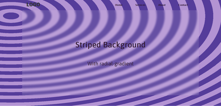
Now, the stripes are being pulled horizontally. Also, since we’re using hard stops to produce stripes, you won’t see any difference when it’s -corner or -side. The stripes will be pulled in the same direction regardless.
You will definitely see a change in the pattern if you use a normal gradient without hard stops, but that’s not the focus of this tutorial. You can try it out yourself to see how it works. In the meantime, try interacting with the CodePen for our repeating-radial-gradient striped background:
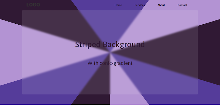
conic-gradient striped background
If you run a Google search for “circular stripes,” you’re likely to come across something like this:
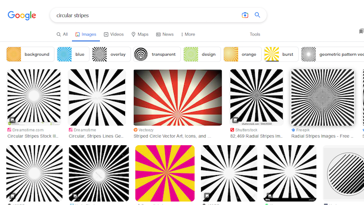
We covered a type of circular stripes with radial-gradient, but clearly, these patterns are quite different. So, for good measure, let’s learn how you can create something similar.
In CSS there’s a third — albeit less popular — type of gradient called the conic-gradient. This gradient rotates around a point of origin. To replicate the pattern above, you’re going to need a lot of color stops:
background-image: conic-gradient(
  #553c9a 0,
  #553c9a 10%,
  #b393d3 10%,
  #b393d3 20%,
  #301934 20%,
  #301934 30%,
  #553c9a 30%,
  #553c9a 40%,
  #b393d3 40%,
  #b393d3 50%,
  #301934 50%,
  #301934 60%,
  #553c9a 60%,
  #553c9a 70%,
  #b393d3 70%,
  #b393d3 80%,
  #301934 80%,
  #301934 90%,
  #553c9a 90%,
  #553c9a 100%
);
Here’s a screenshot of how it looks:
Unlike its more popular siblings, there’s no way of creating a repeating conic gradient. If you want more stripes — like the examples shown in the Google search results — you’ll need more color stops.
You can also change the position of the origin along the x and y directions like a radial-gradient, except this time, you won’t be specifying a shape.
Customizing a striped background
So far, we’ve covered five different methods you can use gradients to implement a striped background. These patterns may look good as is, but you can still make some improvements.
In this section, we’ll learn how to customize a striped background using animations and additional layers.
Using CSS animation
Let’s make the stripes in our background move across the page with CSS animations. To do this, we’ll double the background-size and change its background-positon, then use @keyframes to animate it:
#main {
  width: 100%;
  min-height: 100vh;
  position: relative;
  background-image: repeating-linear-gradient(
    45deg,
    #553c9a,
    #553c9a 50px,
    #b393d3 50px,
    #b393d3 100px
  );
  background-size: 200%;
  background-position: right;
  background-attachment: fixed;
  animation: animateBg 10s linear infinite alternate;
}
@keyframes animateBg{
  100%{
    background-position: left;
  }
}
The background is alternating between its original position on the right and its final position on the left. You can use timing functions to control how the animation behaves.
Here’s the result:
Adding a second layer
There are a few ways to add a second layer to our striped background.
First, you can add a background-color to the element, or the body of the webpage. You won’t be able to see this background-color if the stripes are opaque, so we need to use RGBA colors to make our striped background layer transparent:
background-image: repeating-linear-gradient(
    45deg,
    rgba(85, 60, 154, 0.5),
    rgba(85, 60, 154, 0.5) 50px,
    rgba(179, 147, 211, 0.5) 50px,
    rgba(179, 147, 211, 0.5) 100px
  );
  background-color: #301934;
  background-size: cover;
  background-attachment: fixed;
}
Here’s the striped background made with transparent colors before adding a background-color:
And this is how it looks after adding our dark magenta background-color:
You can also add a second gradient to the background-image:
background-image: repeating-linear-gradient(
    45deg,
    rgba(85, 60, 154, 0.5),
    rgba(85, 60, 154, 0.5) 50px,
    rgba(179, 147, 211, 0.5) 50px,
    rgba(179, 147, 211, 0.5) 100px
  ),linear-gradient(to right,#ff007f,#ff6b2d);
The result should look like so:
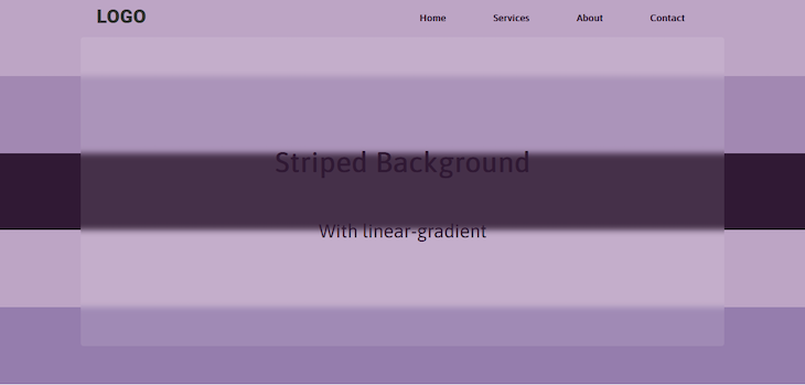
You can also darken the edges with a radial-gradient:
background-image: repeating-linear-gradient(
    45deg,
    rgba(85, 60, 154, 0.5),
    rgba(85, 60, 154, 0.5) 50px,
    rgba(179, 147, 211, 0.5) 50px,
    rgba(179, 147, 211, 0.5) 100px
  ),radial-gradient(circle at center,transparent 20%,#000);
Here’s the outcome:
How about adding another repeating gradient? Here’s the code:
background-image: repeating-linear-gradient(
    45deg,
    rgba(85, 60, 154, 0.5),
    rgba(85, 60, 154, 0.5) 50px,
    rgba(179, 147, 211, 0.5) 50px,
    rgba(179, 147, 211, 0.5) 100px
  ),
  repeating-linear-gradient(
    45deg,
    #553c9a,
    #553c9a 45px,
    #b393d3 45px,
    #b393d3 60px);
Layering these two repeating gradients would result in a unique striped pattern as shown below:
That looks great, doesn’t it? You can use different colors and directions for the gradients to get more awesome patterns. Try it out yourself, and see what you can come up with.
Here’s the CodePen for our last example that you can interact with:
Browser support
Both linear-gradient and radial-gradient are supported on the newest versions of all modern browsers. However:
- Chrome v25 and below require the
-webkit-vendor prefix - Safari v6 and below require the
-webkit-vendor prefix - Firefox 15 and below require the
-moz-prefix - Opera v11.5 requires the
-o-vendor prefix
Repeating gradients are also well-supported, but:
- Chrome v10 through v25 require the
-webkit-prefix - Safari v5.6 through v6 require the
-webkit-prefix - Firefox v3.6 through v15 require the
-moz-prefix - Opera v11.5 requires the
-o-prefix
Conic gradients are supported on all modern browsers. They’re not supported at all by Internet Explorer. There are no vendor prefixes available for this type of gradient.
For a more detailed analysis, you can check out Can I Use.
Conclusion
You’ve just learned how to implement striped backgrounds with CSS. The main thing you need to accomplish this is a gradient with hard color stops.
There are three types of CSS gradients — linear, radial, and conic. We covered how you can use repeating gradients to make the stripes with just a few color stops. You lose a bit of control, but it does save time.
Finally, we covered a few ways you can customize the striped background. You can animate the stripes, or add another layer of color or gradients.
Now you have a cool way of styling backgrounds with CSS for your next project. If you have any questions about how to implement striped backgrounds with CSS, comment them below.
Source: https://blog.logrocket.com
#css