Building simple data visualizations with React
If you’re looking for an alternative to building your own custom charts using D3, there are a lot of great React charting libraries out there (like Victory by Formidable Labs, Recharts, and React Vis by Uber, to name a few).
I personally like Nivo because it has an interactive documentation site. You can adjust the chart properties using toggles in the UI to quickly visualize and iterate on your design.
There are also lots of examples (or “recipes”) and an active community on Discourse. The charts are responsive and some have an API, which can be useful if you want to render your charts server-side. Not to mention, the Nivo library is free, open source, and actively maintained.
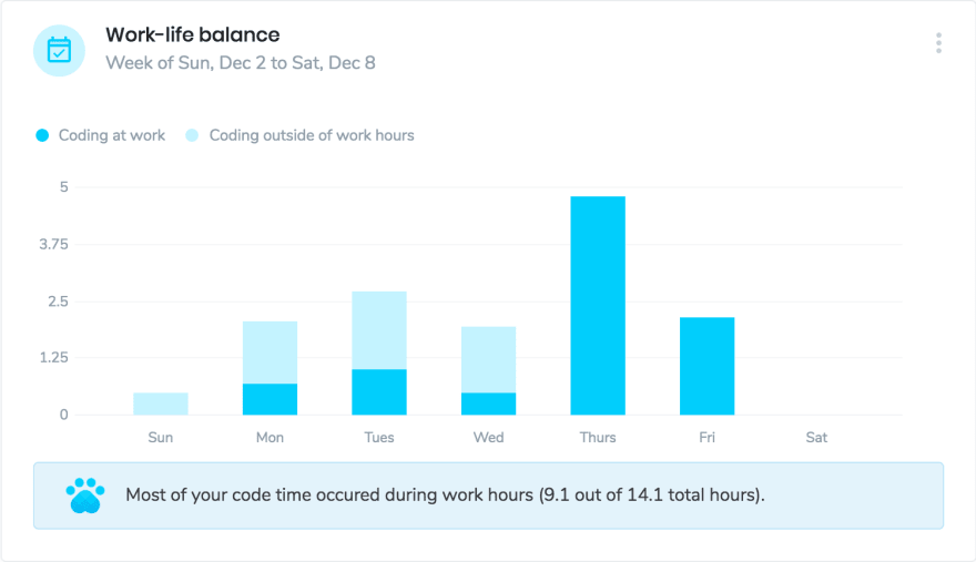
Here’s a live example of a chart I built using Nivo that shows how many hours I coded during and outside of my normal work hours during a week in December.
If you’re interested in using Nivo for your own project, here’s a brief overview of how I built this chart.
First, I chose to build my project on StackBlitz. I like to use StackBlitz to quickly prototype my data visualizations and see what they look like with actual data. I also like CodePen, CodeSandbox, and JSFiddle, but my favorite thing about StackBlitz is that it’s powered by Visual Studio Code, which is my code editor of choice.
Next, I imported my dependencies. For this chart, I imported @nivo/bar and Material, since I also used a few Material UI components.
My data came from my Software.com plugin for VS Code (I’m on the team at Software - check us out!). I stored it as a constant in its own file (item.js) and imported it into my main file (workLifeBalance.js).
Since my data isn’t in the exact format that is required for the Nivo bar chart, I did some light array manipulation to map my data to the Nivo structure (see data.json for that structure), which is also clearly documented on the Nivo site.
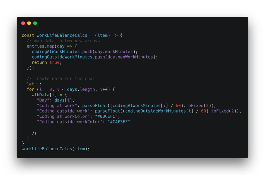
Mapping data from our an API response to Nivo’s structure. Snippet using Carbon.
The last step was to pass my data as a property into the custom bar chart component (BarChart.js) I created using Nivo. If you want to reuse your Nivo charts but with different stylistic elements, you can also make those properties customizable. For instance, I made another chart that uses “grouped” instead of “stacked” bars, so I made that a variable.

Bar chart component. Snippet made using Carbon.
You can add some fit and finish by customizing the Nivo theme. If you’re looking to customize the theme more than I did, see this file in the Nivo GitHub repository.
That’s it! If you’re interested in building your own Nivo chart, you can fork this chart and plug in your data. And if you want to see what your work-life balance and the rest of your coding data looks like, check out Software.com!
What are your favorite chart libraries for React?
By : Brett Stevens
#reactjs #javascript