Documenting React Components With Storybook
What Is Storybook?
Storybook markets itself as a playground for UI components and its main focus is on “writing stories.”
Storybook uses the concept of stories to document components.
A story usually contains a single state of one component, almost like a visual test case. Technically a story is a function that returns something that can be rendered to a the screen.
Your component storybook will contain many different stories for many different components.
Each story we write will contain a single state, for example:
Button
  ├── primary
  ├── secondary
  └── tertiary
What’s great about Storybook is that it works with many popular front-end frameworks and libraries such as React, Vue, React Native, Angular, and more.
Set Up
For this tutorial, I’ll be adding Storybook to my Building Design Systems With React talk which I gave in May 2019 at ReactJS Girls London. You’re welcome to follow along with your own code, or check out the final code in my repository.
- Change into your project directory and install your dependencies (if you need to). I forgot and spent ten minutes trying to figure out why nothing was working…
Then, install the boilerplate files for Storybook. (This will take a hot second to download. In the meantime, perhaps you’d like to brew some fresh coffee.)
cd my-project
npx -p @storybook/cli sb init
This tool will check out your package.json file to determine which framework or library (view layer) you’re using. If automatic detection fails, or if you want to use Storybook for HTML, use the following command:
npx -p @storybook/cli sb init --type html |
- Once installed, let’s start Storybook with the following command:
npm run storybook
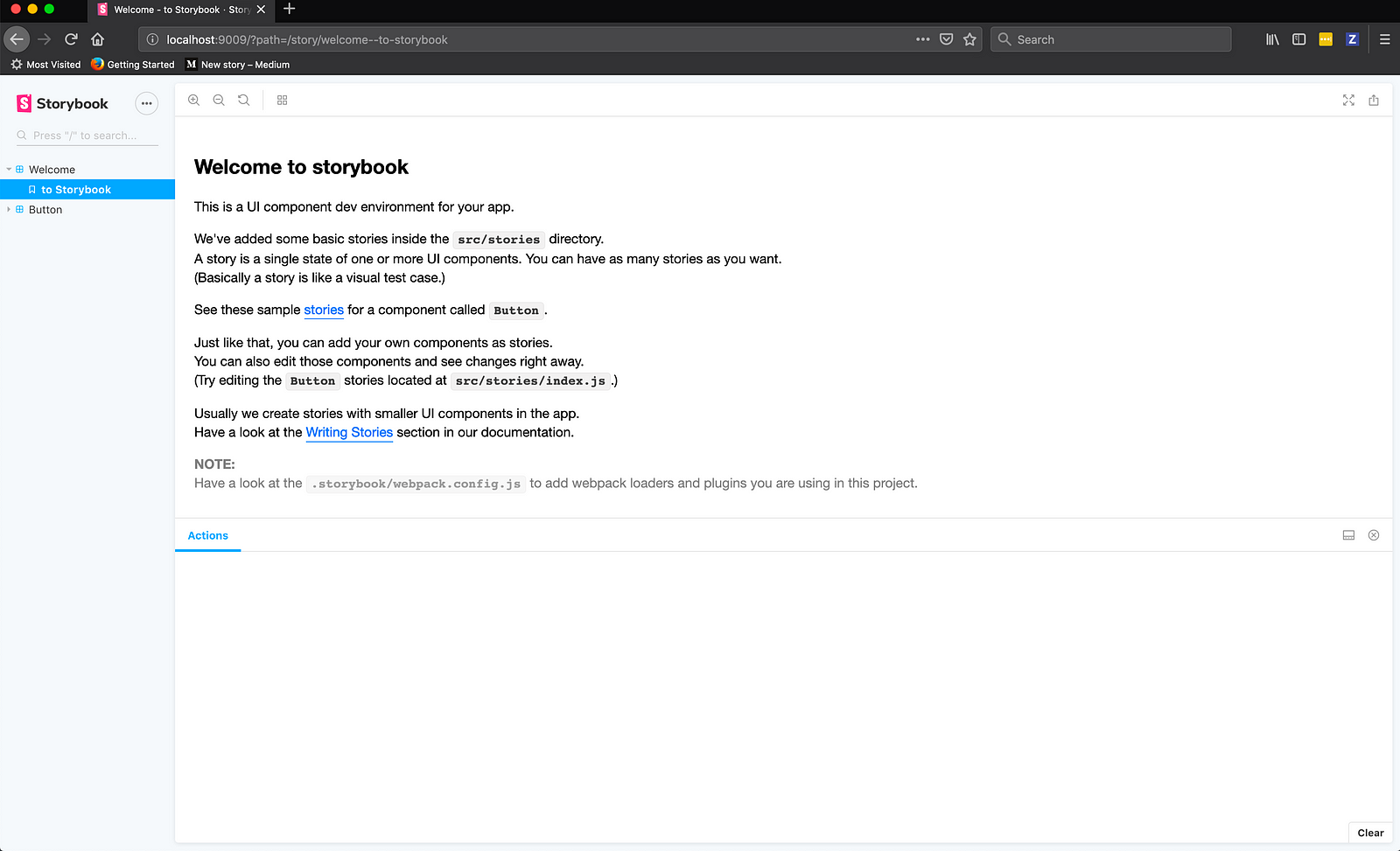
After running, a localhost window popped up in my browser and I saw this screen:
- Now we’ll want to add Storybook as a development dependency within our project. We can do that by running the following command:
npm install @storybook/react --save-dev
- Storybook has a few peer dependencies which we also need to have installed.
reactandreact-domshould be saved as normal dependencies.@babel/coreandbabel-loadershould be saved as development dependencies.
npm install react react-dom --save
npm install babel-loader @babel/core --save-dev
- We’ll want to add an npm script so we can easily start Storybook. Inside our
package.jsonfile, let’s add a storybook script.
{
  "scripts": {
    "storybook": "start-storybook"
  }
}
- Lastly, let’s create the Storybook config file, which will simply tell Storybook where we’ll be writing our stories.
You most likely already have this file created from the previous steps, however if you don’t, create a new config.js file inside the storybook/ folder.
My config.js file contains the following:
import { configure } from "@storybook/react";

function loadStories() {
  require("../src/stories");
}

configure(loadStories, module);
This tells Storybook to look inside of the src/stories folder for our stories.
Let’s Document
- Ensure your development server is running with npm run storybook.
- First, we’ll get rid of the boilerplate inside of
src/stories/index.js. My file looks like this:
import React from "react";
import { storiesOf } from "@storybook/react";
import { action } from "@storybook/addon-actions";
- Now, let’s import our first component. For my project, I’ll be importing my Button component. It lives directly inside of the src/ folder.
import Button from '../Button';
I’m using enums to describe my button types, so I’ll import those as well.
import { ButtonTypes } from "../buttonTypes";
- We now want to write our first
storiesOffor our button. We’ll start with three states: primary, secondary, and tertiary.
We need to use the .add() function to add each state. This takes two arguments: the name of the state we want to add and a function which returns the component.
Here is what my index.js file looks like:
import React from "react";

import { storiesOf } from "@storybook/react";
import { action } from "@storybook/addon-actions";

import Button from "../Button";
import { ButtonTypes } from "../buttonTypes";

storiesOf("Button", module)
  .add("primary", () => (
    <Button
      type={ButtonTypes.PRIMARY}
      onClick={action("clicked")}
      label="Primary"
    />
  ))
  .add("secondary", () => (
    <Button
      type={ButtonTypes.SECONDARY}
      onClick={action("clicked")}
      label="Secondary"
    />
  ))
  .add("tertiary", () => (
    <Button
      type={ButtonTypes.TERTIARY}
      onClick={action("clicked")}
      label="Tertiary"
    />
));
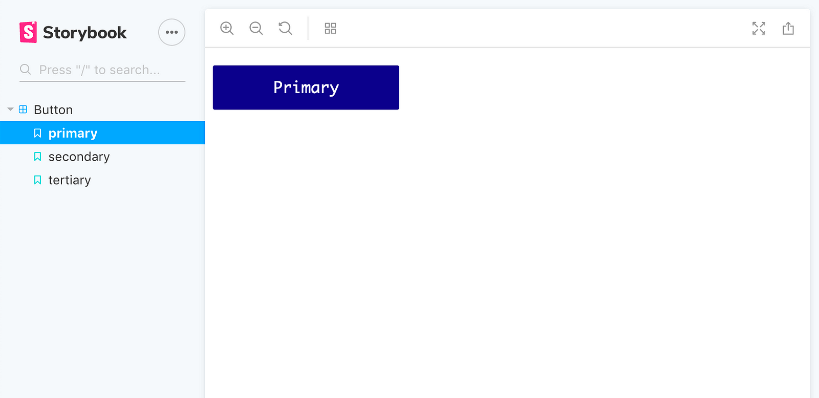
When we check this out in the UI, we should see one story, Button, with three states: primary, secondary, and tertiary.
- Now that this is working, I want to modularize my stories a bit better. If I were doing this for an enterprise application, or a full design system, I’d add the stories next to the components themselves. However, due to the fact that this is a proof-of-concept, I’ll be adding them within the stories/ folder.
I’ll create a buttonStories.js file inside of src/stories/.
Next, I’ll copy and paste all of the code from the index.js file over to this new file.
Lastly, I’ll update index.js to import the buttonStories.js file.
import "./buttonStories";
And that’s it! You now can create Storybook stories to document the states of your component.
Theming
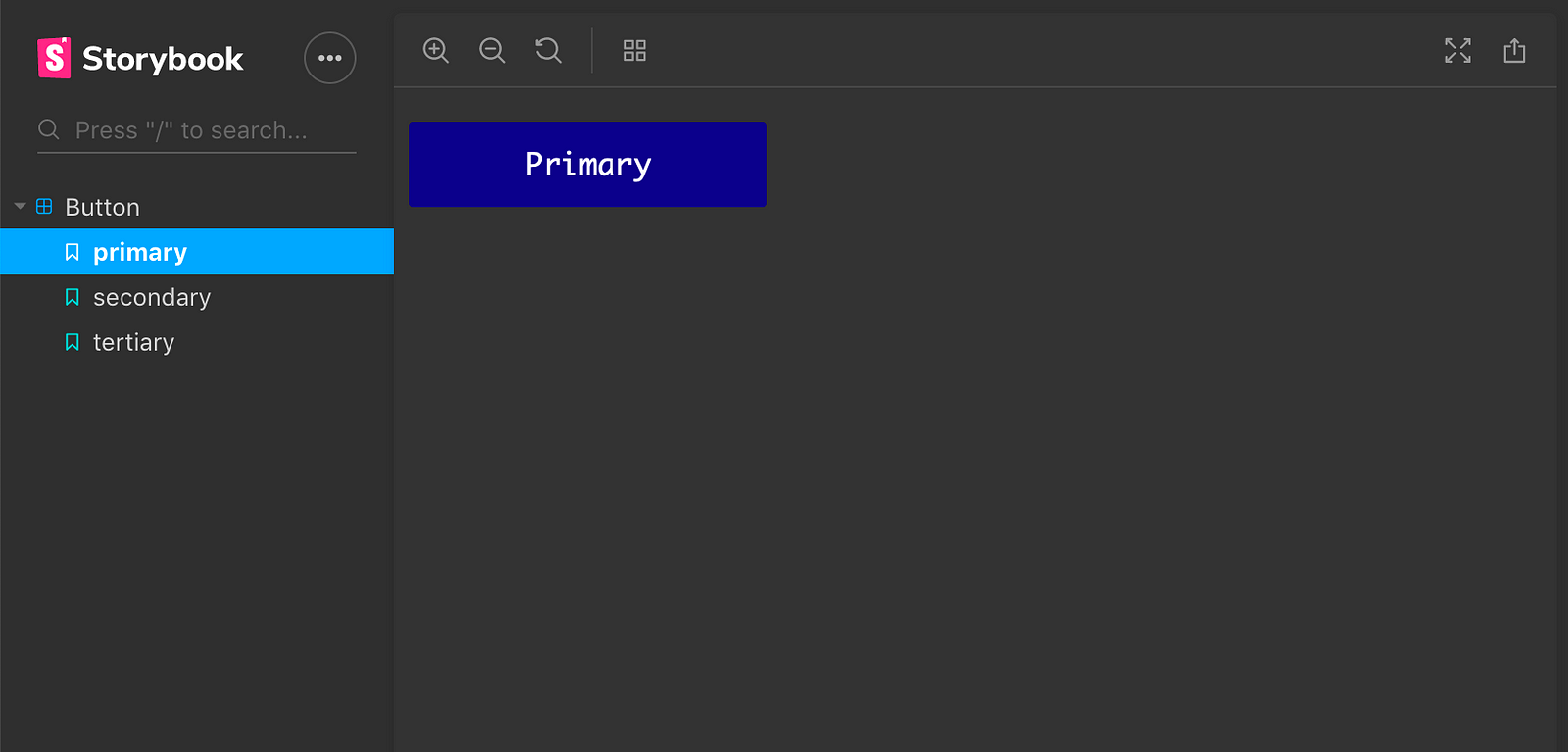
You can select different themes for your Storybook documentation.
Dark Theme
- Import addParameters and themes:
import { addParameters } from '@storybook/react';
import { themes } from '@storybook/theming';
- Next, add the theme key to the parameter options:
import { addParameters } from '@storybook/react';
import { themes } from '@storybook/theming';

// Option defaults.
addParameters({
  options: {
    theme: themes.dark,
  },
});
And voila, a dark theme!
Custom Themes
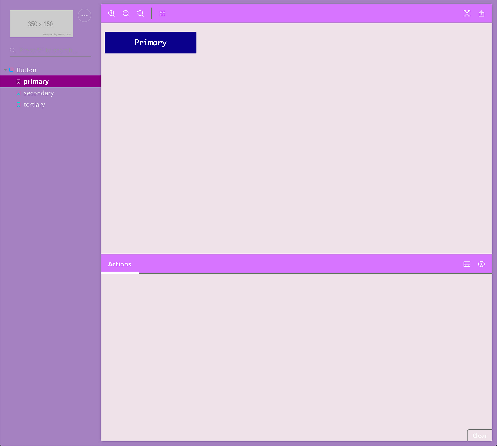
You can generate a custom theme by using the create() function.
-
Create a new file within the .storybook folder, and name it appropriately for your theme. I’ll call mine
purpleDream.js -
Paste the following code and update the values to suit your theme’s needs.
import { create } from "@storybook/theming";

export default create({
  base: "dark",

  colorPrimary: "mistyrose",
  colorSecondary: "purple",

  // UI
  appBg: "#9f84bd",
  appContentBg: "#ede3e9",
  appBorderColor: "grey",
  appBorderRadius: 4,

  // Typography
  fontBase: '"Open Sans", sans-serif',
  fontCode: "monospace",

  // Text colors
  textColor: "white",
  textInverseColor: "rgba(255,255,255,0.9)",

  // Toolbar default and active colors
  barTextColor: "white",
  barSelectedColor: "white",
  barBg: "#ca7df9",

  // Form colors
  inputBg: "white",
  inputBorder: "silver",
  inputTextColor: "white",
  inputBorderRadius: 4,

  brandTitle: "My custom storybook",
  brandUrl: "https://example.com",
  brandImage: "https://placehold.it/350x150"
});
- Update your
config.jsfile to use your new theme.
import { configure } from "@storybook/react";
import { addParameters } from "@storybook/react";
import purpleDream from "./purpleDream";

function loadStories() {
  require("../src/stories");
}

addParameters({
  options: {
    theme: purpleDream
  }
});

configure(loadStories, module);
And there you go. You now have a custom theme (hopefully not as ugly as mine.)
I hope you enjoyed this tutorial on getting started with Storybook & React. Feel free to check out my code on GitHub.
#reactjs