A website content should be wrapped or contained in a width that makes the content easy to read. To achieve that, we can use what has been called a wrapper, or a container. Using a wrapper in CSS can be possible in different ways which might introduce some challenges along with it.
In this article, I will explain about layout wrappers in CSS, how they work, how to use them, and when not to use them. Notice that throughout this article, I might mention the terms wrapper and container, and both of them means the same.
Are you ready? Let’s dive in!
A Brief About Wrappers
When you hear the word wrapper or container, it’s actually means that a group of elements is wrapped or contained inside another element. Without using additional elements, we can add a wrapper to the <body> element as below:
body {
    max-width: 1170px;
    margin-left: auto;
    margin-right: auto;
    padding-left: 16px;
    padding-right: 16px;
}
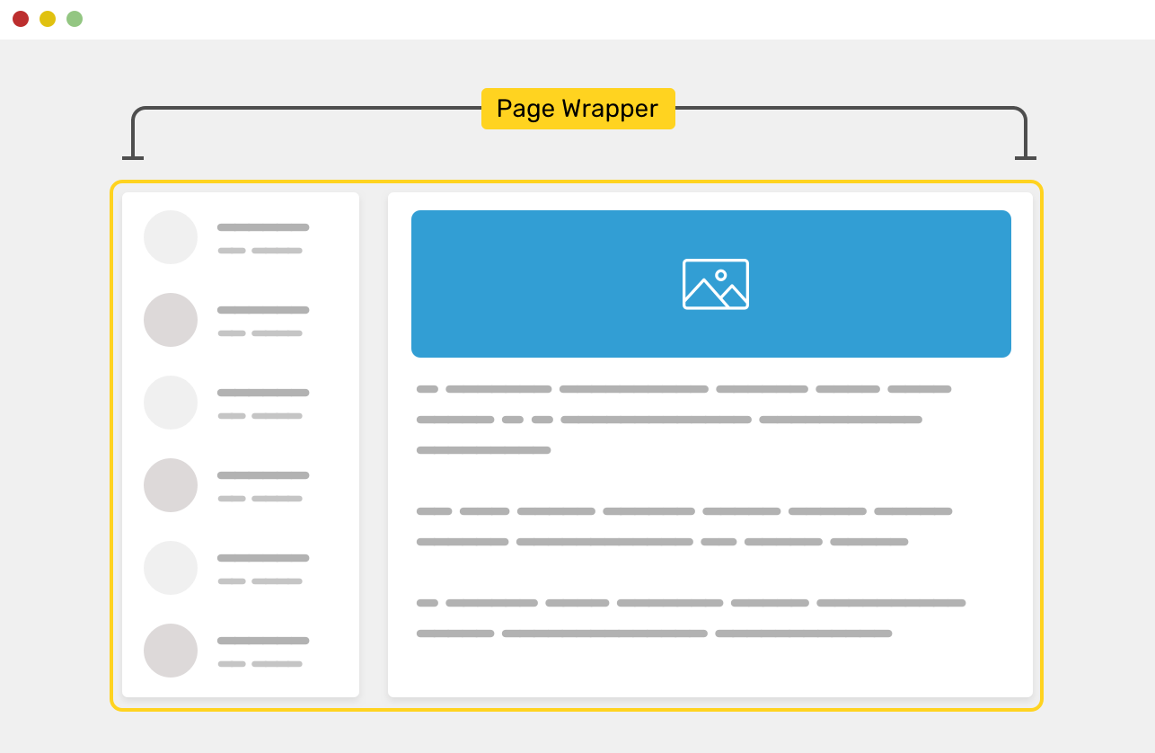
However, adding the wrapper to the <body> element might not practical for today’s work. The wrapper element can prevent child items from going outside its boundaries. Consider the following figure:
We have aside and main elements, and they live inside another element that wraps them. The .wrapper element has a width, of course.
<div class="wrapper">
    <aside>...</aside>
    <main>...</main>
</div>
Without a wrapper, the child elements will stick to the edges of the screen. This can be very annoying to the user, especially on a large screen.
The figure above shows how the elements will stretch when there is no element wrapping them. This behavior isn’t something that a user should experience. Let me explain the reason behind that.
#layout #css