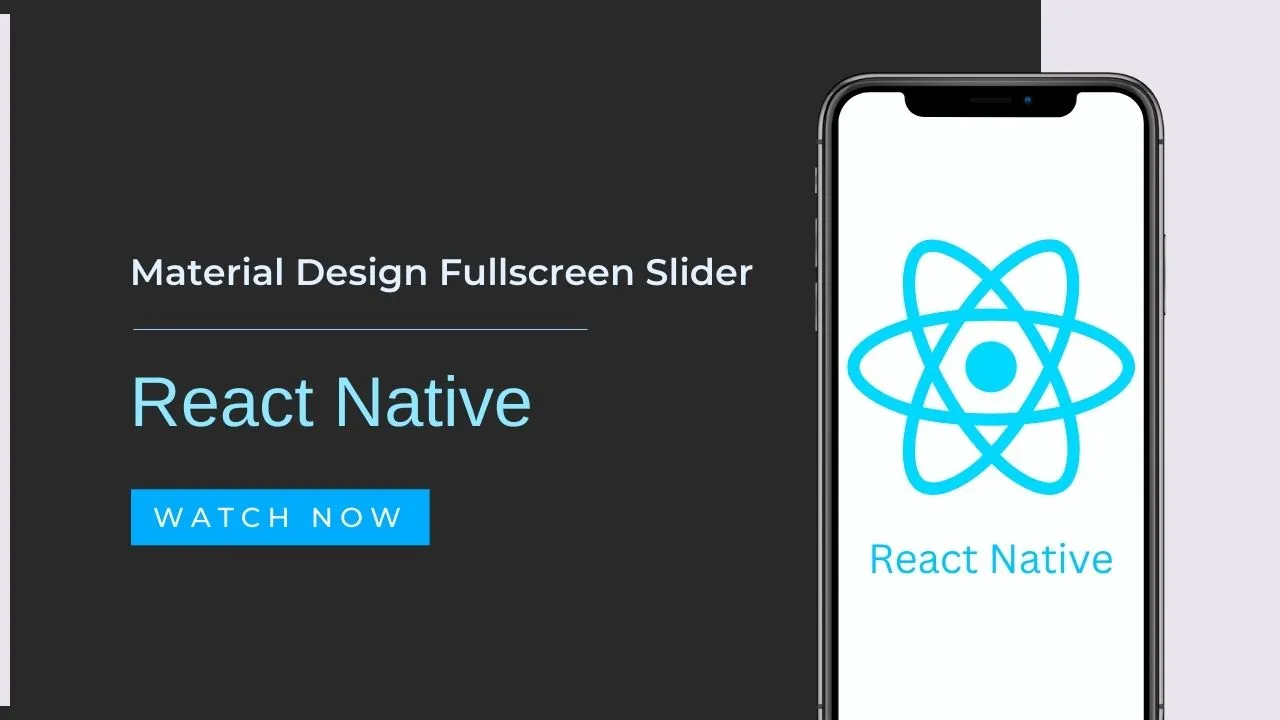
Material Design Fullscreen Slider in React Native
A Material Design inspired fullscreen slider/onboarding component for React Native driven apps.
Basic usage:
1. Install & Import the component.
# Yarn
$ yarn add @gorhom/paper-onboarding

# NPM
$ npm i @gorhom/paper-onboarding --saveimport PaperOnboarding, {PaperOnboardingItemType} from "@gorhom/paper-onboarding";
2. Define onboarding items as follows:
const data: PaperOnboardingItemType[] = [
  {
    title: 'Item 1',
    description: 'Desc 1',
    backgroundColor: '#222',
    image: '/* IMAGE COMPONENT */,'
    icon: /* ICON COMPONENT */,
    content: /* CUSTOM COMPONENT */,
  },
  {
    title: 'Item 2',
    description: 'Desc 2',
    backgroundColor: '#333',
    image: /* IMAGE COMPONENT */,
    icon: /* ICON COMPONENT */,
    content: /* CUSTOM COMPONENT */,
  },
  {
    title: 'Item 3',
    description: 'Desc 3',
    backgroundColor: '#444',
    image: /* IMAGE COMPONENT */,
    icon: /* ICON COMPONENT */,
    content: /* CUSTOM COMPONENT */,
  },
  // ...
];
3. Add the onboarding component to the app.
const Screen = () => {
  const handleOnClosePress = () => console.log('navigate to other screen')
  return (
    <PaperOnboarding
      data={data}
      onCloseButtonPress={handleOnClosePress}
    />
  )
}
4. All component props.
data,
safeInsets: _safeInsets,
direction = DEFAULT_DIRECTION,
// indicator config
indicatorSize = DEFAULT_INDICATOR_SIZE,
indicatorBackgroundColor = DEFAULT_INDICATOR_BACKGROUND_COLOR,
indicatorBorderColor = DEFAULT_INDICATOR_BORDER_COLOR,
// override styles
titleStyle,
descriptionStyle,
// close button config
closeButton,
closeButtonTextStyle,
closeButtonText = DEFAULT_CLOSE_BUTTON_TEXT,
onCloseButtonPress = DEFAULT_CLOSE_BUTTON_CALLBACK,
onIndexChange,
Preview:

Download Details:
Author: gorhom
Live Demo: View The Demo
Download Link: Download The Source Code
Official Website: https://github.com/gorhom/react-native-paper-onboarding
License: MIT
1.05 GEEK