How to use Panda CSS to Author CSS Styles
Master the art of crafting CSS styles effortlessly with Panda CSS. Simplify styling with Panda CSS! Explore how to use Panda CSS to author CSS styles, including creating conditional styles, type-safe styles, and custom theming. Learn step-by-step how to author CSS styles effortlessly. Unleash the power of Panda CSS for streamlined web design.
When it comes to web development, working with the right tools is important. This holds true even when it comes to writing CSS styles.
Today’s developers are a little spoiled from having so many options! There are a myriad of tools we can use to author CSS styles, such as Tailwind CSS and Bootstrap to name just a couple. One of the latest additions to the ever-growing list of CSS tools is Panda CSS.
Panda CSS provides a great developer experience for authoring styles and improves performance by generating static CSS at build time. It also comes with TypeScript support and allows us to write type-safe styles with ease. This means that we can bring the benefits of TypeScript to CSS.
In this article, we will explore Panda CSS, look at its features, and see how it provides a richer developer experience for styling applications.
What is Panda CSS?
Panda CSS is a build-time CSS-in-JS library that transforms how you write CSS styles in your websites and applications. Panda allows you to declare styles directly in your JavaScript code without sacrificing performance or developer experience.
Panda can be used to create visually stunning experiences for any number of applications — personal projects, client work, or the next big startup. It’s compatible with different frameworks and technologies, including Astro, Next.js, Remix, Gatsby, and Vue.js.
Panda offers several features, such as recipes, patterns, conditional styling, type-safe styling, and theming, that we’ll explore in more detail later in this article.
Getting started with Panda
There are two options available for integrating Panda into your applications: the Panda CLI and PostCSS. Before using either integration method, you’ll need to first install the library.
Run the following command in the terminal:
npm i -D @pandacss/devPanda CLI
The CLI is the fastest way to integrate Panda; it takes just five steps.
Step 1: Run the following command below to initialize Panda:
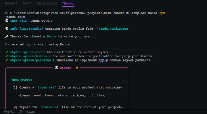
npx panda initThis command generates files that are necessary for Panda to work, including a panda.config.js file and a postcss.config.cjs file.
Here’s the terminal output following initialization:
Step 2: Configure the paths in the panda.config.js file:
import { defineConfig } from '@pandacss/dev'

export default defineConfig({
  preflight: true,
  include: ['./src/**/*.{ts,tsx,js,jsx}', './pages/**/*.{ts,tsx,js,jsx}'], //paths
  exclude: [],
  outdir: 'styled-system'
})
Step 3: Update the package.json file with a prepare script that will run codegen after the dependency installation:
{
  "scripts": {
     "prepare": "panda codegen", //additional script
  }
}
Step 4: Run the panda command to start the build process:
npx panda

npx panda --watch
Step 5: Import the generated CSS file:
import './styled-system/styles.css'

export function App() {
  return <div>Page</div>
}
PostCSS installation
To set up Panda with PostCSS, you’ll need to follow eight steps.
Step 1: Install PostCSS:
npm i postcssStep 2: Run the following command to initialize Panda, which will generate the necessary files:
npx panda init -pStep 3: Add Panda to your postcss.config.cjs file:
module.exports = {
  plugins: {
    '@pandacss/dev/postcss': {}
  }
}
Step 4: Configure the paths in the panda.config.js file:
import { defineConfig } from '@pandacss/dev'

export default defineConfig({
  preflight: true,
  include: ['./src/**/*.{ts,tsx,js,jsx}', './pages/**/*.{ts,tsx,js,jsx}'], //paths
  exclude: [],
  outdir: 'styled-system'
})
Step 5: Update the scripts in the package.json file:
{
  "scripts": {
+    "prepare": "panda codegen", //additional script
  }
}
Step 6: Create a main CSS file at the root of the application and import the required Panda layers into the file:
@layer reset, base, tokens, recipes, utilities;Step 7: Start a build process:
npm run devStep 8: Start using Panda:
import { css } from './styled-system/css'

export function App() {
  return <section className={css({ bg: 'green.400' })} />
}
Panda recipes
It’s important to follow the Don’t Repeat Yourself (DRY) principle in programming in order to improve code maintainability. This holds true even when writing CSS styles.
You can use Panda’s recipes to ensure your CSS code is DRY. Recipes allow you to create predefined styles once and reuse them throughout your application. You can create recipes for common UI components, including accordions, badges, buttons, links, select components, and tags.
Recipes can be highly customizable and may be easily extended or overridden to match your brand and design requirements. Any modifications to a recipe will affect every component that depends on it, meaning you can quickly make changes to the styling of your application.
Recipes consist of four properties:
base: The base styles are the fundamental styles for the componentvariants: The different visual styles for the component, such as size and background colorcompoundVariants: The different combinations of variants for the componentdefaultVariants: The default style of a given recipe
Panda provides a cva function for creating recipes. It takes an object as an argument, with the object containing the style configurations for the recipe.
Let’s create a button recipe as an example. Start by defining the recipe:
import { cva } from '../styled-system/css'

export const button = cva({
  base: {
    display: 'flex'
  },
  variants: {
    visual: {
      solid: { bg: 'red.200', color: 'white' },
      outline: { borderWidth: '1px', borderColor: 'red.200' }
    },
    size: {
      sm: { padding: '4', fontSize: '12px' },
      lg: { padding: '8', fontSize: '24px' }
    }
  }
})
Next, you’ll use the recipe. Behind the scenes, the button function processes the styles defined in its recipe and applies them to the button element, like so:
import { button } from './button'

export default function Button() {
  return (
    <div>
      <button className={button({ visual: 'solid', size: 'sm' })}>
        Click Me
      </button>
      <button className={button({ visual: 'outline', size: 'lg' })}>
        Get Started
      </button>
    </div>
  )
}
Panda patterns
These are layout primitives that allow you to create robust and responsive layouts with ease. The beauty of using patterns lies in the flexibility they provide. You can choose between working with functions or JSX elements based on your preferences.
Patterns are designed to handle common layout scenarios effectively. Panda provides different types of patterns, including flex, grid, wrap, hstack, vstack, container, and more. Let’s see how patterns work in practice.
Functions approach
To see how Panda patterns work, let’s first use the functions approach:
import { css } from "styled-system/css";
import { container, grid } from "styled-system/patterns";
export default function Home() {
  return (
    <main className={container()}>
      <div className={grid({ columns: 3, gap: "6" })}>
        <div className={css({ h: "240px", w: "240px", bg: "red" })}></div>
        <div className={css({ h: "240px", w: "240px", bg: "green" })}></div>
        <div className={css({ h: "240px", w: "240px", bg: "blue" })}></div>
      </div>
    </main>
  );
}
You can directly invoke the patterns and pass the required parameters to them as we did with the container and grid patterns. Panda sets the default maxwidth of the container patterns to 1440px.
JSX approach
Next, let’s see how Panda patterns work using the JSX approach. Panda doesn’t automatically provide JSX components upon installation; you’ll need to opt in by activating that option in the panda.config.mjs file.
To opt in, set the jsxFramework property in the panda.config.mjs file to the desired formwork. When this is set, Panda will output a folder containing the JSX pattern elements you’ll need into the styled-system folder:
import { defineConfig } from "@pandacss/dev";

export default defineConfig({

  include: ["./src/**/*.{js,jsx,ts,tsx}", "./pages/**/*.{js,jsx,ts,tsx}"],
  jsxFramework: "react", //addition

});
Now, you can use the JSX elements:
import { css } from "styled-system/css";
import { Container, Grid } from "styled-system/jsx";

export default function Home() {
  return (
    <Container>
      <Grid columns="3" gap="6">
        <div className={css({ h: "240px", w: "240px", bg: "red" })}></div>
        <div className={css({ h: "240px", w: "240px", bg: "green" })}></div>
        <div className={css({ h: "240px", w: "240px", bg: "blue" })}></div>
      </Grid>
    </Container>
  );
}
Creating conditional styles with Panda
Panda allows you to create conditional styles that are triggered by specific conditions such as breakpoints, CSS pseudo-states, media queries, or custom data attributes.
To look at an example, let’s explore changing the background color of a button when a user hovers:
<button
  className={css({
    bg: 'red.500',
    _hover: { bg: 'red.700' }
  })}
>
  Hover me
</button>

//or

<button
  className={css({
    bg: { base: 'red.500', _hover: 'red.700' }
  })}
>
  Hover me
</button>
You can give the _hover pseudo prop its own definition object or apply it directly to the bg object. The latter option is better because it is straightforward and keeps your code DRY.
Another type of conditional styling you can apply to elements is responsive design. You can apply certain styles at specific breakpoints to make your application responsive. Panda provides the following media query breakpoints by default:
const breakpoints = {
  sm: '640px',
  md: '768px',
  lg: '1024px',
  xl: '1280px',
  '2xl': '1536px'
}
Let’s try changing the font weight of the button based on the screen size:
<button
  className={css({
    fontWeight: 'medium',
    lg: { fontWeight: 'bold' }
  })}
>
  Submit
</button>
You can also apply styles to specific ranges of breakpoints. For example, say you want to change the background color to blue when the button is medium or large. Panda allows you to create media query ranges by combining minimum and maximum breakpoints using a “To” notation in camelCase format.
<button
  className={css({
    bg: 'red'
    fontWeight: { mdToLg: 'blue' }
  })}
>
 a responsive button
</button>
Writing type-safe styles with Panda
Panda’s inbuilt support enables you to make your CSS styles type-safe, meaning you can avoid bugs and errors from things like typos and also make your styles more maintainable.
Let’s see how to make your buttonRecipe type-safe. Panda provides a RecipeVariantProps type utility that you can use to infer the variant properties of a recipe:
import { cva } from '../styled-system/css'

export const buttonRecipe = cva({
  base: {
    display: 'flex'
  },
  variants: {
    visual: {
      solid: { bg: 'red.200', color: 'white' },
      outline: { borderWidth: '1px', borderColor: 'red.200' }
    },
    size: {
      sm: { padding: '4', fontSize: '12px' },
      lg: { padding: '8', fontSize: '24px' }
    }
  }
})

export type ButtonVariants = RecipeVariantProps<typeof buttonRecipe> // { size?: 'small' | 'large' }
The RecipeVariantProps automatically infers and generates the necessary types for the buttonRecipe, meaning you won’t have to manually define the types.
Next, you can import the ButtonVariants type and utilize it in the Button element. With that, the recipe styles are type-safe, and Panda will catch any errors or typos that occur:
import type { button, ButtonVariants } from '../styled-system/recipes'

type ButtonProps = ButtonVariants & {
  children: React.ReactNode
}

export default function Button(props: ButtonProps) {
  return (
    <button {...props} className={button({ visual: 'solid', size: 'sm' })}>
      Click Me
    </button>
  )
}
Creating custom themes with Panda’s design tokens
Panda provides design tokens that developers can use to create custom design systems from scratch, with options for spacings, colors, gradients, fonts, shadows, and more.
You can define custom tokens in the panda.config.mjs file under the theme key:
import { defineConfig } from "@pandacss/dev";

export default defineConfig({
  ...
  theme: {
  // 👇🏻 Define custom tokens here
    tokens: {
      colors: {
        primary: { value: '#0FEE0F' },
        secondary: { value: '#EE0F0F' }
      },
      fonts: {
        body: { value: 'system-ui, sans-serif' }
      }
    }
  },
});
After defining tokens, you can use them to style elements:
<button
  className={css({
    color: 'primary',
    fontFamily: 'body'
  })}
>
  Custom themed button
</button>
Conclusion
While it is a new addition to the CSS ecosystem, Panda is a robust styling solution that combines the best of CSS-in-JS and atomic CSS paradigms. It is a powerful and efficient solution for styling web applications. The advanced features that Panda provides make it a great choice for creating scalable and maintainable stylesheets while optimizing performance.
Panda CSS offers several advanced features, such as type-safe styling, a low learning curve, design tokens, and recipes and variants similar to Stitches.
I expect to see more developers migrate from Stitches to Panda, as Stitches is no longer maintained according to its website. Fortunately, Panda offers a guide that covers migrating from Stitches.
One thing I especially like about Panda CSS is how similar its API is to Chakra UI, which is not surprising, as they were both created by the Chakra UI team.
Source: https://blog.logrocket.com
#css #pandacss