In this article, we’ll focus on basic design using rows, columns, and areas to build a simple responsive web application using CSS Grid.
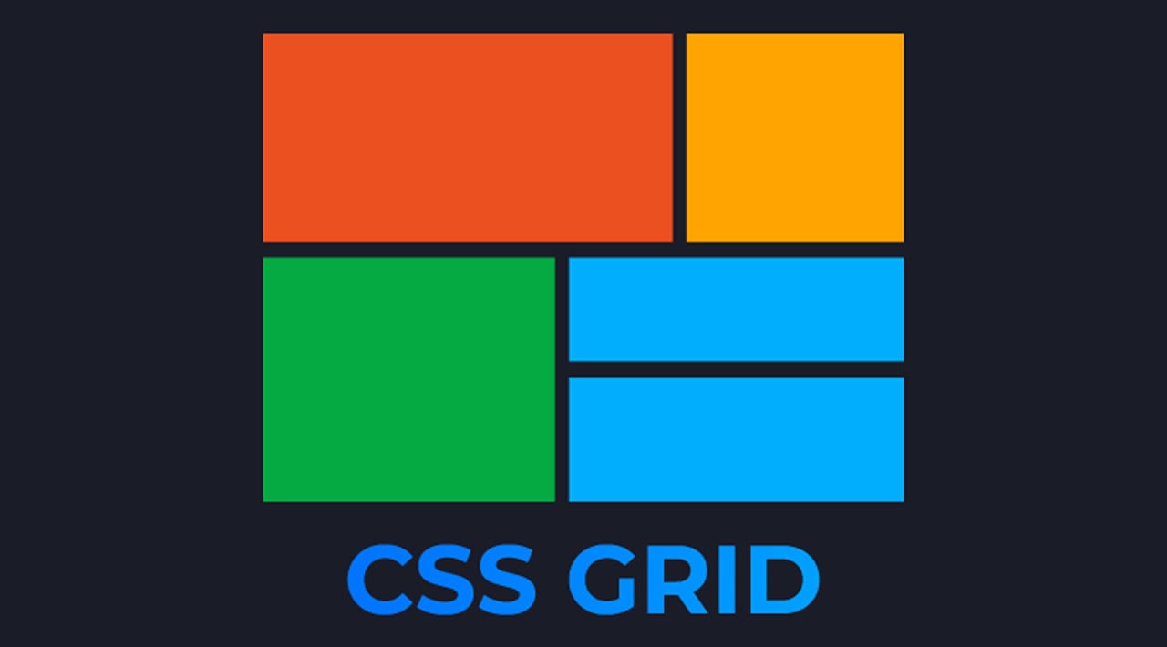
CSS Grid layout is a two-dimensional grid system designed to help web developers divide elements into columns and rows in order to create a consistent and seamless layout for web applications.
The logic behind CSS Grid is that, if a developer takes an element like a div and displays a grid in it, they can then split the element into columns and rows — collectively known as tracks — where items can be taken and placed in the grid. With CSS Grids, this can all happen without the extra work of using positioning properties (top, right, left, bottom).
There are instances where one would use CSS frameworks and others where one would use CSS Grid, but as with most things in web development, it depends on your use case.
#css #web-development #programming