A quick walkthrough using pandas.Series.apply() to create original scale columns to visualize with a count plot graph using sns.countplot().
Displaying results in a way that is easy to understand is a great skill to have when working with datasets. A common way to display information is by using a graph. This post will go through some easy steps using Python to convert your data into easy to understand data and then display that data in a graph.
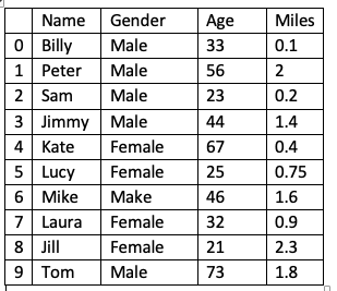
The Data
For this post, we will use some simple data (that I made up*) that has been turned into a DataFrame. There are four variables in this data set; Name, Gender, Age, Miles. The Miles variable refers to how many miles the person walks in a day. From this dataset, we will create a count graph to visually answer the question “ Which age group is the least active?”.
#seaborn #data-science #pandas #python #data-visualization