The objective of data visualization is to communicate hidden patterns uncovered during analysis. And while a visualization must look aesthetically appealing, its primary objective is not to ‘look pretty’.
Use of color in visualisation should be to help disseminate key findings and not to chase some artistic endeavor
More is not better when it comes to color
Use of color must be carefully strategized to communicate key findings and this decision, therefore, cannot be left for automated algorithms to make. Most data should be in neutral colors like grey with bright colors reserved for directing attention to significant or atypical data points.
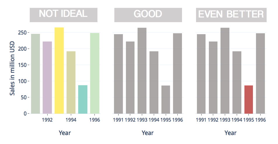
Sales in million USD from 1991–1996. Red colour is used to draw attention to unusually low sales in 1995. Nearly uniform sales in other years are all rendered in grey. [made by author]
Colour can help to group related data points
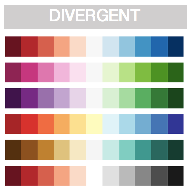
Color can be used to group data points of similar value and to render the extent of this similarity using the following two color palettes :

[made by author]
A sequential color palettes is composed of varying intensities of a single hue of color at uniform saturation. Variability in luminance of adjacent colors corresponds to the variation in data values that they are used to render.
[made by author]
A divergent color palettes is made of two sequential color palettes (each of a different hue) stacked next to each other with an inflection point in the middle. These become helpful when visualizing data with variations in two different directions.
The chart below on the left uses a sequential color palette made of a single hue (green) for values ranging from -0.25 to +0.25 while chart on the right uses a divergent color scheme with different hues for positive _(blue) _and negative (red) values.
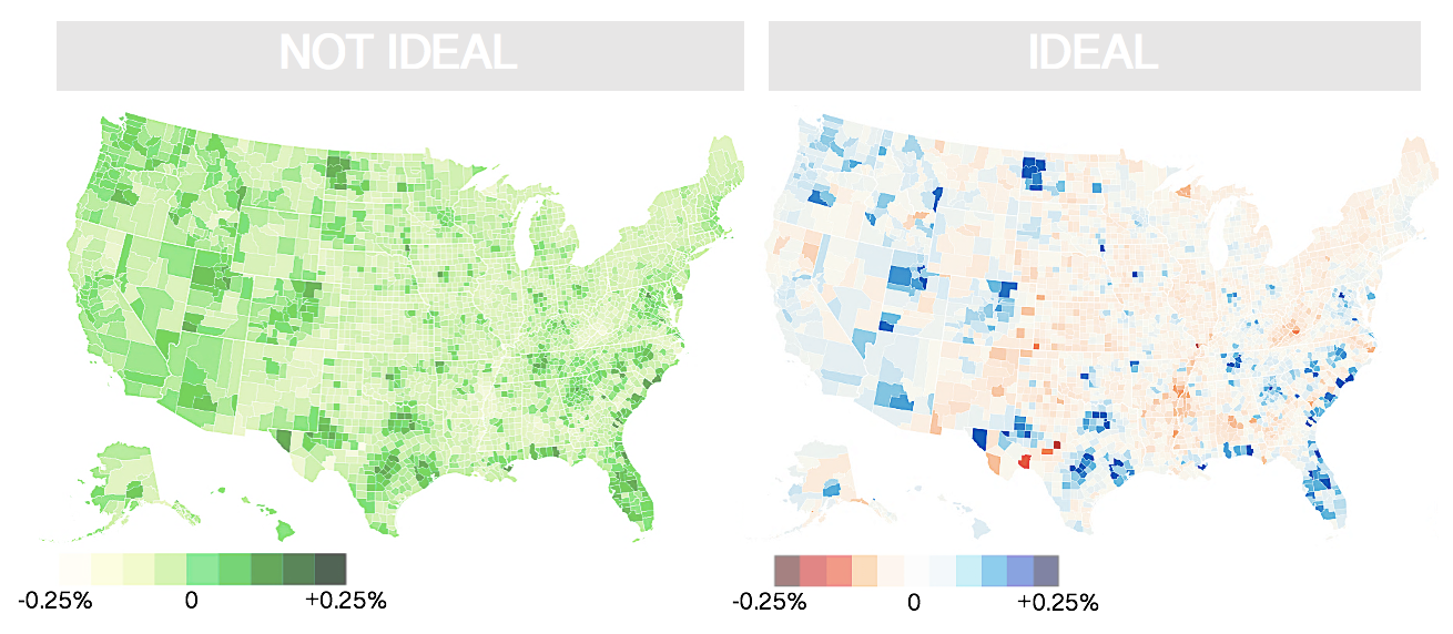
Percentage change in population in the USA from 2010–2019. The divergent color scheme made of two hues (red and blue) with an inflection point at zero is more suitable than a sequential color scheme. [made by author]. Source of data.
In the map on the right, positive and negative values can be identified immediately based on color alone. We can immediately conclude that the population of mid-western and southern towns had declined and that in the east and west coast has increased._ This key insight into the data is not immediately obvious in the chart on the left where not color itself, but the intensity of color green must be used to read the map._
#data-visualization #visual-design #colors #color-theory #data-science