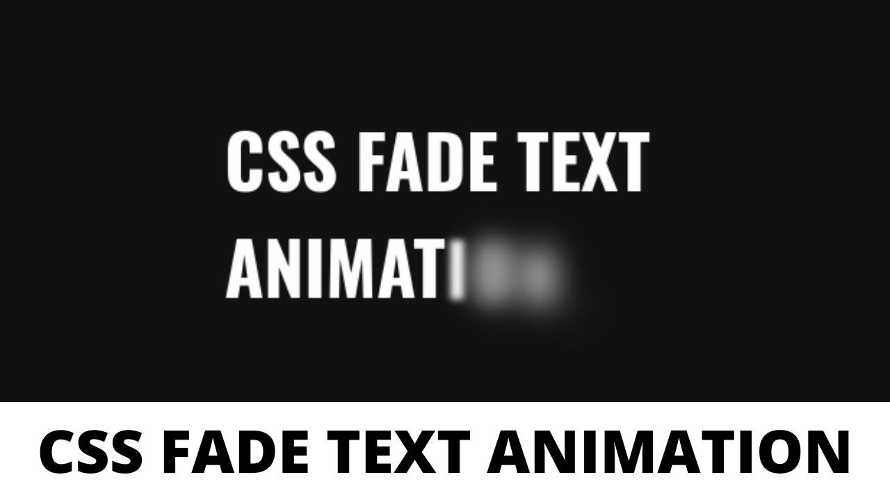
This vide takes you through how to design fade text animation using HTML, CSS and JavaScript. Here, we have used JavaScript to convert text into individual span element and span element is styled using CSS. Three properties i.e. “position” , “opacity” and “blur” are used to achieve the fading animation effect.
Subscribe: https://www.youtube.com/channel/UCXDLrsqe14uFu6k96xjlF4w
Source Code
HTML
<div class="center">
  <div class="text-animation">
    CSS Fade Text Animation.
  </div>
</div>
CSS
body {
  background:#111;
  font-family:"Oswald",sans-serif;
}
.text-animation {
  color:#fff;
  opacity:0;
}
.text-animation span {
  position:relative;
  top:10px;
  left:10px;
  font-size:50px;
  font-weight:600;
  opacity:0;
  text-transform:uppercase;
  animation:fade 400ms ease-in-out forwards;
}
.center {
  position:absolute;
  top:50%;
  left:50%;
  transform:translate(-50%,-50%);
}
@keyframes fade {
  0% {
    top:10px;
    left:10px;
    filter:blur(15px);
    opacity:0;
  }
  50% {
    filter:blur(10px);
    opacity:0.9;
  }
  100% {
    top:0px;
    left:0px;
    filter:blur(0px);
    opacity:1;
  }
}
JS
var wrapper = document.getElementsByClassName("text-animation")[0];
wrapper.style.opacity="1";
wrapper.innerHTML = wrapper.textContent.replace(/./g,"<span>$&</span>");

var spans = wrapper.getElementsByTagName("span");

for(var i=0;i<spans.length;i++){
  spans[i].style.animationDelay = i*80+"ms";
}
#css #javascript #html
11.25 GEEK