Using Raygun to surface mobile application performance problems
Inside the Real User Monitoring (or RUM) mobile dashboard, you will get the data you need to understand your mobile application including:
How often people use your application
How many new and returning users you have
Which countries are using your application
How end users are navigating your application
Once usage data is flowing from your mobile application, your mobile dashboard will become active. Navigating the dashboard is easy. The tabs along the top of the ‘Real User Monitoring’ window give you the high-level categories that you can discover about your application:
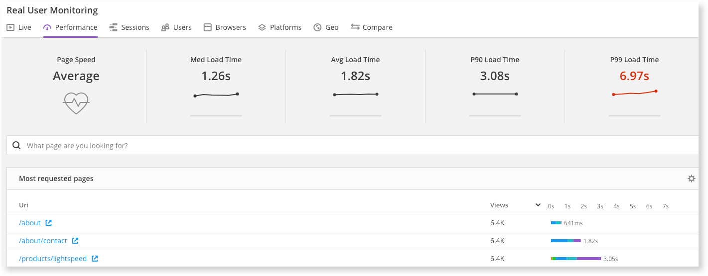
As mentioned above, I’m interested in the application performance right now, which you can see under the ‘Performance’ tab. The overall performance of your application is broken down into network call performance, slowest views and load time distribution. Let’s take a look at these in detail:
Network call performance
The two events that RUM for mobile will log are the performance of network and API calls and view loads. Below is an example of some network calls:
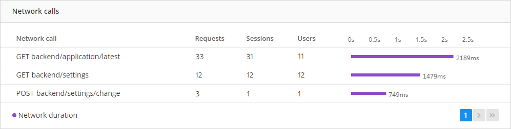
Next to each network call, you can see the number of times it’s been requested from your mobile application, the number of sessions and end users, and the average performance of the call. The slowest network call is listed first in the table, so straight away you’ll see the slowest network call. Slow calls could mean, for example, that a database query is too slow and needs evaluating.
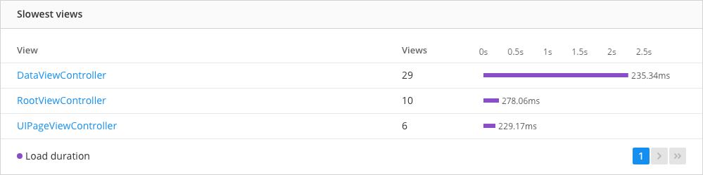
Slowest views
‘Slowest views’ displays the number of times each view is visited and the performance of each view, ordered by the slowest. In the example below, you can see the view ‘DataViewController’ is performing poorly:
Load time distribution
Load time distribution is a graph which shows your mobile application’s performance over time. From here, you can analyze trends or see sudden changes. In the chart below, you can see the peaks indicating your applciation has run into a performance problem.
A slow loading page may be related to the slowest performing view. Looking at the changes made to the recent deployment of the application (specifically around the slowest view) is a good place to start:
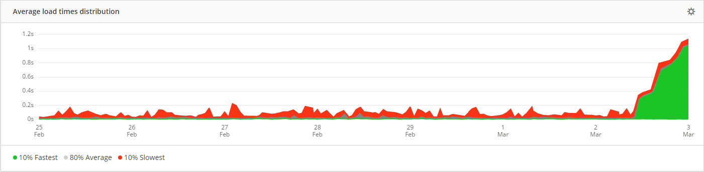
The graph splits the data into three percentiles. The green peaks show the first 10% fastest performance values, while the red displays the 10% slowest. The remaining 80% average performance times are gray. If the red and gray values are far apart, then the slowest values are probably outliers and less important. If the red and gray values are both high, then you’ve got a performance issue that is affecting your users. Ideally, you want all values to be as low as possible.
#mobileapp