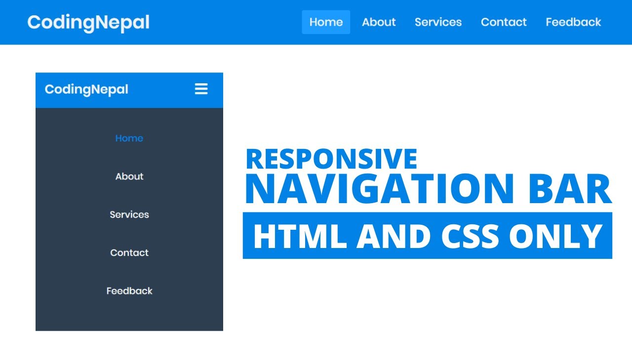
In this video you’ll learn how to create a Fully Responsive Navigation Menu Bar using HTML and CSS only. As you know the Menu Bar or Navigation Bar (Navbar) is important for any kind of website.
Many websites have responsive navbar. Essentially, responsive design is a way to put together a website so that it automatically scales its content and elements to match the screen size on which it is viewed. It keeps images from being larger than the screen width and prevents visitors from mobile devices from needing to do extra work to read your content.
As you can see in the image, This is a simple and fully Responsive Navbar Bar, not a stylish or not a fancy one. This is pure CSS based Responsive Navigation Bar where HTML <input type="checkbox"> tag is used to toggle menu bar that means when you click on that three-line bars.
The checkbox will be checked and the menu bar is shown and when you again click on those bars, the checkbox will be unchecked and that shown menu bar will be hidden. This process is only done by HTML <input type="checkbox"> tag and <label> tag.
Download Codes From Here - https://codingnepalweb.com
👕 T-shirts for programmers: https://bit.ly/3ir3Gci
🔔 Subscribe: https://www.youtube.com/c/CodingNepal/featured
#html #css
