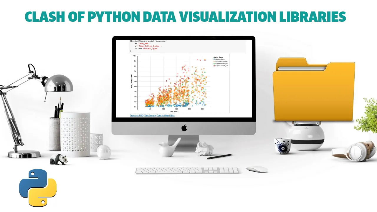
Seaborn, Altair, and Plotly
Data visualization is a fundamental ingredient of data science. It helps us understand the data better by providing insights. We also use data visualization to deliver the results or findings.
Python, being the predominant choice of programming language in the data science ecosystem, offers a rich selection of data visualization libraries. In this article, we will do a practical comparison of 3 popular ones.
The libraries we will cover are Seaborn, Altair, and Plotly. The examples will consist of 3 fundamental data visualization types which are scatter plot, histogram, and line plot.
We will do the comparison by creating the same visualizations with all 3 libraries. We will be using the Melbourne housing dataset available on Kaggle for the examples.
#data-visualization #python #data-science #programming #clash of python data visualization libraries #libraries